Resolve to Love Where You Live

According to U.S. News, approximately 80% of New Year's resolutions fail by the second week of February.  But what if that didn't have to be the case?  What if you made a resolution that would not only better your life but also the lives of your family and friends and all who enter your home? 

80% of resolutions fail by the second week of February.

Okay, maybe that sounds a little deep, but it's something we firmly believe.  What if you made a resolution to finally tackle that room you've been putting off?  Or that wall that you've stared at for over a year and still can't decide what color to paint it?  Having a beautiful home isn't just about the aesthetics but more the quality of life it brings.  As designer Laura Nelson put it,

I realized what an emotional effect it has on people to change their surroundings, to give them a space that speaks to them and improves their day-to-day life.

So what's holding you back? 

Money.  That's what we often hear.  But when you think about it, investing in your home only requires a small investment but yields big results. 

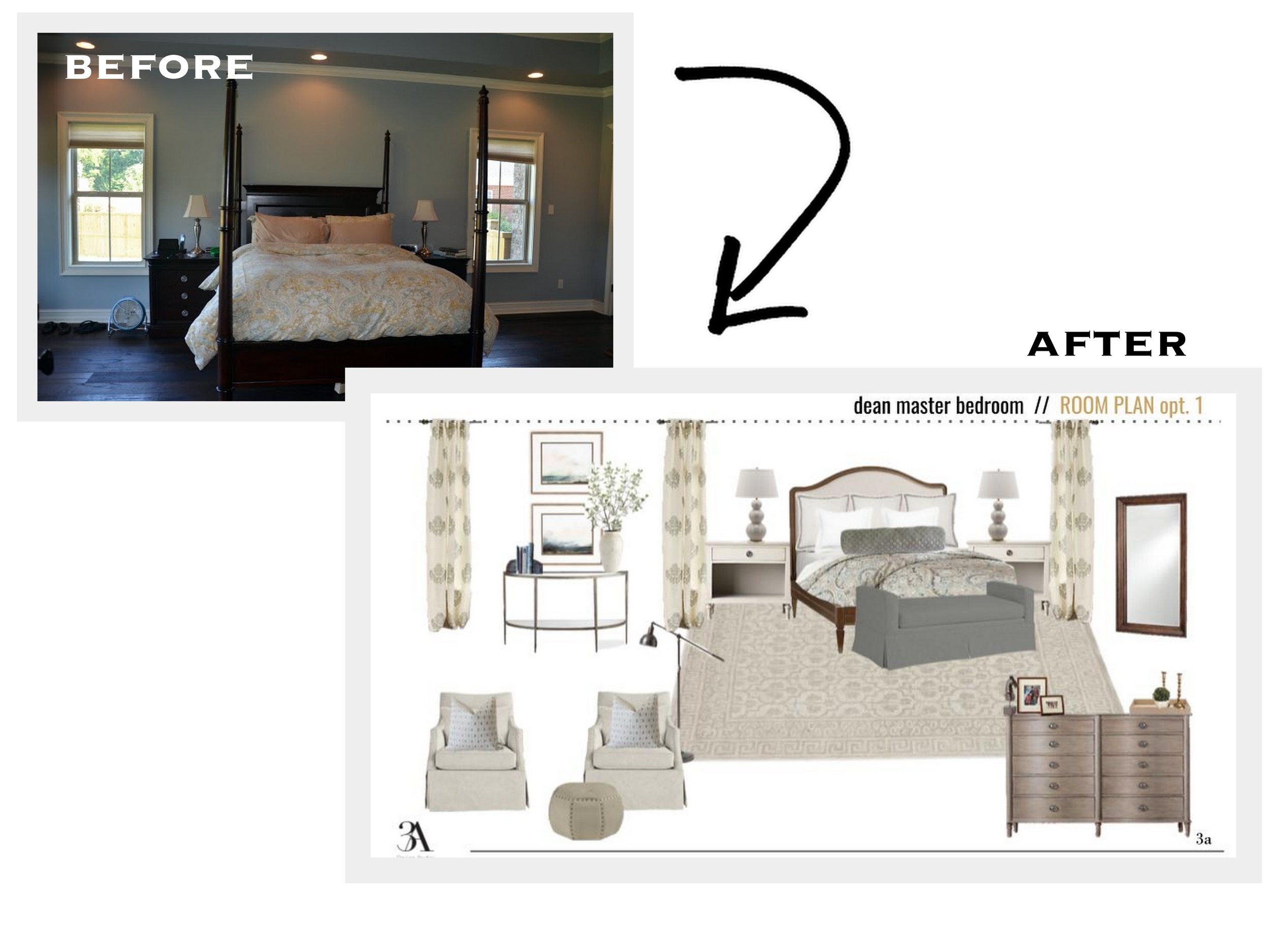
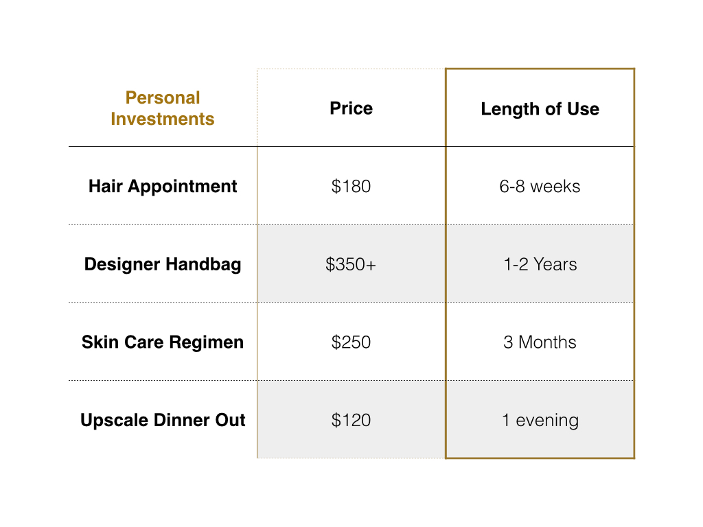
For those that just need a little guidance or a few finishing touches, our A La Carte Package is perfect.  And it starts at $125--that's about what you'd spend on a meal out for two.  Our full room E-Designs start at $750.  Let's think about what else we spend hundreds of dollars on without blinking an eye and the length of that investment.  

When you look at the money issue that way, it seems like a no-brainer, right? Our E-design services can be enjoyed for years to come. Your home is where you spend the majority of your time aside from your workplace.  Why not enjoy it?  Why not sit down on your sofa and look around and like what you see?  Why not leave your master bedroom door open because you're not afraid of a guest looking in?

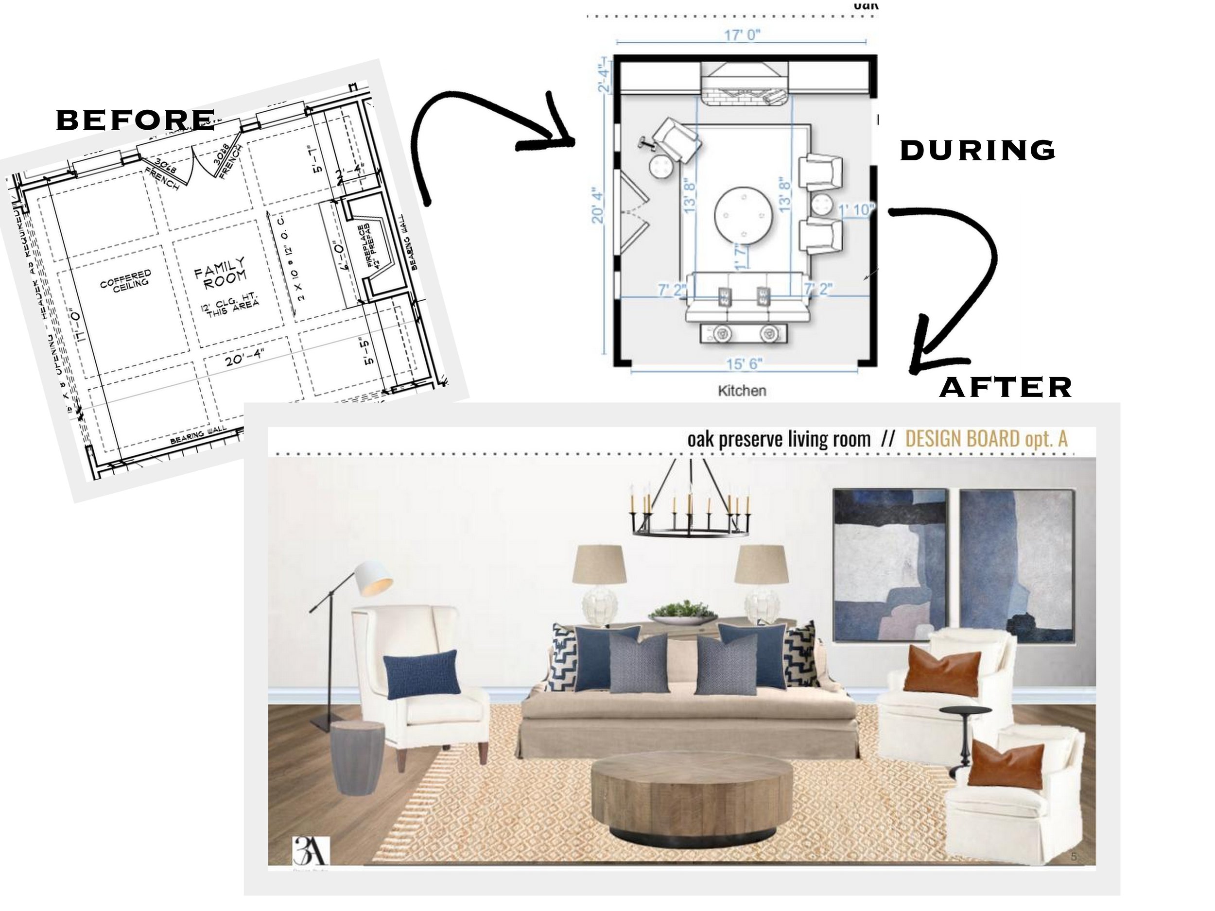
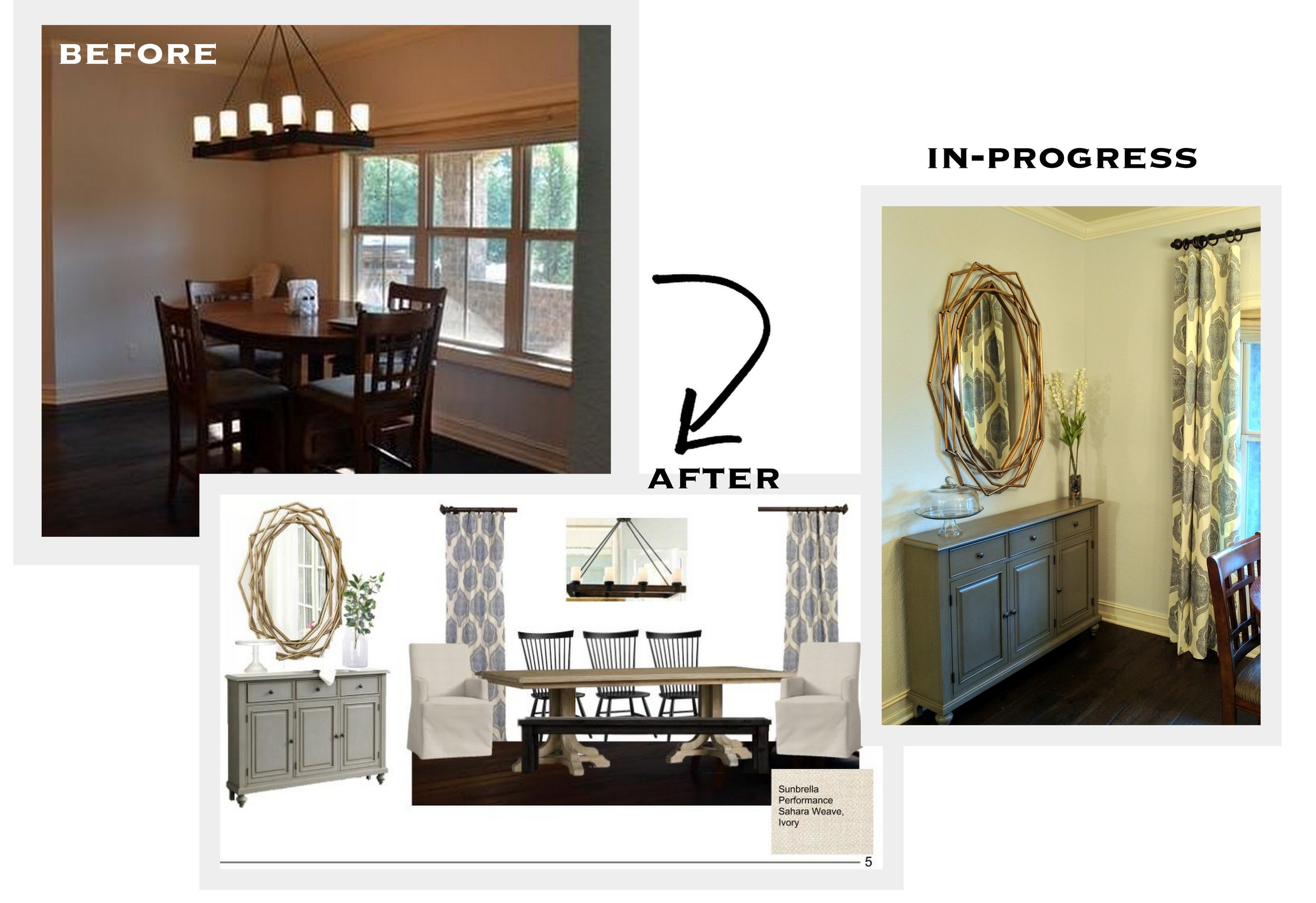
Whether it's starting from scratch--from paint colors to hard finishes to lighting, we've helped clients starting out with only blue prints and walked them through the entire design process.  Or maybe you just need an extra pair of eyes (in our case, two) to help bring your Pinterest board vision to life.  We are here to listen to your needs, wants and ideas and put our years of experience to work to make your room, your home truly yours. 

So let's stop being the 80% and start making resolutions that will actually change our lives for the better.  Resolve to love where you live.  We'd love to help you get started!


Condo Refresh

With summer vacation days coming to a close, condo owners are assessing their rentals and looking to refresh their properties to get more bang for their buck next year.  I don't know about you, but one of the main things I look at when renting a condo (next to location) is the style of the place.  If you're going away, you'd like it to be a place you want to relax, right?  A place you want to spend time.  A place to make you feel like you're on a vacation.  

A few design updates can go a long way when sprucing up a condo.  And thinking outside of the coastal cookie cutter box can make your condo stand out among the rest of the competition. 

Here a condo E-Design we recently completed.  They didn't need a full overhaul-just a little refresh, and we were more than happy to oblige.

With a great neutral backdrop to start, all we had to do was add in a few new pieces to bring this place back to life.  We suggested updating the kitchen with a new backsplash in these coastal blue arabesque tiles and replacing the existing can lights over the bar with these antique nickel pendants.  Finishing off the updated kitchen, we suggested using these modern, easy to clean acrylic bar stools in lieu of the dated wooden ones they had.

In the living area we added in a durable seagrass rug one size larger than their existing one (scale is huge), brought in some new pillows for their existing slipcovered sofa and added some blue lamps.  The blue color and acrylic base of the lamps tie into the tile and barstools in the adjoining kitchen, and the fabric on the pillows (great for camouflaging stains) has a coral inspired look with a slightly unexpected color palette. Update complete!

If you're looking to update your condo or rental, here are a few things to consider giving a "refresh"--

  • lighting
  • pillows
  • wall paint colors
  • hardware
  • backsplash
  • rugs

And if you have no idea where to start, contact us and read more about our E-Design process here.  We'd love to help!


Client Project - A Farmhouse E-Design

We wrapped up a huge great room design in a beautiful Alabama farmhouse last month and have been dying to share it with you guys.  Dana previewed a little tease of it here, but today we’re showing you the rest.

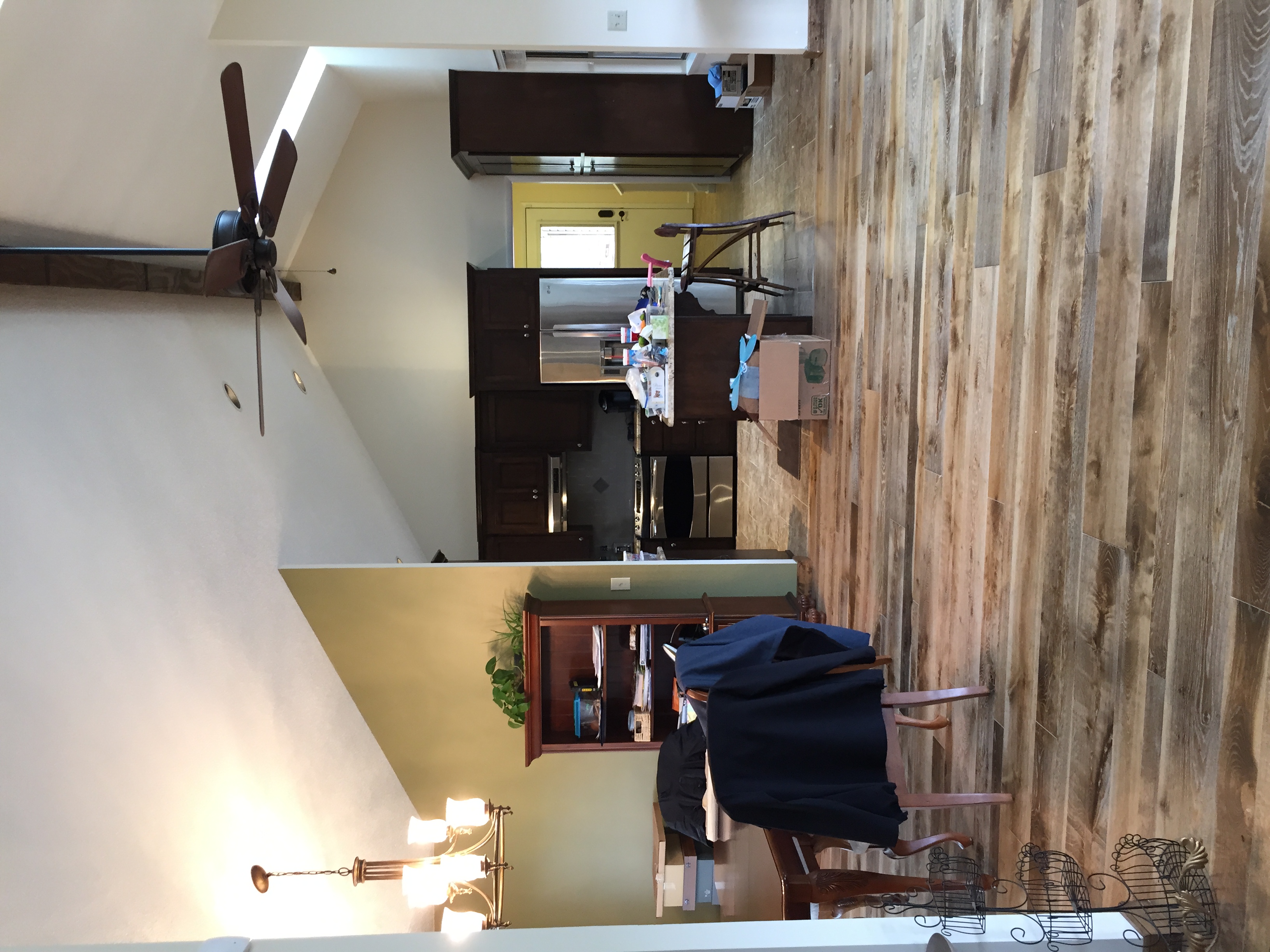
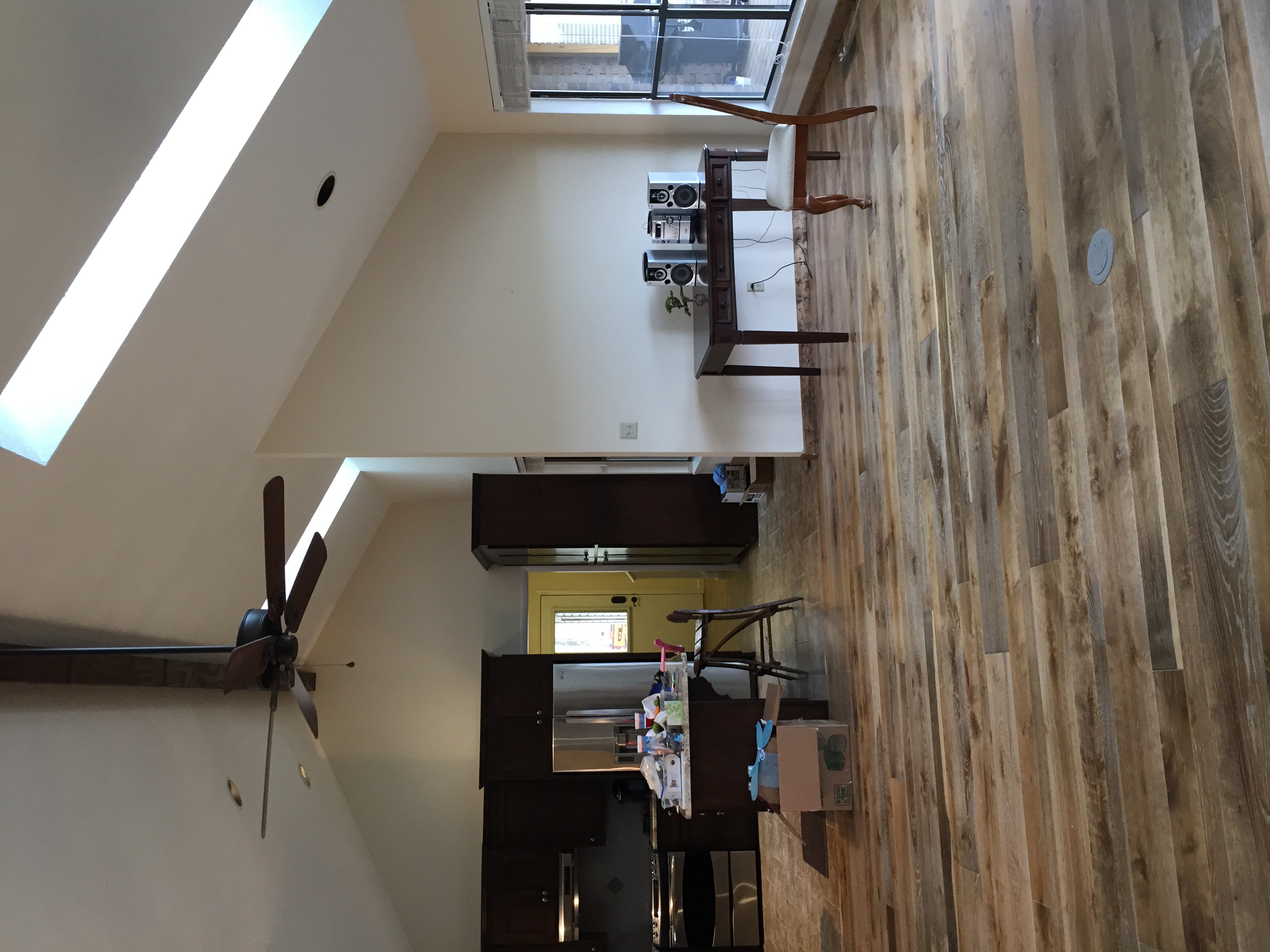
Our sweet clients had just moved into their new home a couple of weeks before we went for the consultation.  We had seen some photos of the house through email but we couldn’t really get a grasp of its openness and amazing views of their man-made lake and 3 acres below.

Look at that view.  (pardon the boxes and such...they had just moved in)

View standing in the living room and looking back into the kitchen.  Don't you just love all of the openness?

Our clients told us they liked cool, soothing colors and wanted a design that would work with the aesthetic of the farmhouse and also be comfortable and durable for their young family.

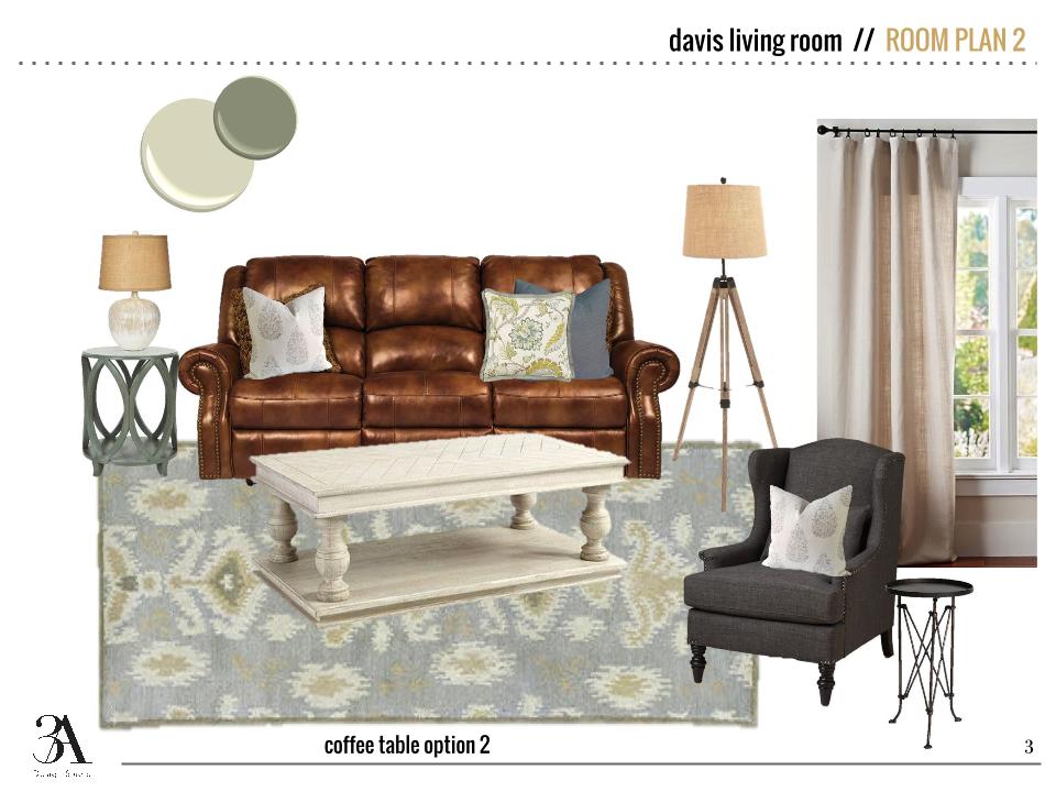
We got to work by first selecting new paint colors for the walls and built-ins and then sent over some sofa options.  Due to a long wait time on a custom sofa, the clients ultimately had to select one in town that fit their needs.  We still got to “go shopping” with them virtually and added their newly selected sofa and loveseat to the design foundation.  As you can see below, we also presented them with a couple of options for a coffee table as well.

The entry is right off of the living room so we brought some of the rustic elements and the same color palette to this side of the room.

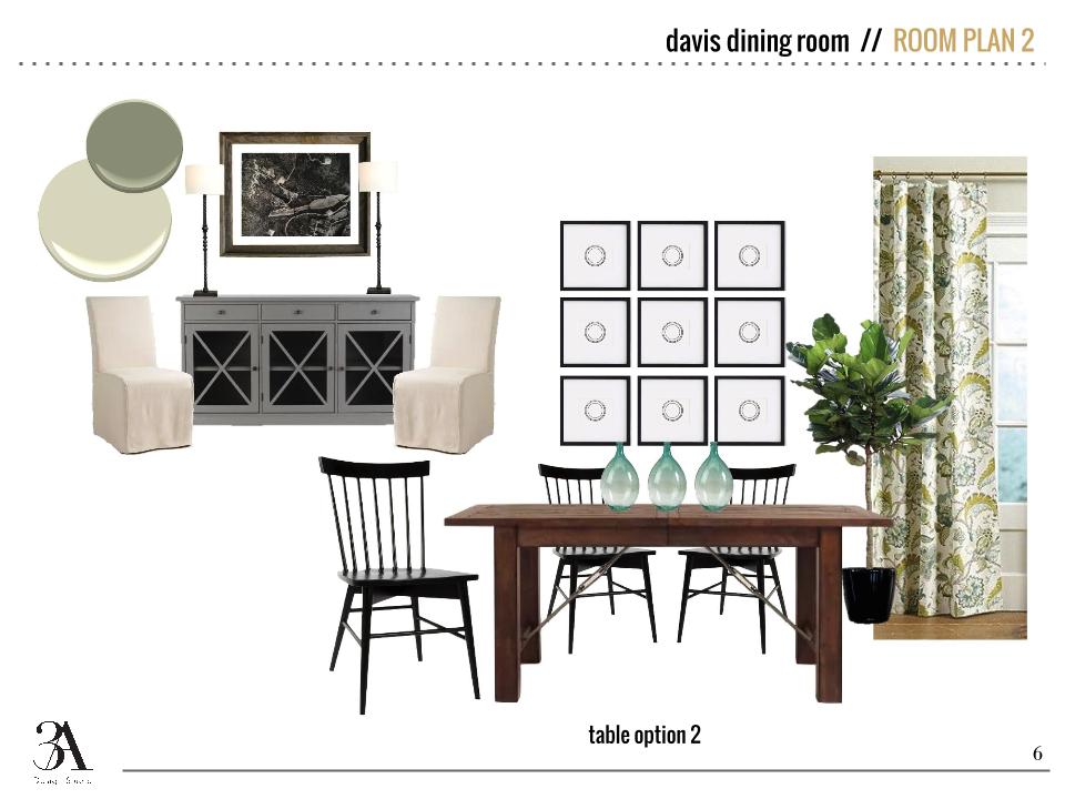
n the dining room we suggested all new furniture to tie in with the rest of the space.  We chose more colorful window treatments and accessories to bring some life to this side of the room.

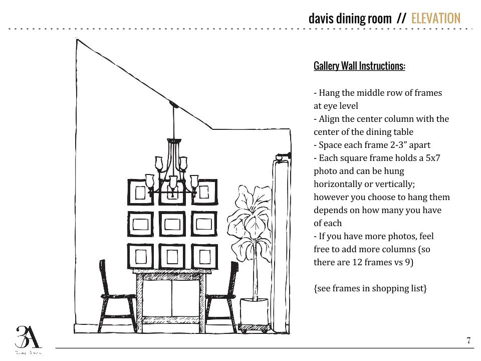
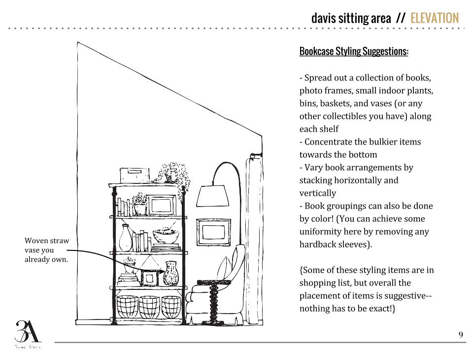
We love supplying our clients with not only mood boards and items suggestions but also elevations so they can actually visualize the scale and look of the new pieces in the space.

Directly across from the dining room was an unassigned space where we created a seating area.  The clients had some slipper chairs that they wanted to recover so we supplied fabric and pillow options to complete the look.

BEFORE

BEFORE

Aside from the large great room, we also supplied tile backsplash ideas for the kitchen to be used at a later date and included some suggestions for finishing off their master bedroom. They need bedding suggestions to match their existing duvet and a remedy for covering a mid-height wall outlet.

It was so great to work in a home where we could really tie each room together and supply the homeowners with a look they’ve been hoping to achieve.  We’ve already seen a couple of the progress pictures and can’t wait to see the finished product!

If we can help you finish off a troublesome space (or spaces), please let us know!  Whether it's a few styling suggestions and paint colors or a newly designed room, we can help.  Go here and fill out our design questionnaire at the bottom of the page to begin.

An office / guest room design

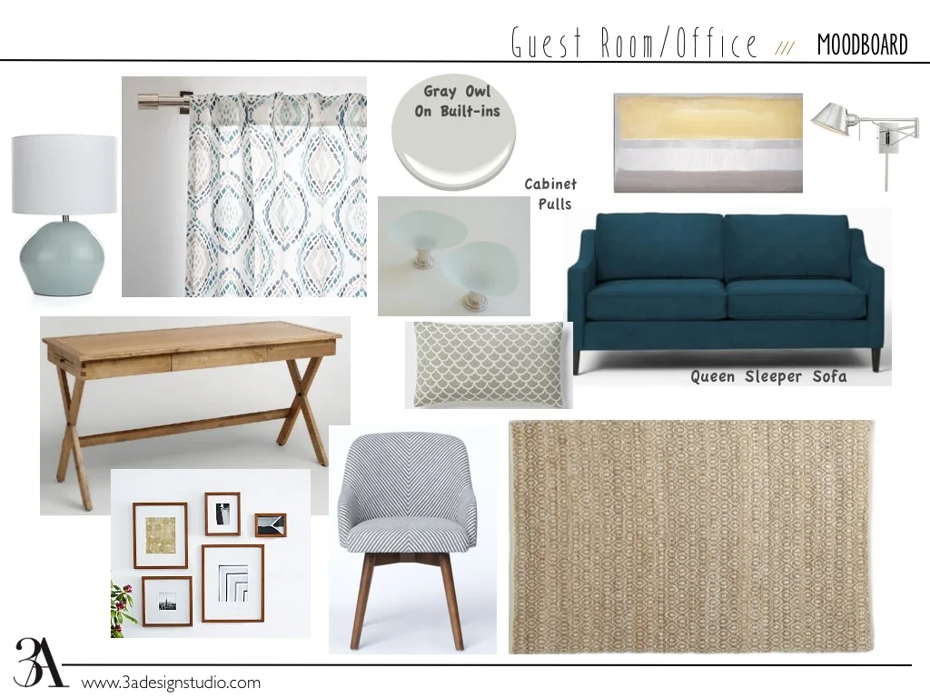
Our latest completed e-design, came from a client who like many, had a spare bedroom that needed to function as both an office and a guest room for the occasional visitor.

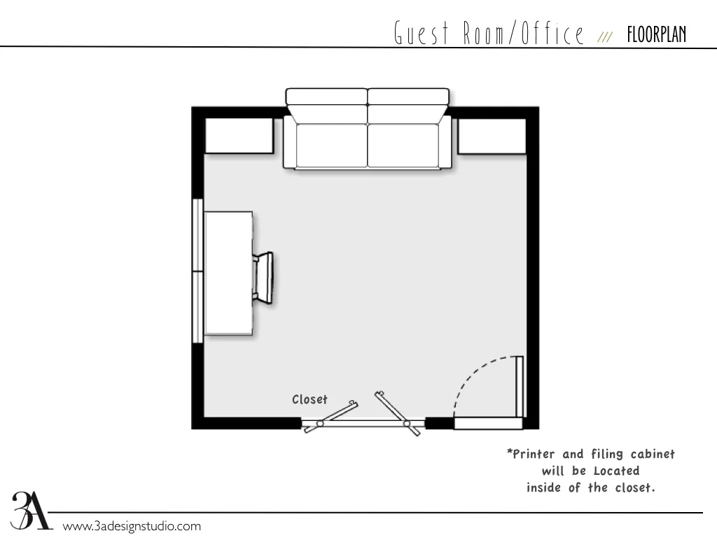
A couple requirements she had were A) when the room was being used by a guest, she wanted the ability to tuck away any office related items so that it felt more like a guest room than an office and B) she needed storage for her many books.

office/guest room

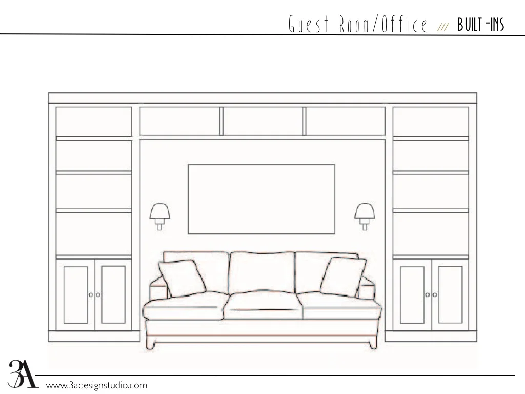
Based on the space, we decided the best option was to have a pull out sofa in between built-in bookshelves. The sofa could act as both a comfortable place to read and a bed when needed.  We selected a streamlined desk with a storage drawer and suggested running electricity into the closet so that she could keep her wireless printer, filing cabinet, and other office related items behind the louvered doors. 

For the color palette, we wanted to keep the room light so that it would be conducive to studying and also flow with the rest of the house. We kept the walls white, chose a pale gray for the built-ins (BM Owl Gray) and layered the room with neutrals and blues. The end result was a contemporary, beachy look. I absolutely love the contrast of the peacock blue sofa against the natural wood finishes!

office/guestroom

Well, I hope you got some ideas. If you have a design challenge that you need help with, drop us a line. Whether it is finding the perfect coffee table or designing an entire room, we can help.