Resolve to Love Where You Live

According to U.S. News, approximately 80% of New Year's resolutions fail by the second week of February.  But what if that didn't have to be the case?  What if you made a resolution that would not only better your life but also the lives of your family and friends and all who enter your home? 

80% of resolutions fail by the second week of February.

Okay, maybe that sounds a little deep, but it's something we firmly believe.  What if you made a resolution to finally tackle that room you've been putting off?  Or that wall that you've stared at for over a year and still can't decide what color to paint it?  Having a beautiful home isn't just about the aesthetics but more the quality of life it brings.  As designer Laura Nelson put it,

I realized what an emotional effect it has on people to change their surroundings, to give them a space that speaks to them and improves their day-to-day life.

So what's holding you back? 

Money.  That's what we often hear.  But when you think about it, investing in your home only requires a small investment but yields big results. 

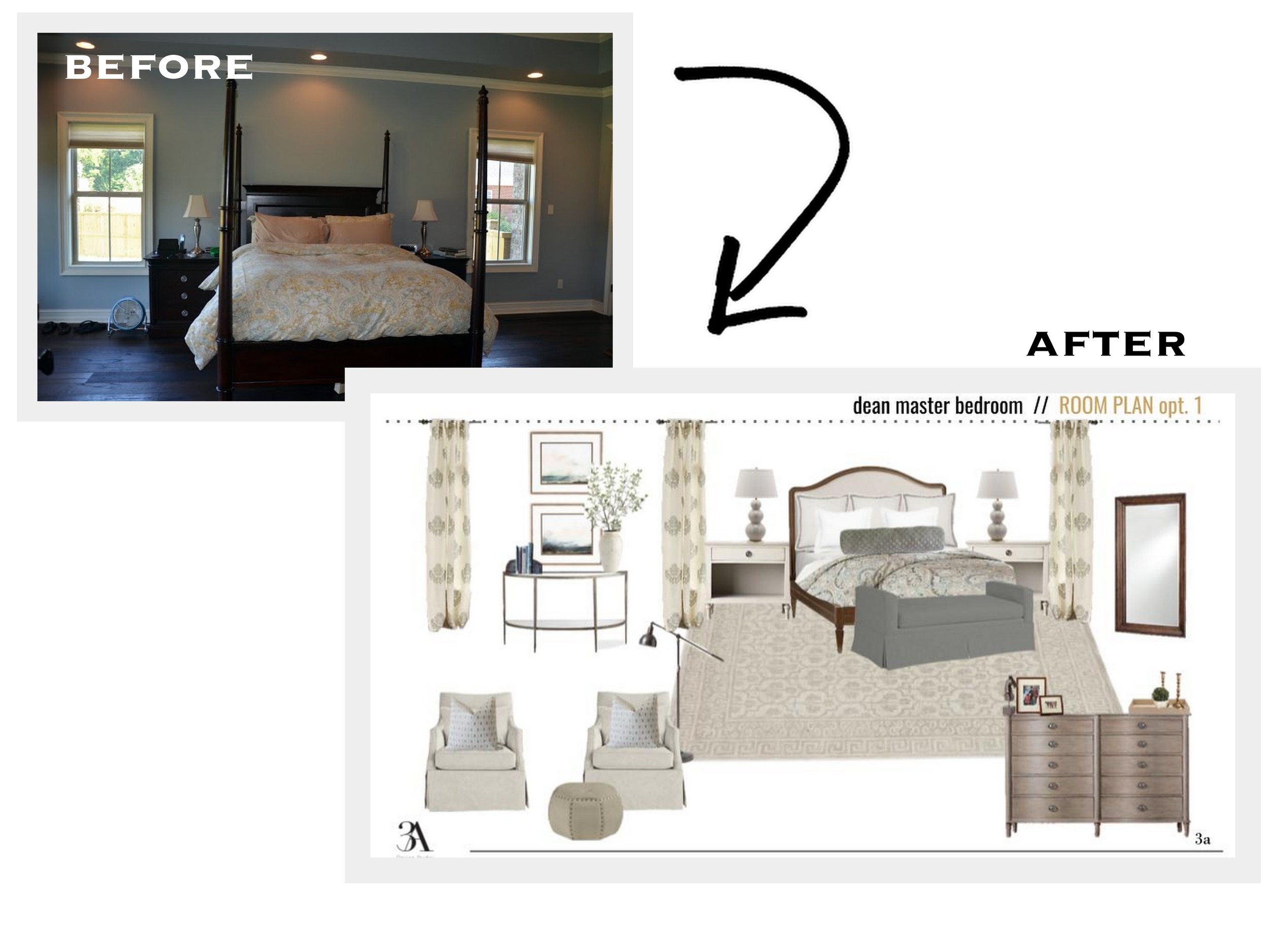
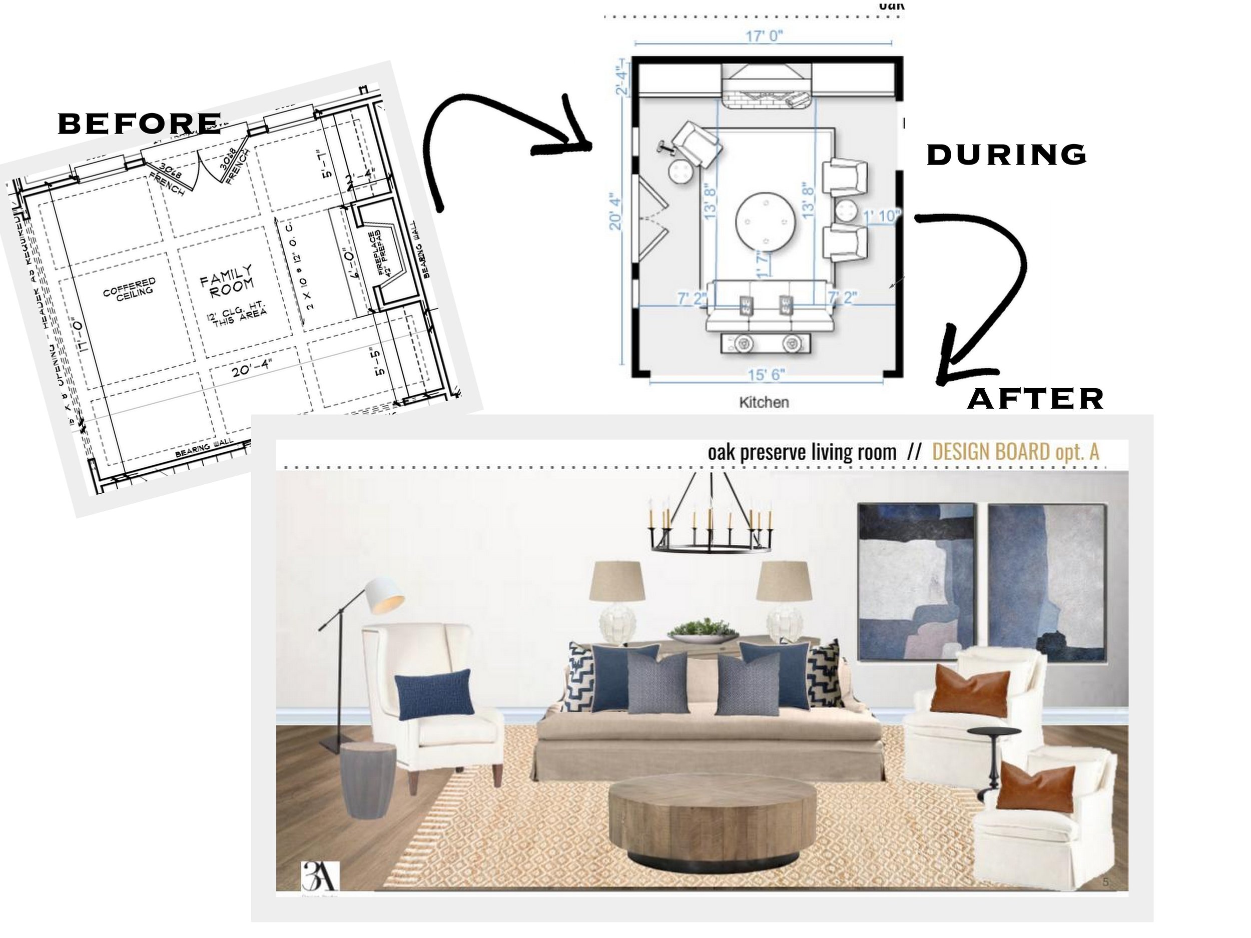
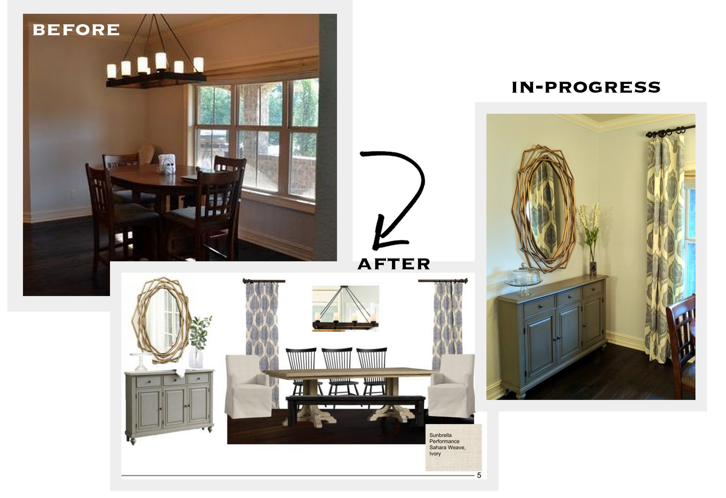
For those that just need a little guidance or a few finishing touches, our A La Carte Package is perfect.  And it starts at $125--that's about what you'd spend on a meal out for two.  Our full room E-Designs start at $750.  Let's think about what else we spend hundreds of dollars on without blinking an eye and the length of that investment.  

When you look at the money issue that way, it seems like a no-brainer, right? Our E-design services can be enjoyed for years to come. Your home is where you spend the majority of your time aside from your workplace.  Why not enjoy it?  Why not sit down on your sofa and look around and like what you see?  Why not leave your master bedroom door open because you're not afraid of a guest looking in?

Whether it's starting from scratch--from paint colors to hard finishes to lighting, we've helped clients starting out with only blue prints and walked them through the entire design process.  Or maybe you just need an extra pair of eyes (in our case, two) to help bring your Pinterest board vision to life.  We are here to listen to your needs, wants and ideas and put our years of experience to work to make your room, your home truly yours. 

So let's stop being the 80% and start making resolutions that will actually change our lives for the better.  Resolve to love where you live.  We'd love to help you get started!


Before/After: A Lesson in Paint and Scale by Chango & Co.

Susana Simonpietri, creative director for New York interior design firm Chango & Co., knows how to transform a space.  One thing I love about her company's website is that instead of just showing a portfolio of their work, they also show a great deal of before and after pictures of their projects.  It's here that you can get a true grasp of what a good eye, great scale and great color can do for a space.

Here is one project in particular that is a favorite of mine, a brownstone in Brooklyn's Park Slope neighborhood. 

New paint, furniture and minimal styling update this entry.

New paint, furniture and minimal styling update this entry.

It's hard to believe that this is the same size room isn't it?  Those huge mirrors are amazing and define the grandeur of the rooms ceiling height.

It's hard to believe that this is the same size room isn't it?  Those huge mirrors are amazing and define the grandeur of the rooms ceiling height.

Anyone else swooning over that light fixture?

Anyone else swooning over that light fixture?

This dining room was updated with some paint, a new light fixture and amazing built-in, another signature element in Chango's designs. 

This dining room was updated with some paint, a new light fixture and amazing built-in, another signature element in Chango's designs. 

New wallpaper and mirror and your powder room is transformed.

New wallpaper and mirror and your powder room is transformed.

This master got a makeover with some new trim, paint and large-scaled furniture to fit the room.

This master got a makeover with some new trim, paint and large-scaled furniture to fit the room.

I spy another great addition of a built-in.  What family doesn't need more storage?

I spy another great addition of a built-in.  What family doesn't need more storage?

Here is the other side of the family room, showcasing some more built-ins that look like they should have been there all along.

Here is the other side of the family room, showcasing some more built-ins that look like they should have been there all along.

Last but not least is this adorable nursery.  Look at how different the windows look when they have the right window treatments!

Last but not least is this adorable nursery.  Look at how different the windows look when they have the right window treatments!

For more before and after photos of their work go here.  And if we can help transform your space from a "blah" before to an amazing after, drop us a line today!

3A's Three Things

3as three things

Here three things that caught my attention this week. Click the numerical headings for the links.

// one //

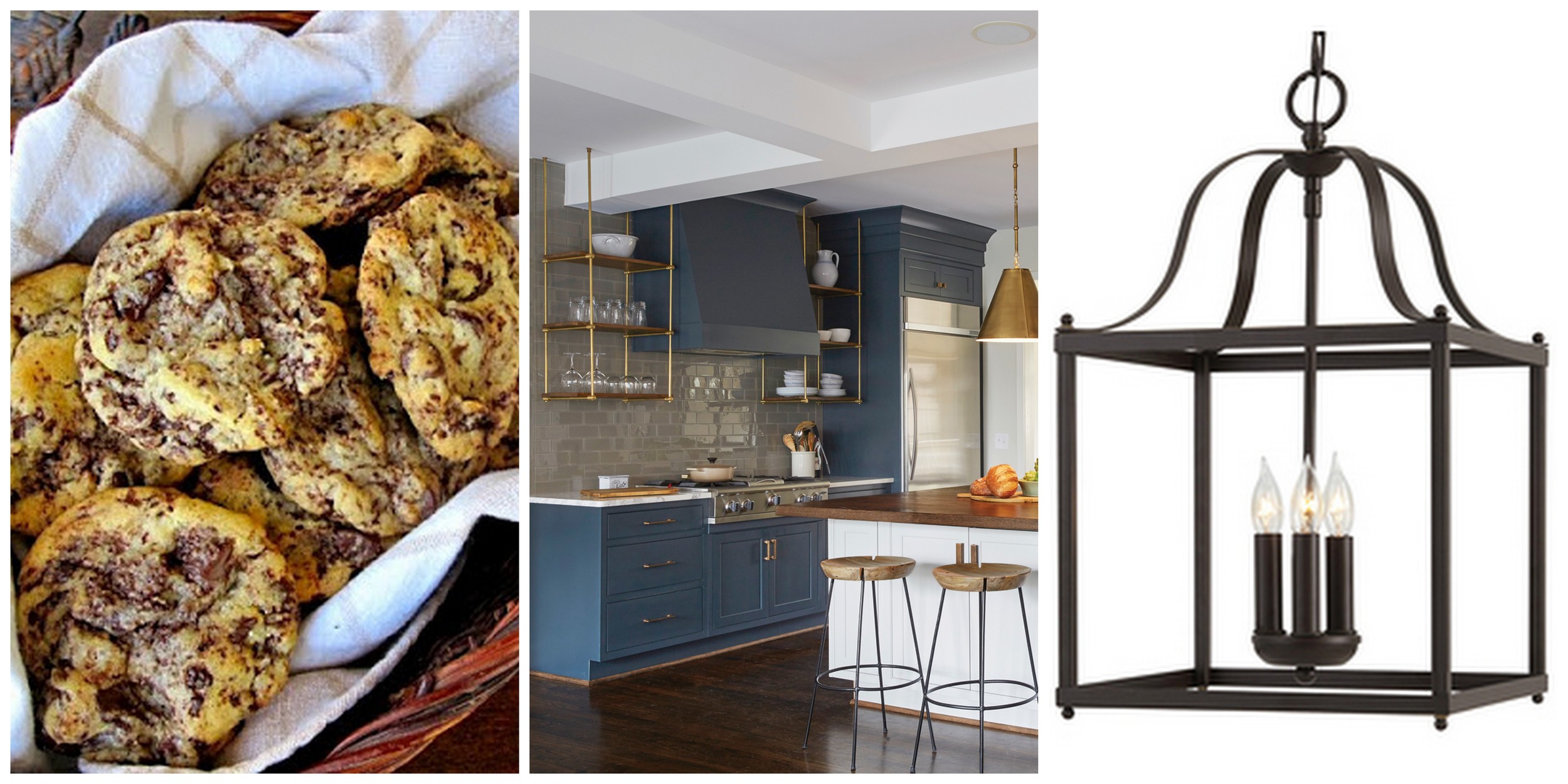
My friend Megan made these when she hosted me and my friends at her home last month.  They are a modified chocolate chip recipe (with sea salt!) that was featured in the NY Times.  I'm not allowed to bake when Jon's traveling because I have no self control with sweets at this point in my pregnancy, but I can tell you this is what I would make if I did.  The copious amount of chocolate and the finishing surprise of the sea salt make these the best cookies ever. 

// two //

I love a good before and after as much as anyone else, if not more.   This home's transformation was no exception.  Featured on Birmingham Home and Garden, this home, designed by Marianne Strong, was a real treat (sorry, I must still be thinking about the cookies). Seriously, all of the rooms were beautifully updated, but this kitchen was beyond.  Click on the links above to tour the whole home.

// three //

I decided to wander down the lighting aisle on a recent trip to Lowes and was pleasantly surprised by many of their affordable options--this Collinwick Allen + Roth pendant included. For $119 it is a great alternative to the more expensive look-a-likes out there.  If you're looking for a timeless piece in a traditional style, this a great buy.

Before and After of Ellen Pompeo's Trailer

I am a real sucker for "Before and Afters".  There's just something so inspiring about seeing a space brought back to life.  And the best part is that most of the time, the transformation doesn't require that much.  If you enlist the help of a designer, you can get your money back ten-fold in the result.  Designing is what we do for a living.  This is how we think.  You wouldn't go to the doctor for a hair color would you?  No, you go to the people with the right knowledge to get you the right results.  If you can relinquish some control and ask the professionals, you can end up with a room that you'll love!  Okay, enough about that.  Let's take a look at this fabulous makeover that got me all fired up!  

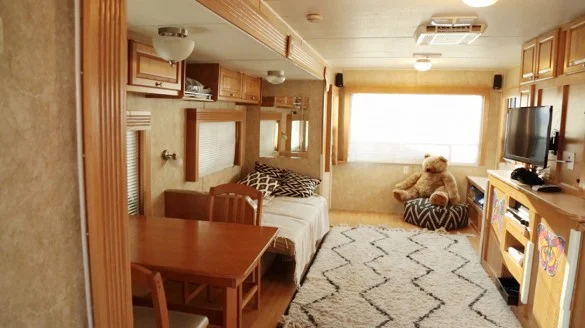
This trailer belongs to actress Ellen Pompeo from Grey's Anatomy.  Prior to breathing new life into the space, Ellen commented that the trailer was "depressing," not the adjective you want to  describe where you spend most of your time.  Your home (or in her case, home away from home) is supposed to be your place of rest, relaxation and happiness so don't settle for a place that you don't enjoy!  That's what Pompeo decided when she enlisted the help of celebrity interior designers Mat Sanders and Estee Stanley, from Domain Home.  The amazing results speak for themselves.

DINING ROOM BEFORE

DINING ROOM BEFORE

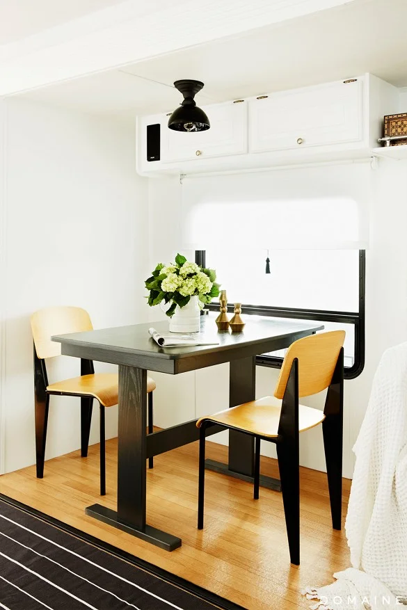
DINING ROOM AFTER

DINING ROOM AFTER

The whole trailer was painted in Ralph Lauren Paint Starch (#RL1066) by Home Depot.  The new, light and bright walls truly woke up the space.  This is yet another example of how a simple paint job can truly transform a room.

LIVING AREA BEFORE

LIVING AREA BEFORE

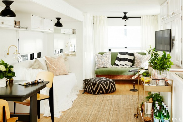
LIVING AREA AFTER

LIVING AREA AFTER

Lighting is also another way to make a great impact.  These black porcelain ones from School House Electric were the perfect update for the tired, old fixtures.

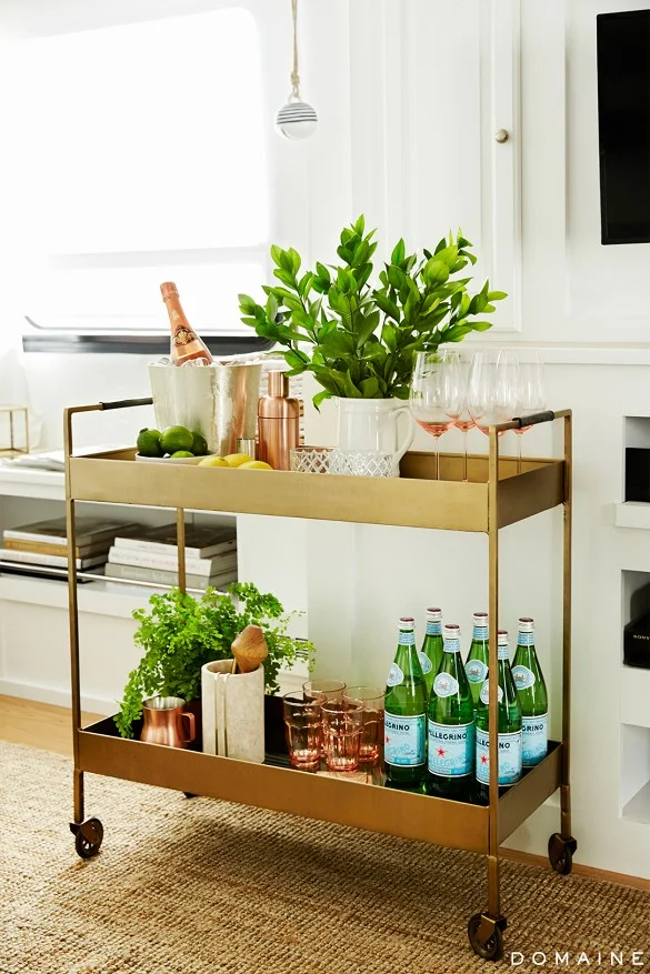
I also love the bar cart they brought in.  Here's another closeup shot of it.  If you follow our blog regularly, you know I love a beautifully styled bar cart (as discussed here) so this one did not disappoint.  

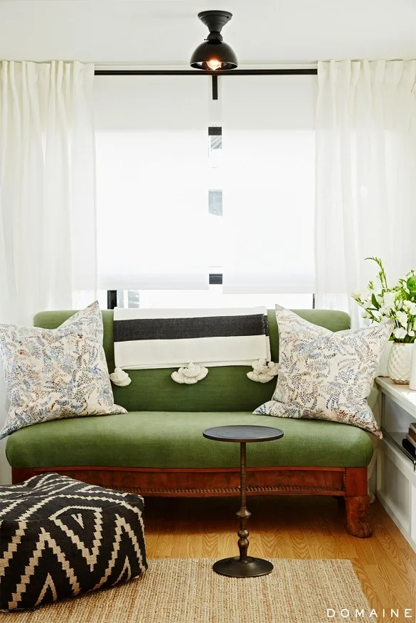
That green velvet settee really got me too.  It reminds me of the green velvet sofa I have in Auden's nursery. And that stripe tassel throw isn't so bad either.  

BEDROOM BEFORE

BEDROOM BEFORE

BEDROOM AFTER

BEDROOM AFTER

It's a beautiful new space isn't it?  For all of the details on Pompeo's trailer as well as where to get the items you see, go here.  Many of the items were very budget-friendly.  And thankfully, Domain Home is always so great to list their sources.

If you have a space that could use a makeover, let us know how we can help!  Our E-Design process is so easy...and Christmas is right around the corner.  A new room would make a great gift for yourself, your family or your spouse! 


Gray Master Bath - Before and After

As I mentioned to you guys a couple of weeks ago, I've been wanting to paint our master bathroom for well over a year.  Well friends, it's finally happened!  The hubby and I tag-teamed it yesterday and got it done.  I don't know why we waited so long!  

IMG_7000.JPG

Thankfully my in-laws watched the little one so we could focus and get it done with few distractions.  It took us less than four hours (not counting drying time between coats), and I am oh so happy with the outcome!  The color I chose was Mountain Smoke by Valspar.  Here's some proof on how much a can of paint can really transform a room!

Before:

If you look at the area between the mirror and the window, you can see a bit of the faux finish previously there.

If you look at the area between the mirror and the window, you can see a bit of the faux finish previously there.

After:

IMG_7007.JPG
Valspar Mountain Smoke 4

I absolutely love how the gray paint immediately elevated the look of the tiles and the space.  It looks so much more put together and sophisticated (and no more faux finish!).  The previous green did little to compliment the existing tile, but now the color pics up on the veins that run through it. And despite the walls being a darker color, everything looks more crisp and bright in there now.  I'll be honest.  This would not be my first choice in tile, but I wasn't going to spend lots of money on something new, so I had to work with it.  And I think the gray was definitely the best choice. 

IMG_7001.JPG

All day yesterday I kept telling Jon "I love it!  What a change!  I'm so glad we did this!"  It's been while since I've been that ecstatic about a paint job.  And he likes the final outcome too (which is good since he did a lot of the painting!).  Overall, I couldn't be happier with our $65 project (including the paint rod extender).  My master bath finally feels just as it should!

I'll leave you with one more before and after shot for comparison:

Gray bathroom

Are there any projects that you've been procrastinating on?