Client Glam-Pham

It has been a while since we shared any of our projects. Thought I would share today some work we recently completed for our client Glam-Pham.

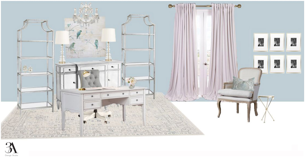
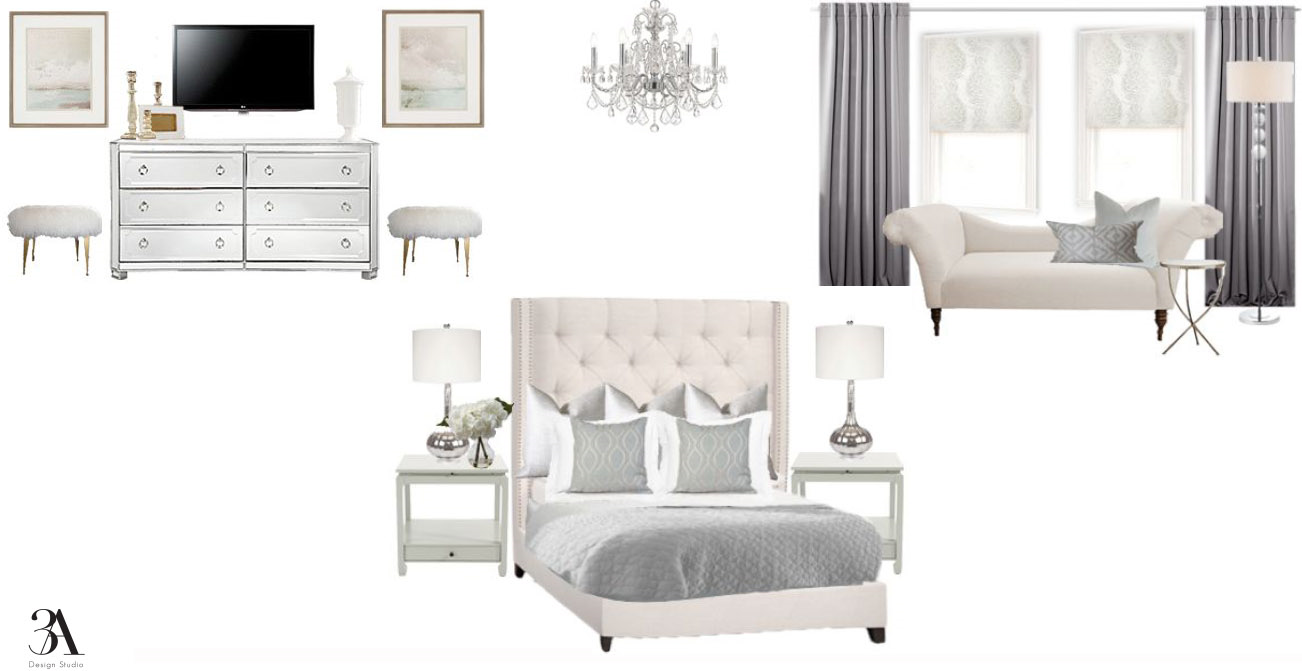
Client Glam-Pham was in the process of building a new home in Houston, Texas and reached out to us. She needed help with putting together a design for her master bedroom and office, as well as paint color suggestions for the entire house.  She wanted a soft glam aesthetic for both rooms. Our color palette consisted of soft blues, grays, and ivories. We mixed in a few metallics, along with luxurious textiles and a couple chandies of course! Here is what we came up with.

Master Bedroom

soft glam bedroom design

Master Bedroom and Bath Wall Color Suggestions


Office

Office Paint Color Suggestions

We can't wait to see progress pics and promise to share. In the mean time, we are really excited to be working on a design for her living room. It is going to be fabulous! A navy sofa may make its way into the room. Here is the color pallete we will be working with.

navy and blush color pallete

We will keep you posted. 

Have a great weekend!

jessicasignature.jpg

If you are building a home, let us help you. We can help pick out finishes, as well as put together a design that you can implement once you move in. Drop us a line here to start the conversation.

Nguyen Office Part I

The hubby and I have talked for sometime about swapping our daughter’s room and the office. Her room is a finished out attic space. Even though it is decent in size, the ceiling height is low and you literally have to hunch down to get into her closet.

This past week he took some time off and offered to work on swapping the rooms. My husband being a man of action doesn’t spend a lot of time on planning, so I did not have much time to think about what I wanted to do to in the space. 

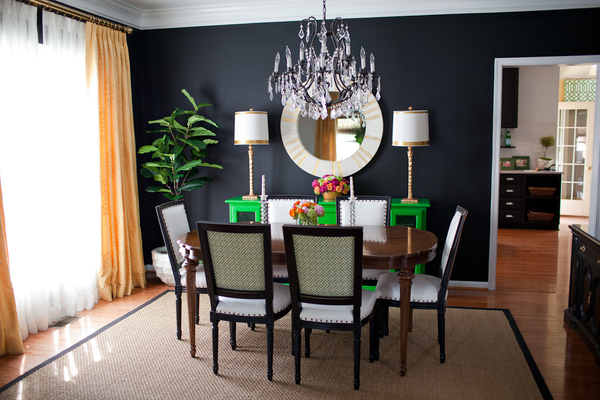
The room needed a new coat of paint and new baseboards. With just one small window, the room doesn’t have a lot of natural light. Our office furniture is white, so I wanted a bold color in the space for contrast. At first I was thinking of painting an accent wall emerald green but decided on black.

After going through my swatches, I narrowed it down to Black Satin, Baby Seal Black, and Nightfall (all Benjamin Moore colors).

black wall color.jpg

BM Black Satin

Kiki's List

Kiki's List

BM Baby Seal Black

Chezerbey

Chezerbey

BM Nightfall

Apartment Therapy

Apartment Therapy

In the end, Benjamin Moore Nightfall was the winner. It is a dark graphite with blue undertones and was the lightest out of the three. I went with a an eggshell finish in hopes that it would reflect some light but it ended up being shinier than I hoped. If I could do it again I would go with matte.

This is a hard room to photograph. The dark wall looks darker in person.

This is a hard room to photograph. The dark wall looks darker in person.

I am not going to lie. I was bit worried the black would absorb too much light and make the room look like a crack den but it actually makes the room feel cozy and allows the other colors in the room to pop. It also made the room appear wider as black visually recesses. The room is still a work in progress. I want to bring some natural elements, maybe in the way of a throw rug. Above the desk we plan to install a white floating shelf and black cork board the length of the desk. I also plan to bring in some more lighting among other accessories.

Once the room is finished I'll take better pics to share. Hope you guys have a great week!


Feminine Office E-design

The e-design I am sharing with you today is a special one because it is for one of my besties!

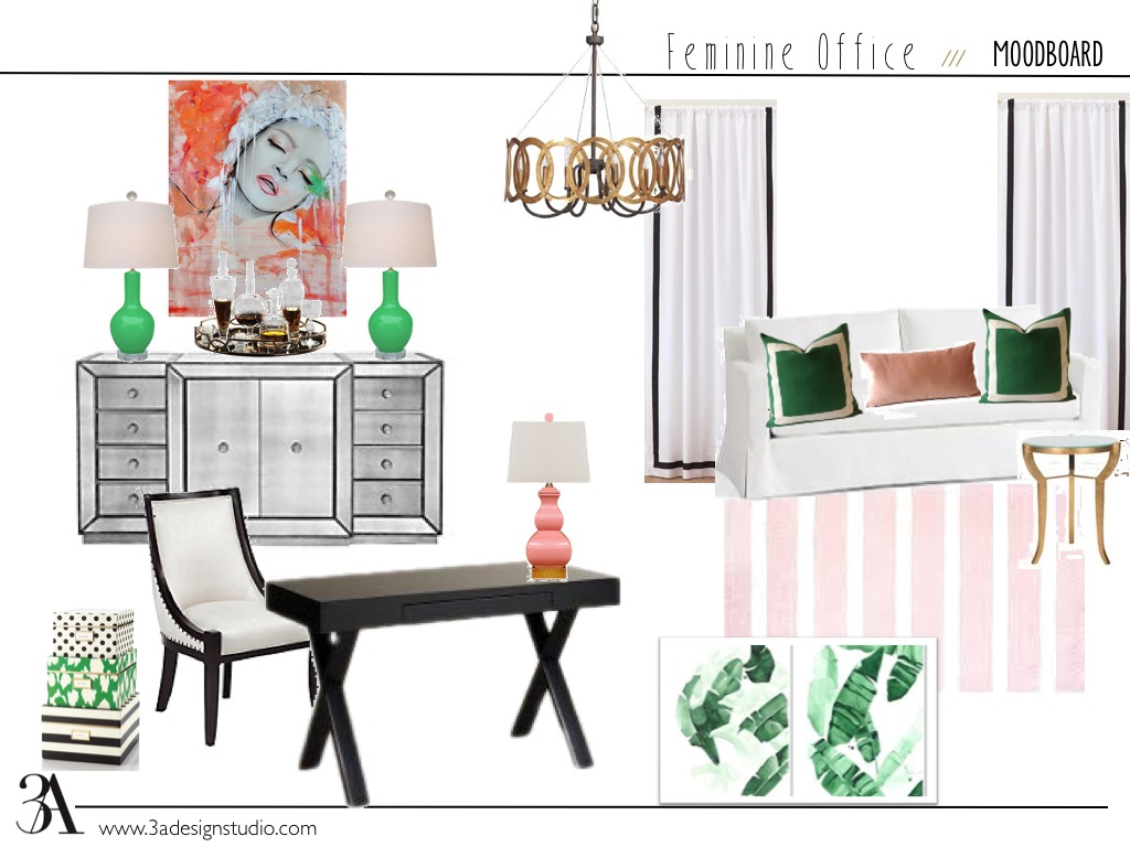
Meet Carmen of Label Me Artsy, a fashionista living in Hawaii.  Recently, she and her husband purchased a new home and asked if I could help design an office for her. She requested an inspiring space that is both feminine and vibrant. 

Screen shot 2015-06-10 at 12.56.09 PM.png

Immediately, I thought of this print that I love by Leigh Viner as inspiration for the room. It is very feminine and has a gorgeous color palette.

Surveillance by Leigh Viner

Surveillance by Leigh Viner

The overall look for the office was a bit tropical glam with emerald greens and blush pinks. Have a look.

Slide1.jpg

It was a lot of fun working on this project. Even with the distance, Carmen in Hawaii and me in Florida, through our e-design service we were able to design a beautiful office that Carmen loves.

If you need help designing a room or just need help selecting a few pieces to finish off the look of a room, drop us a line. We work with all different project sizes and are currently working on an Ask My Designer service for those small design dilemmas.

Happy hump-day!


Let's Take a Tour-Grow Marketing Offices in SF

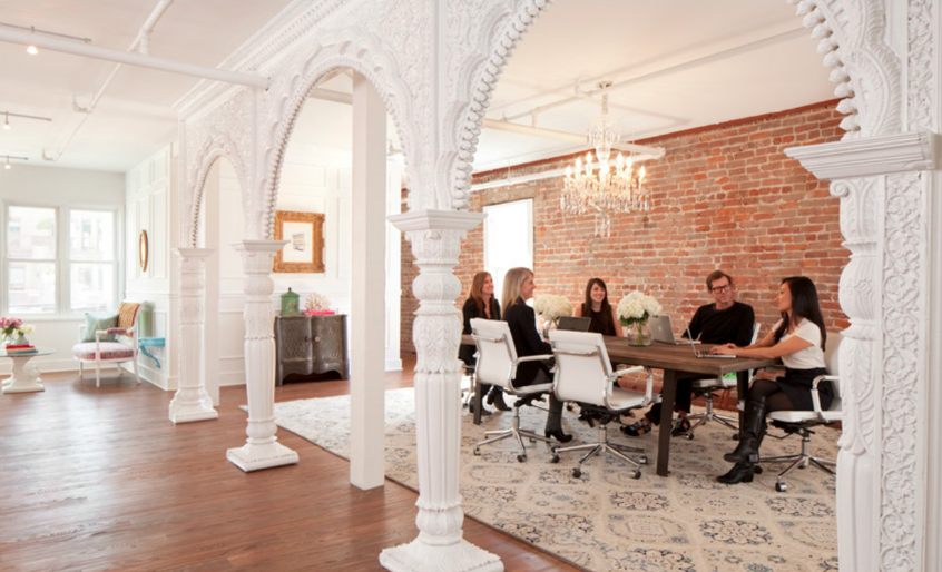
The latest edition of Rue Magazine detailed the inside look of the offices at Grow Marketing in San Francisco.  As soon as I turned the virtual page, I thought to myself, "I want to work here!"

Cassie Hughes and Gabrey Means used to be rivals, each working for fashion giants Gap Inc. and Levi's.  After meeting and chatting over a bottle of wine, they decided they should start a new business venture, together.  What formed was Grow Marketing, now residing on Pacific Avenue in historic Jackson Square in San Francisco.

The pair set out to create an agency of their own and "foster an environment that felt supportive, yet aspirational."  After looking at the interiors of their offices, I think they succeeded in doing just that!  Let's take a tour. 

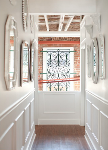
Exposed brick, crisp white walls and beautiful moldings are the backdrop for this stunning office.  Gabrey and Cassie worked with designer Josef Medellin to transform the building, originally built in 1907.

grow marketing office1 via rue mag

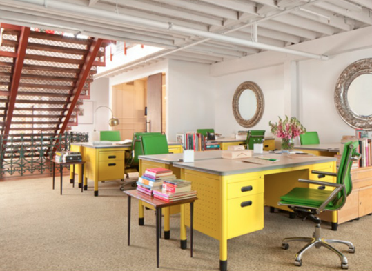
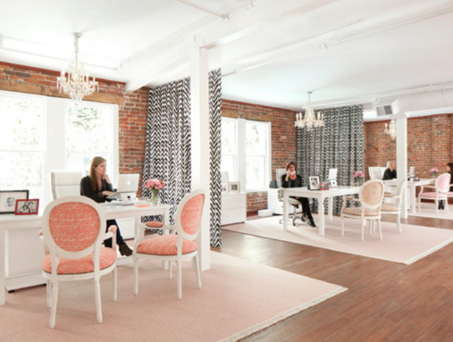
Of course, the bright yellow furniture can't be forgotten either.

grow marketing offices2 via rue mag

I'd gladly take a meeting in this adorable conference room.

grow marketing offices3 via rue mag
grow marketing offices7 via rue mag

Relaxed brainstorming areas are filled with leopard print upholstery and a vintage suitcase functioning as a coffee table. My mind is already traveling to great places just looking at it.

grow marketing offices4 via rue mag

More white and historic moldings...and flowers.  I can't forget the flowers.

grow marketing offices5 via rue mag

Seriously, isn't this place so chic? Hard to believe it used to be a watering hole and brothel at one time, huh?

grow marketing offices6 via rue mag

I love the open floor plan and the juxtaposition of the industrial stairs with the glamorous chandeliers and furnishings.

grow marketing offices8 via rue mag

More cheerful office furniture...and those oversized mirrors?  Amazing.

grow marketing offices9 via rue mag

A workplace dreams are made of...

grow marketing offices10 via rue mag

I sincerely apologize if you're reading this at your generic cubicle, but I can assure you you're not the only one longing for an office like this.  Job well done, Means, Hughes and Medellin. Job well done.

grow marketing offices11 via rue mag

TGIF friends!

An office / guest room design

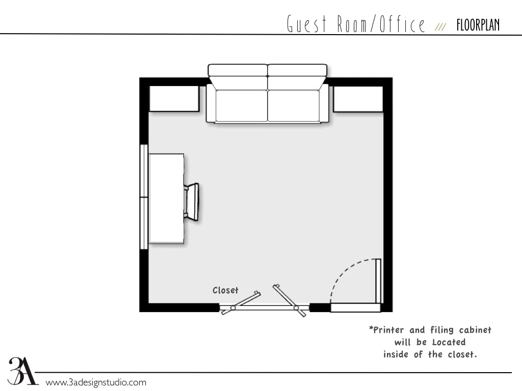
Our latest completed e-design, came from a client who like many, had a spare bedroom that needed to function as both an office and a guest room for the occasional visitor.

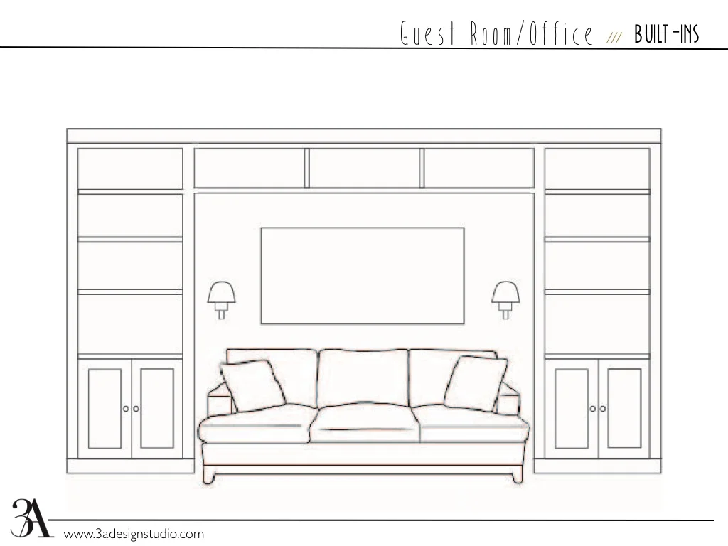
A couple requirements she had were A) when the room was being used by a guest, she wanted the ability to tuck away any office related items so that it felt more like a guest room than an office and B) she needed storage for her many books.

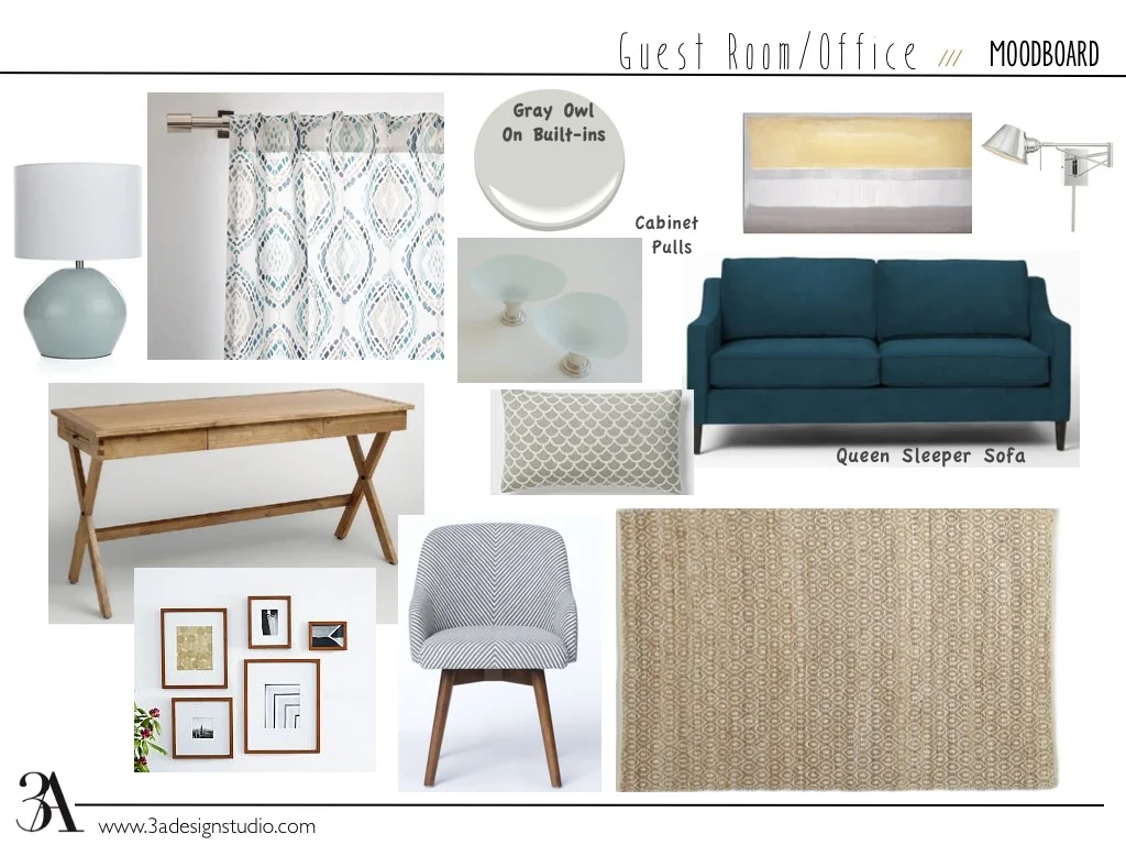
office/guest room

Based on the space, we decided the best option was to have a pull out sofa in between built-in bookshelves. The sofa could act as both a comfortable place to read and a bed when needed.  We selected a streamlined desk with a storage drawer and suggested running electricity into the closet so that she could keep her wireless printer, filing cabinet, and other office related items behind the louvered doors. 

For the color palette, we wanted to keep the room light so that it would be conducive to studying and also flow with the rest of the house. We kept the walls white, chose a pale gray for the built-ins (BM Owl Gray) and layered the room with neutrals and blues. The end result was a contemporary, beachy look. I absolutely love the contrast of the peacock blue sofa against the natural wood finishes!

office/guestroom

Well, I hope you got some ideas. If you have a design challenge that you need help with, drop us a line. Whether it is finding the perfect coffee table or designing an entire room, we can help.

Dream Office

We recently met with a client who is looking to upgrade and move several rooms in her home.  One of those rooms moving to another area in her house is her office.  The possibilities started swarming in my head.  I love designing work spaces.  Love it.  

It got my thinking about my own home office as well.  For designers our "offices" are where our creativity takes shape so it's important for the space itself to be worthy of housing such a job.  Sadly, my current office does not do that.  Once things call down a bit around here, I want to really tackle our home office...a space that's received the least amount of attention since we moved into our home two years ago.  Between new work projects and squeezing in time to plan my daughter's first birthday (coming up next month) my personal design time has been lacking.  However, I've decided that decorating our office will be my Christmas present (I need to fill my husband in on this too).  :)

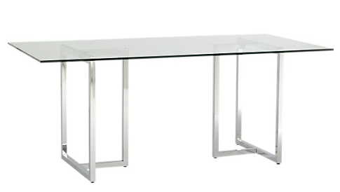
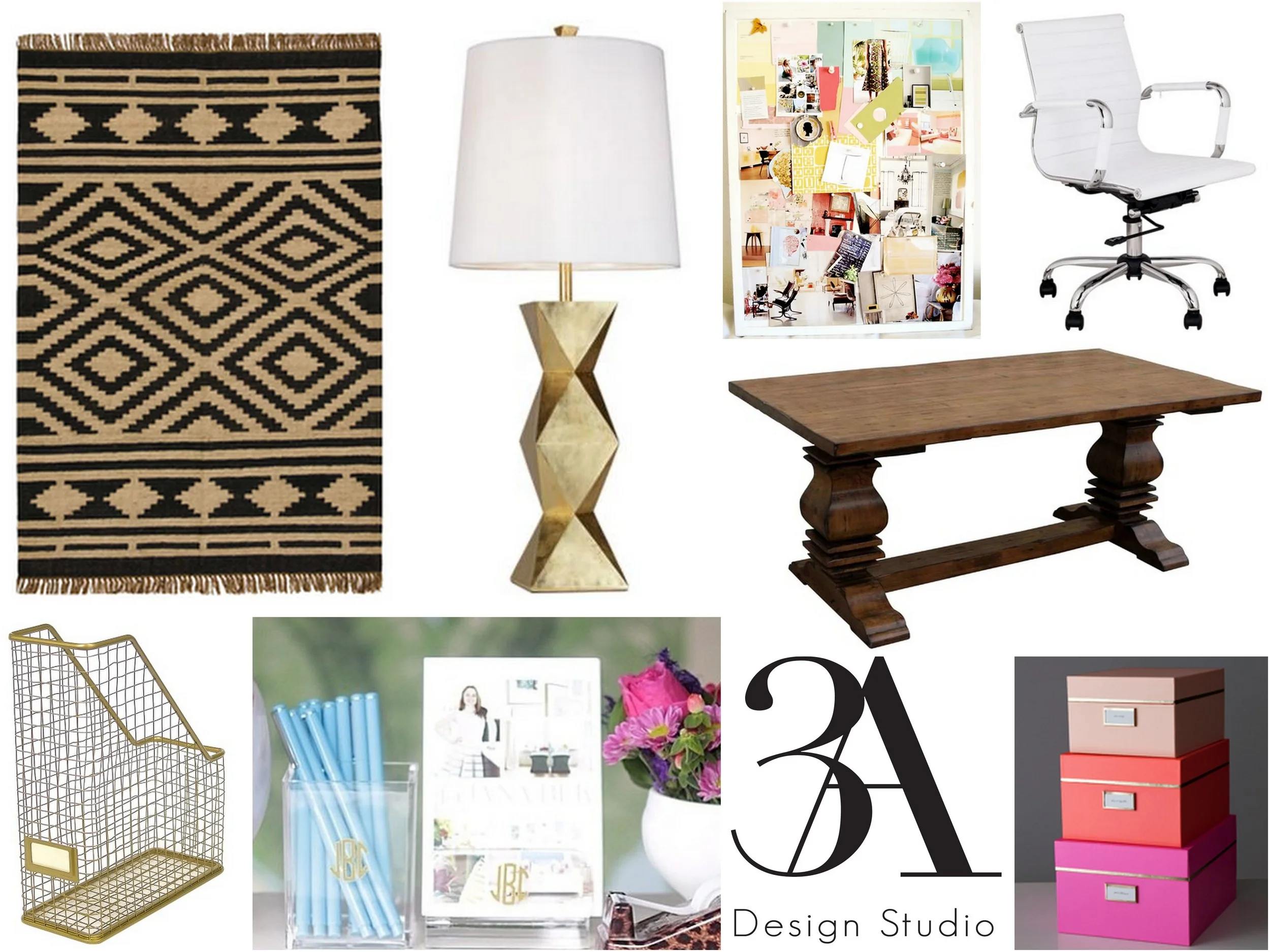
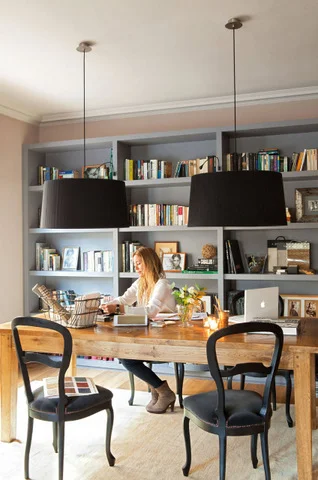
We currently have a desk, rug, bookcase, sofa and ottoman already in the space.  The sofa and ottoman are going to go and the current desk is where my husband's computer resides.  This means my work space will be completely new and completely my own.  With the sofa and ottoman gone there will be plenty of space on the other side of the room for my desk.  I really like the idea of using a dining table for my work area.  I've seen this CB2 desk used in an office space before and loved it.  

cb2 silverado

Dining room tables can often be less expensive and more versatile as well so naturally I took to Craigslist to see if there were any good deals in town.  I found this one for only $60!

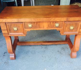
I absolutely love the base and think it would look great refinished.  I also thought I'd glance at the desks for sale and found this adorable one for $125.  Look at that woodgrain.  Beautiful.  If I needed a desk for a small space, this would be the winner.  I can see if paired with some more contemporary pieces (maybe a desk chair and modern lamp)...

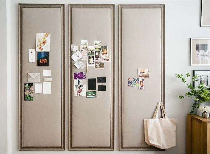
Of course I also want a large memo board.  I talked about a few favorite ideas here.  I definitely want it to be the focus of the room.  If I had another wall to spare, I'd love something like this.

As seen in the office of Esla Events featured in Rue.

As seen in the office of Esla Events featured in Rue.

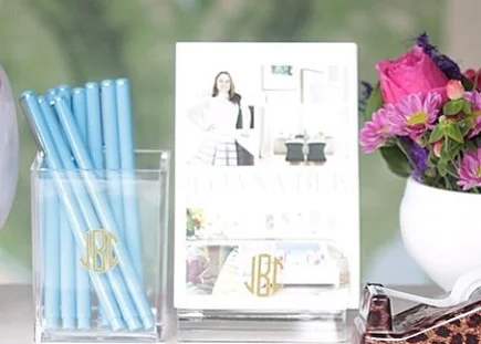
Organization is key as well.  I think this acrylic pencil cup and business card holder from Design Darling would look amazing on my new desk.  

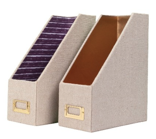
I really like this wire magazine holder from Target (only $9).  Every office needs a little gold.

gold threshold magazine storage

If you want something with more coverage, these Nate Berkus ones are a great option.
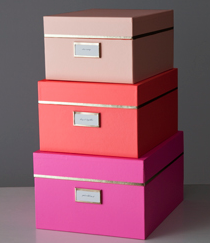
These Kate Space nesting boxes would be a great for storage too.  I love the vibrant colors and gold trim detail on the lids.  
kate spade nesting boxes

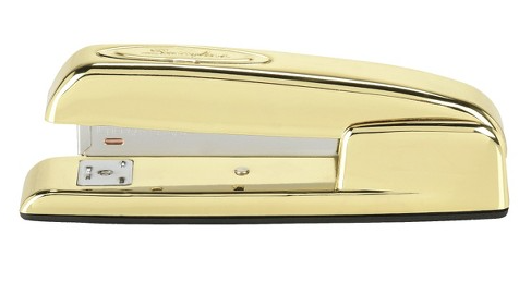
This gold stapler by Swingline would make a great desk accessory worthy of residing on the desk and not tucked away in a drawer. 

gold stapler

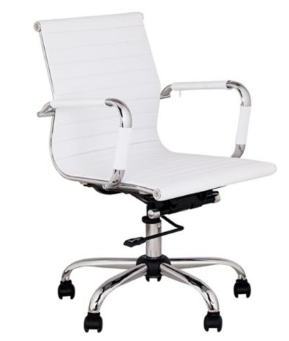
I can't decide if I want a stationary chair or one that swivels.  If I go with the swivel option, this one has good modern lines and great reviews.  I love a good mix of old (desk) and new (chair).

white leather desk chair

I've already got a rug in the room that will be staying so all that's left is some lighting.  I really like the one from West Elm that I mentioned last Friday.  Although this faceted one could be really great too.  

ripley gold sculptural lamp

Normally, I stick to neutrals in my home and add interest through pattern and texture, but in a creative space, I think color would be so inspiring.  I can't wait to have it all finished!