Resolve to Love Where You Live

According to U.S. News, approximately 80% of New Year's resolutions fail by the second week of February.  But what if that didn't have to be the case?  What if you made a resolution that would not only better your life but also the lives of your family and friends and all who enter your home? 

80% of resolutions fail by the second week of February.

Okay, maybe that sounds a little deep, but it's something we firmly believe.  What if you made a resolution to finally tackle that room you've been putting off?  Or that wall that you've stared at for over a year and still can't decide what color to paint it?  Having a beautiful home isn't just about the aesthetics but more the quality of life it brings.  As designer Laura Nelson put it,

I realized what an emotional effect it has on people to change their surroundings, to give them a space that speaks to them and improves their day-to-day life.

So what's holding you back? 

Money.  That's what we often hear.  But when you think about it, investing in your home only requires a small investment but yields big results. 

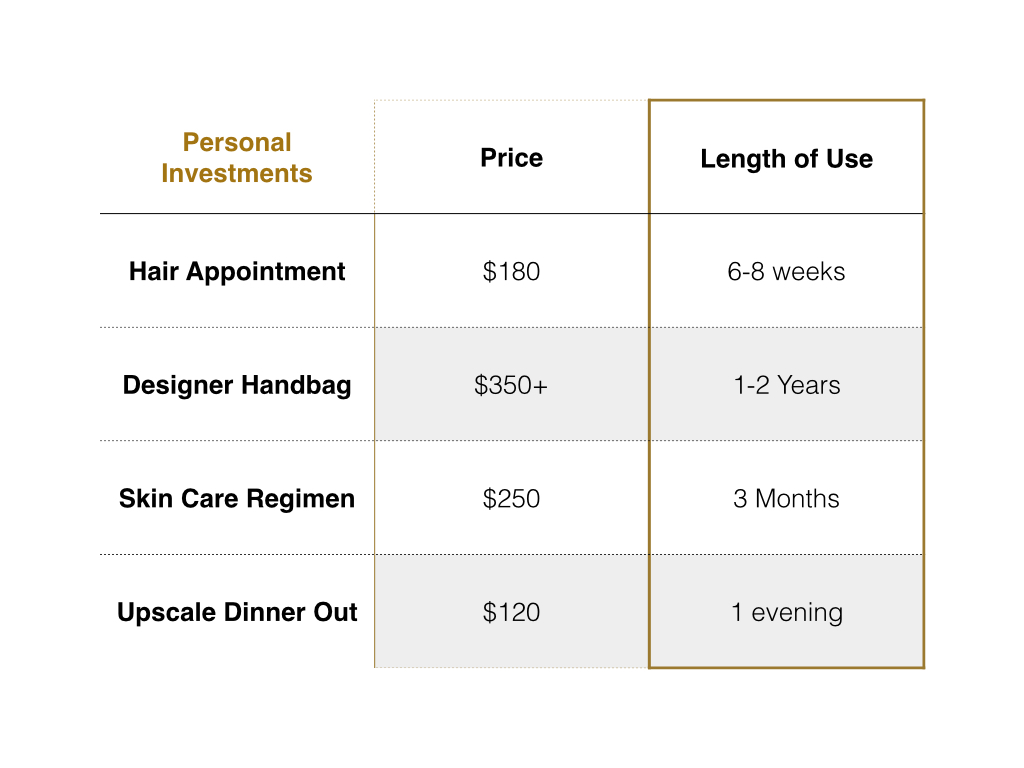
For those that just need a little guidance or a few finishing touches, our A La Carte Package is perfect.  And it starts at $125--that's about what you'd spend on a meal out for two.  Our full room E-Designs start at $750.  Let's think about what else we spend hundreds of dollars on without blinking an eye and the length of that investment.  

When you look at the money issue that way, it seems like a no-brainer, right? Our E-design services can be enjoyed for years to come. Your home is where you spend the majority of your time aside from your workplace.  Why not enjoy it?  Why not sit down on your sofa and look around and like what you see?  Why not leave your master bedroom door open because you're not afraid of a guest looking in?

Whether it's starting from scratch--from paint colors to hard finishes to lighting, we've helped clients starting out with only blue prints and walked them through the entire design process.  Or maybe you just need an extra pair of eyes (in our case, two) to help bring your Pinterest board vision to life.  We are here to listen to your needs, wants and ideas and put our years of experience to work to make your room, your home truly yours. 

So let's stop being the 80% and start making resolutions that will actually change our lives for the better.  Resolve to love where you live.  We'd love to help you get started!


Client Project: Farmhouse Before and Afters

We last showed this client farmhouse project here, but now we're back with a few before and afters!  

Special thanks to our awesome client for sending us these updated photos!  

One of the sad (for us) things about doing E-design is that often our projects are too far away for us to "check-in" on or photograph after.  So when clients send us some after shots, it is a real treat, and we thought you guys might want to see too. 

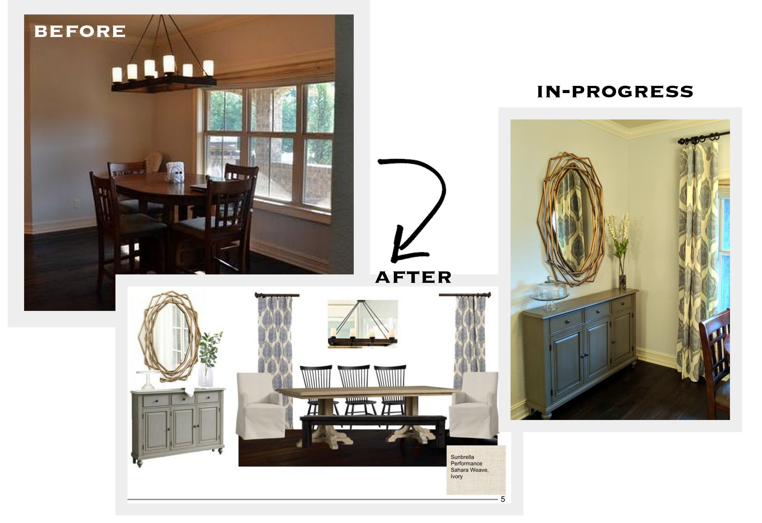
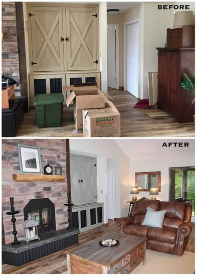
Here's a before/after comparison of the corner of the living room and front entry.  We suggested new paint colors for the walls and cabinets and outfitted the space with a new layout and pieces for the entry. 

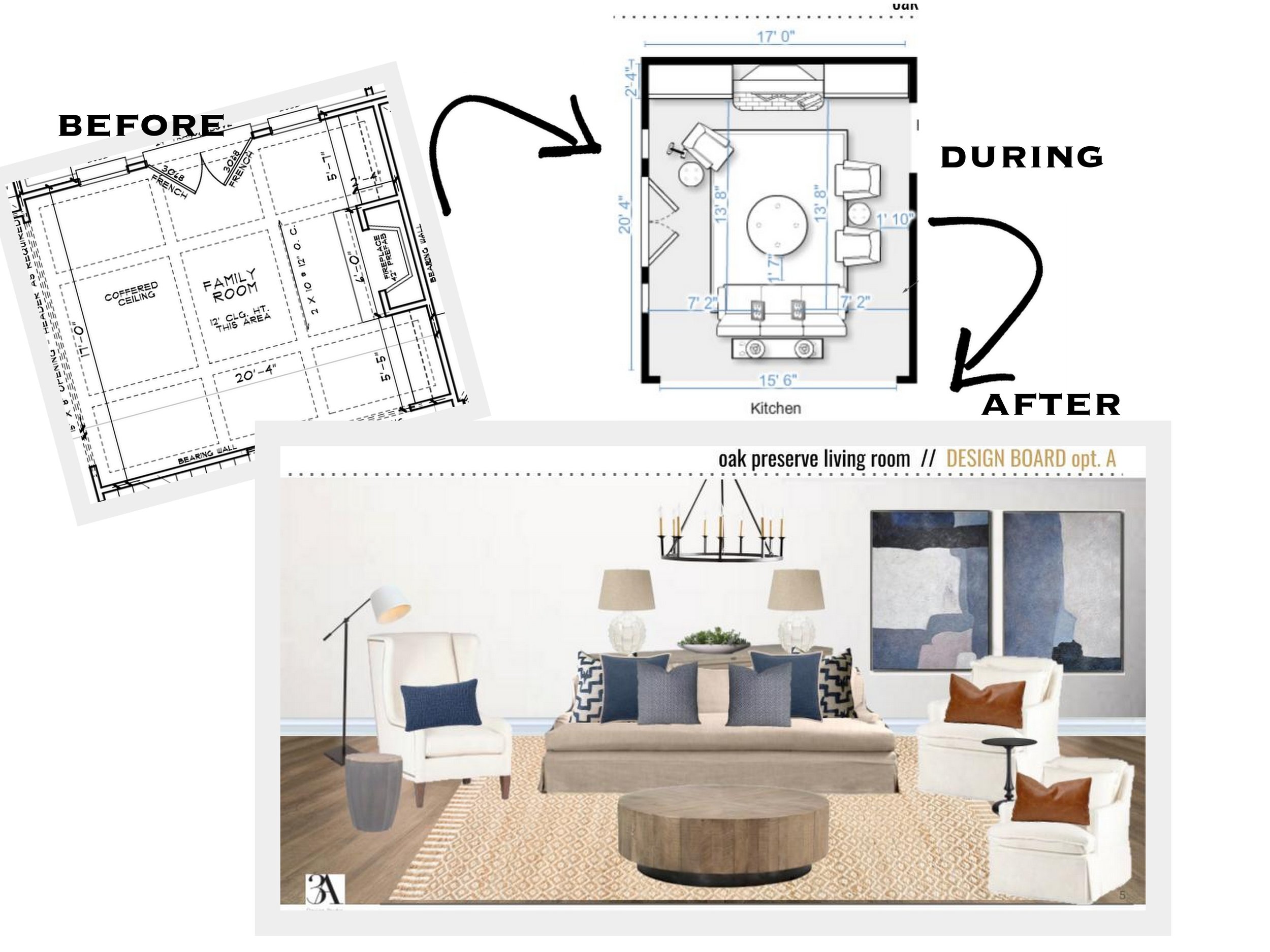
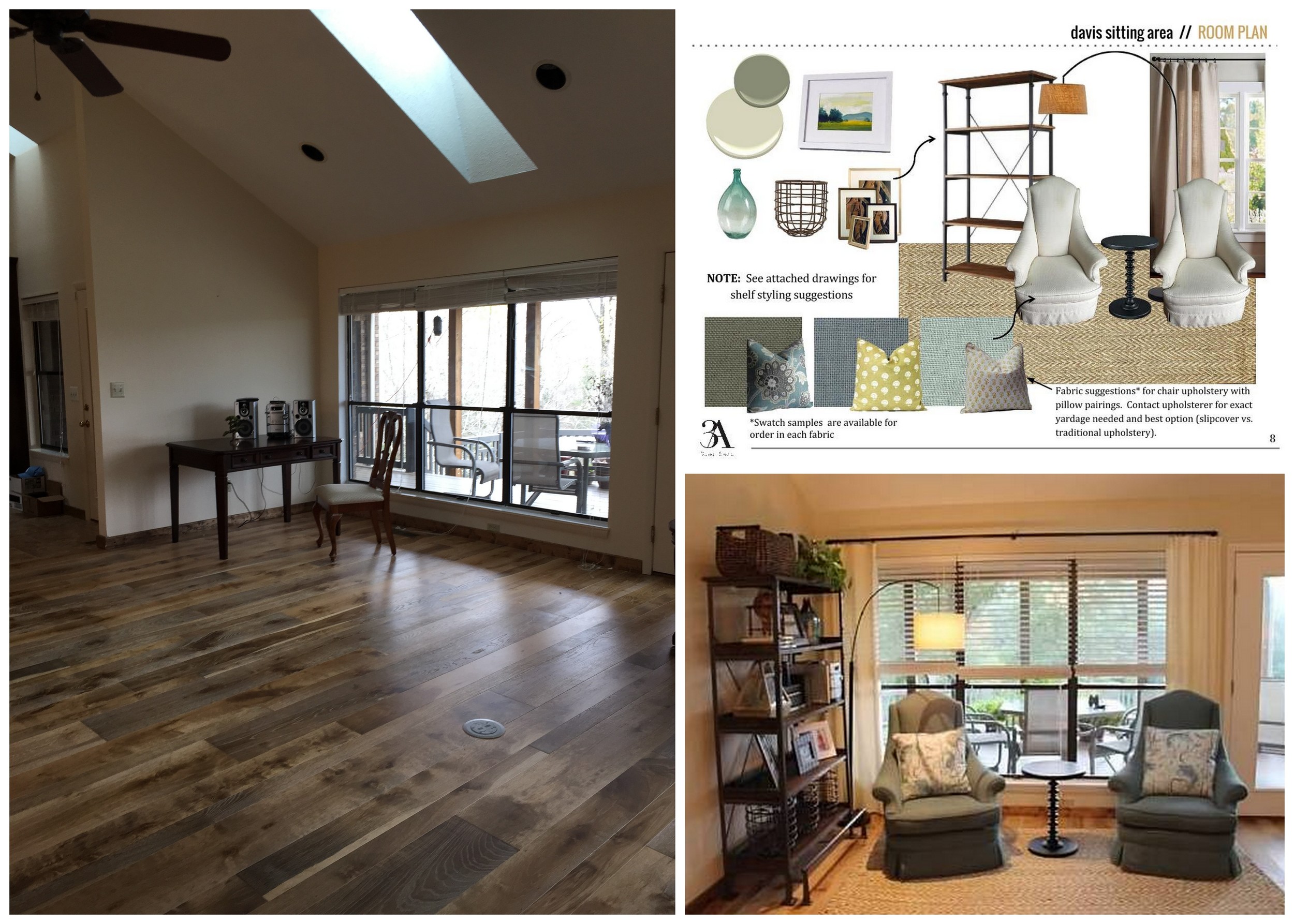
This before/after is of the previously "yet to be determined" corner of the great room when we first saw it, our suggested plans and the final result.  Pretty amazing, right?

And here's one more comparison (because we can't get enough) showing the elevation concept we sent to the clients and the finished result.  

Our clients did an amazing job implementing everything, and we loved seeing our designs come to life!

If we can help you transform your space, contact us here or check out our E-Design page for more information. 

Nguyen Office Part I

The hubby and I have talked for sometime about swapping our daughter’s room and the office. Her room is a finished out attic space. Even though it is decent in size, the ceiling height is low and you literally have to hunch down to get into her closet.

This past week he took some time off and offered to work on swapping the rooms. My husband being a man of action doesn’t spend a lot of time on planning, so I did not have much time to think about what I wanted to do to in the space. 

The room needed a new coat of paint and new baseboards. With just one small window, the room doesn’t have a lot of natural light. Our office furniture is white, so I wanted a bold color in the space for contrast. At first I was thinking of painting an accent wall emerald green but decided on black.

After going through my swatches, I narrowed it down to Black Satin, Baby Seal Black, and Nightfall (all Benjamin Moore colors).

black wall color.jpg

BM Black Satin

Kiki's List

Kiki's List

BM Baby Seal Black

Chezerbey

Chezerbey

BM Nightfall

Apartment Therapy

Apartment Therapy

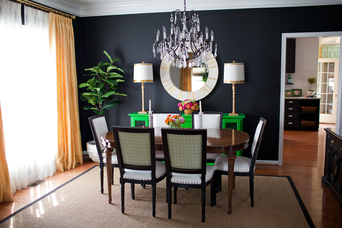
In the end, Benjamin Moore Nightfall was the winner. It is a dark graphite with blue undertones and was the lightest out of the three. I went with a an eggshell finish in hopes that it would reflect some light but it ended up being shinier than I hoped. If I could do it again I would go with matte.

This is a hard room to photograph. The dark wall looks darker in person.

This is a hard room to photograph. The dark wall looks darker in person.

I am not going to lie. I was bit worried the black would absorb too much light and make the room look like a crack den but it actually makes the room feel cozy and allows the other colors in the room to pop. It also made the room appear wider as black visually recesses. The room is still a work in progress. I want to bring some natural elements, maybe in the way of a throw rug. Above the desk we plan to install a white floating shelf and black cork board the length of the desk. I also plan to bring in some more lighting among other accessories.

Once the room is finished I'll take better pics to share. Hope you guys have a great week!


Before/After: A Lesson in Paint and Scale by Chango & Co.

Susana Simonpietri, creative director for New York interior design firm Chango & Co., knows how to transform a space.  One thing I love about her company's website is that instead of just showing a portfolio of their work, they also show a great deal of before and after pictures of their projects.  It's here that you can get a true grasp of what a good eye, great scale and great color can do for a space.

Here is one project in particular that is a favorite of mine, a brownstone in Brooklyn's Park Slope neighborhood. 

New paint, furniture and minimal styling update this entry.

New paint, furniture and minimal styling update this entry.

It's hard to believe that this is the same size room isn't it?  Those huge mirrors are amazing and define the grandeur of the rooms ceiling height.

It's hard to believe that this is the same size room isn't it?  Those huge mirrors are amazing and define the grandeur of the rooms ceiling height.

Anyone else swooning over that light fixture?

Anyone else swooning over that light fixture?

This dining room was updated with some paint, a new light fixture and amazing built-in, another signature element in Chango's designs. 

This dining room was updated with some paint, a new light fixture and amazing built-in, another signature element in Chango's designs. 

New wallpaper and mirror and your powder room is transformed.

New wallpaper and mirror and your powder room is transformed.

This master got a makeover with some new trim, paint and large-scaled furniture to fit the room.

This master got a makeover with some new trim, paint and large-scaled furniture to fit the room.

I spy another great addition of a built-in.  What family doesn't need more storage?

I spy another great addition of a built-in.  What family doesn't need more storage?

Here is the other side of the family room, showcasing some more built-ins that look like they should have been there all along.

Here is the other side of the family room, showcasing some more built-ins that look like they should have been there all along.

Last but not least is this adorable nursery.  Look at how different the windows look when they have the right window treatments!

Last but not least is this adorable nursery.  Look at how different the windows look when they have the right window treatments!

For more before and after photos of their work go here.  And if we can help transform your space from a "blah" before to an amazing after, drop us a line today!

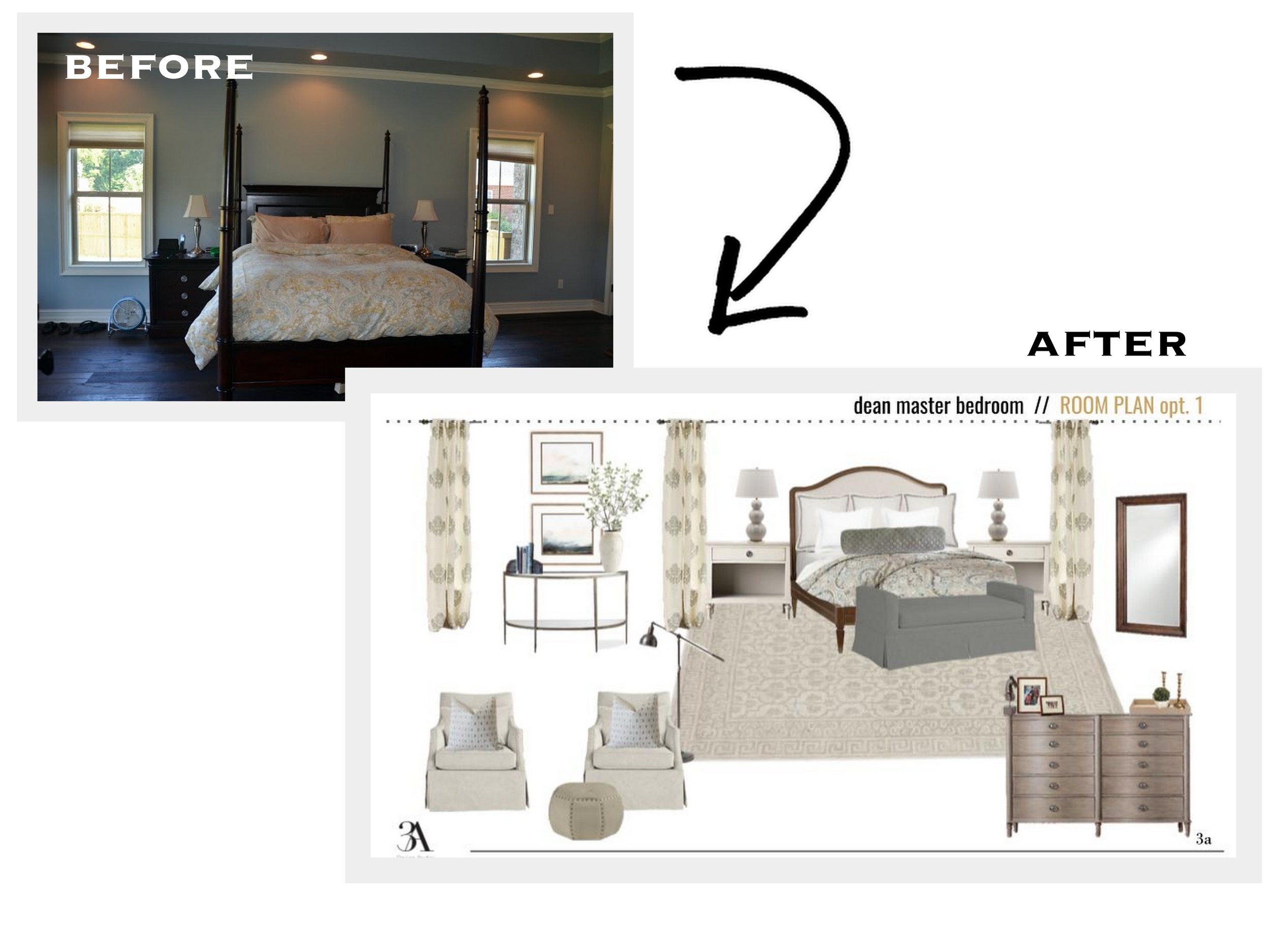
Client Project- Soothing Master Retreat

One of our recent clients made a move from Charleston, SC back to their home state of Alabama.  Their new home is absolutely stunning, but they felt that their old furnishings weren’t doing the new space justice.  They enlisted our help in their master bedroom where they wanted to create a comfortable retreat but were overwhelmed with never-ending choices.  We were so excited to help them make this space their own!  

Before: The door pictured leads out onto a covered second-story porch.  Dreamy right?

Before: The door pictured leads out onto a covered second-story porch.  Dreamy right?

The double doors lead to their gorgeous master bath (with a cooper tub!) and the door to the right of that is the one entering the bedroom. 

The double doors lead to their gorgeous master bath (with a cooper tub!) and the door to the right of that is the one entering the bedroom

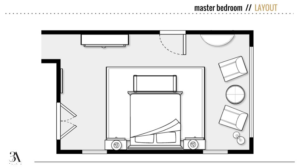
Keeping the space neutral with some coastal colors (the clients' favorite) worked in, we added some layers with textures and patterns and chose new furniture to better accommodate the space, adding a seating area in front of the big window wall. 

master bedroom layout

Here's a before shot of the focal wall in the room:

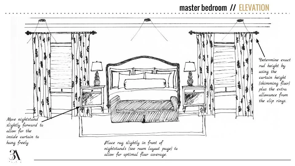
And here's the "After" elevation of the same wall.  We added long, patterned curtains to accentuate the clients' new woven shades (not pictured above) and tall ceilings and used new layers of bedding, an upholstered bench and neutral rug to soften up all of the wood tones in the room.

bedroom hand drawn elevation 3a design studio

Here is the final room plan.  We kept an overall muted palette for a soothing backdrop and added in some blues with artwork, fabrics and accessories.  

soothing neutral master bedroom mood board 3a design studio

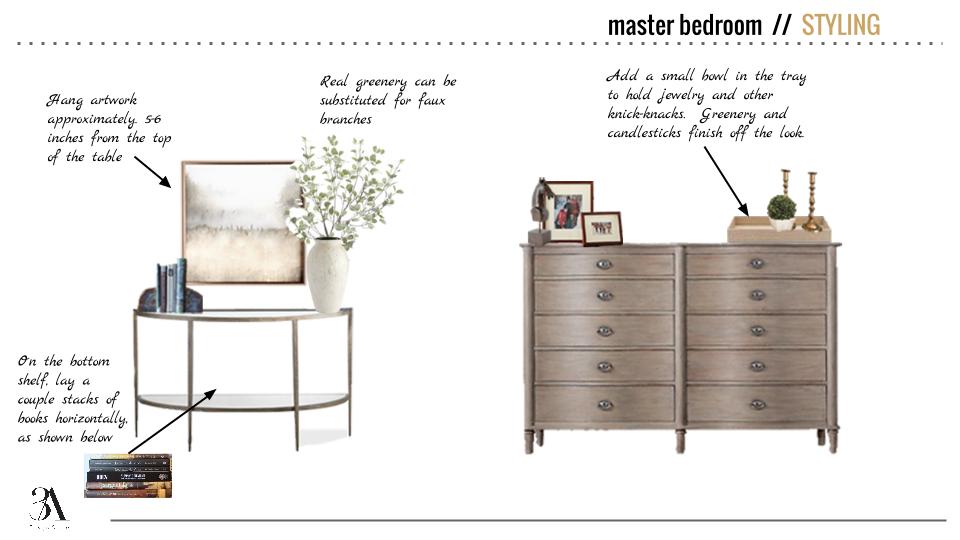
Also included were a few styling options for the corner console and dresser.

dresser and console styling 3a design studio

We were thrilled with the final product and were so excited to receive this response from the client:  

I LOVE it!  Beautiful, beautiful work.  And so professionally presented.  Best of all, I feel like I can take this plan and run with it - I can do it now that I know what I'm looking for!  Thank you both so much for an outstanding job.  I'm thrilled.

That's another one in the books!  If we can help you achieve the room you've always wanted, drop us a line here