Fixer Upper Favorites- Big Country House

Like the majority of America, we are on the Fixer Upper train and love to tune in to Joanna's designs and Chip's antics.  I love to play that "if it were us, which house would you pick?" game with Jon.  Thankfully, we're usually on the same page!

This week's couple was on the same page as well and were captivated by the Big Country House (or its potential) and the beautiful land and pond that came with it.  I don't blame them.  The end result was a completely different house with some great design features... and even a few similarities to some of our previous designs. 

Let's review my favorites (all images via https://magnoliamarket.com):
 

You can't beat a large porch and MULTIPLE French doors, right?

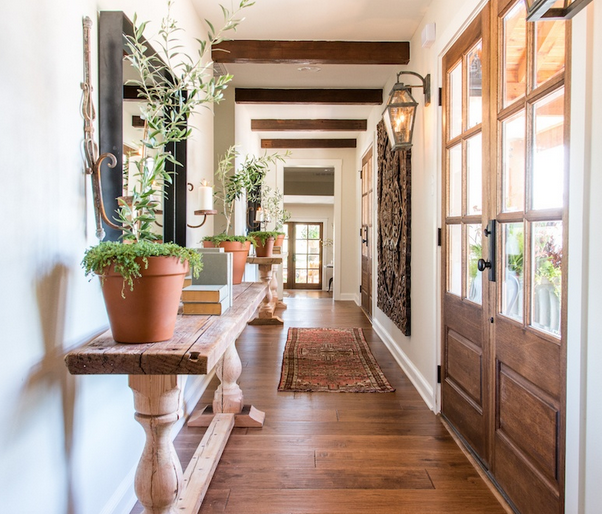
This long hallway AND THOSE BEAMS had me hitting pause and rewind a couple of times.  Gorgeous.

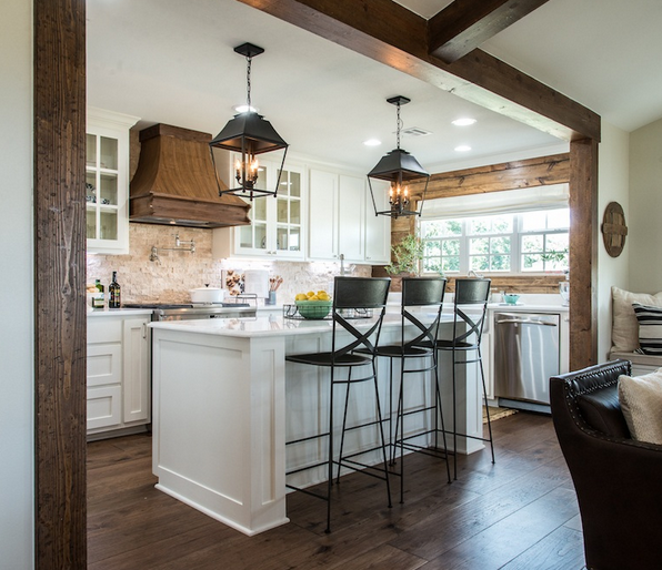
I also fell in love with those bar stools--classic with a modern touch.

And those pendants reminded me of a client design we did last spring...

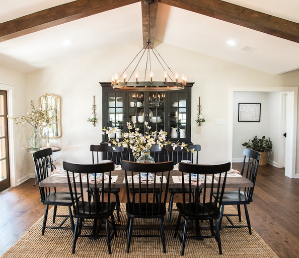
The dining room light looked familiar as well...but we chose ours for our clients' living room.

Speaking of the dining room... we are a big fan of those chairs and have used them in a couple of designs as well...

We're all about the functionality (and often cost savings) with a barn door but if you can add an antique door instead, do it!  Look at that patina!

The bunk room was another winner.  I don't think one can go wrong with a room full of built-in bunks, ever.  And we're always into each bunk having their own individual lights (as you'll see in a new beach house design coming up soon!).

So that's my list.  What were your favorite parts?  Can't wait for next week's transformation!

A Tale of Two Baths

In the second installment of a "Tale of Two..." we're featuring two bath designs we recently completed for a client new build.  Unlike our last client in the "tale of two kitchens," this family was able to nail down a favorite.  But in the interest of showing you a bit more of our process and this gorgeous bath (if we do say so ourselves), we thought we'd share the two options with you.    

boothbay gray bathroom edesign mood board 3a design studio

Option A features cabinets painted in Benjamin Moore's Boothbay Gray (HC-165) with matte black hardware and porcelain floors that mimic marble without all of the upkeep.  Two different light fixture options with natural wood accents were given for hanging above the fabulous soaking tub.

lamp room gray farrow and ball bathroom edesign mood board 3a design studio

Option B had the same tile but a different vanity color (Lamp Room Gray by Farrow & Ball) with a lighter option of wood mirrors with satin nickel hardware.  As with Option A, two different ceiling lights were given to leave the client with the final decision. 

Many times, we supply our clients with a couple of perfectly great options and give them the freedom to "pull the trigger" so to speak on the option they gravitate toward the most.  We've found that while most clients come to us feeling lost or overwhelmed with a space, they still want to feel a part of the process in the end.  Narrowing down some choices but leaving the final decision with them, is a great way to not only give them confidence but to also help them feel invested in the space---after all, it is their home.  We love that part of our job!

With these baths, we didn't think the client could go wrong with either option (obviously we had a hard time picking a favorite ourselves), but which one would you choose for your home?  Comment below and tell us which one "speaks" to you. 

We'll have more designs from this beautiful home coming up soon.  Stayed tuned!

Client Project-Nautical Nursery

Is it just us, or is everyone you know having babies these days?  We have a few nurseries in the works right now, and couple we're waiting to get "after" pictures of.  So exciting.  We LOVE doing nurseries and kid rooms!

Here is a recent one for an October baby.  The family wanted a nautical look without plastering sailboats on everything in sight--challenge accepted.  The walls are being painted in thick gray and white stripes and all of the large furniture pieces in the room will have a neutral palette.  There will be little pops of blue here and there with a few vintage whale pieces making an appearance as well.  Also, in the room, the client's antique, cane seat rocker (we couldn't find a matching one online, so the one on the mood board is just for a reference), but who doesn't love antique kid-sized piece of furniture??   

nautical nursery moodboard edesign 3a design studio

Gray blackout curtains were a must because---babies and sleep.  Ikea's Hemnes gray-brown dresser from a few years back is still on point.  Serena & Lily bedding was chosen with trellis sheets and nursery basics bumper and skirt in blue.  And this sailboat toile pillow
 (on sale!) will be perfect in the rocker. 

Stacked white floating shelves will keep decor off of the dresser, which will also function as the changing table and a rope mirror will hang above to bring in some more natural light from the room's single window. 

We can't wait to see photos of this one!

If you need help with your little one's room, or any room for that matter, contact us here
 and we'll help you get started!

Client Project-Farmhouse Entry and Dining Room

Hello, hello!  Summer is officially here (as in school is out for our kiddos), and we have been working hard on a few projects before the chaos ensues (hopefully not).  So we wanted to drop in and share a few new designs with you!

Today's design is for an entry/dining/sitting area that opens up to the clients' large kitchen.  It's a big space with pine wood clad walls and a stone-covered hearth. 

Because this space will function as multiple things on multiple occasions, we kept the pieces classic and timeless but with a touch of "farm."  The kitchen cabinets will be painted in White Dove by Benjamin Moore, one of our favorite white cabinet colors, and the rest of the color scheme is neutral with touches of blue and green.  Of course, we also brought in lots of texture!

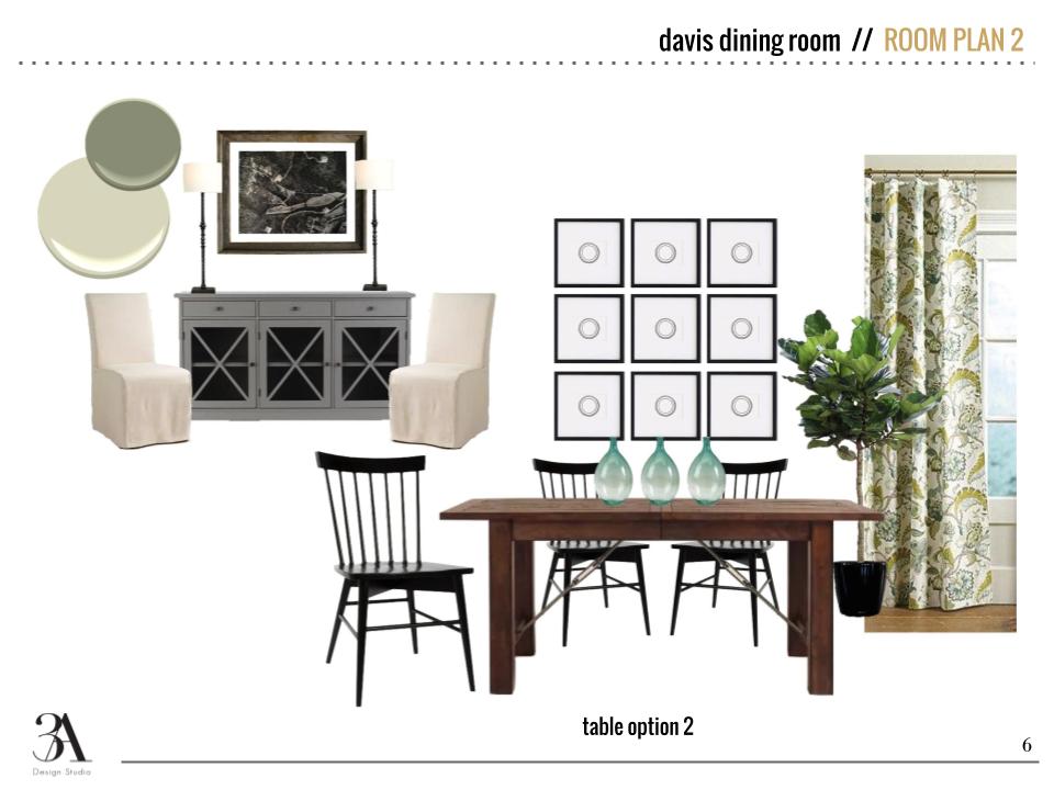
As you can see, we offered two options for the dining room seating and suggested slipcovers since the clients have kiddos themselves.  Aside from the wood bead Regina Andrew chandelier, the lamps on the entry table and rope hanging mirror are two of my personal favorites in the space.  I think I could put those Visual Comfort Thomas O'Brien lamps in every design I do and be happy.

Lighting is one of the largest ways to transform a space, and since the chandelier we suggested was a big buy, we also supplied some real life images of it so the clients could get a better idea of its look before pulling the trigger.  Even though this is an E-Design, we still want clients to feel as if they are out shopping with us!

So there's a little peek into our latest work and our process!  We'll be back soon with some more client designs to share with you guys!

Client Glam-Pham

It has been a while since we shared any of our projects. Thought I would share today some work we recently completed for our client Glam-Pham.

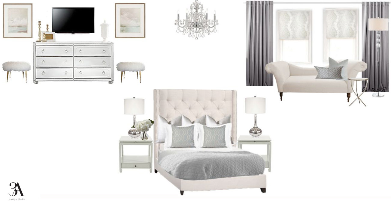
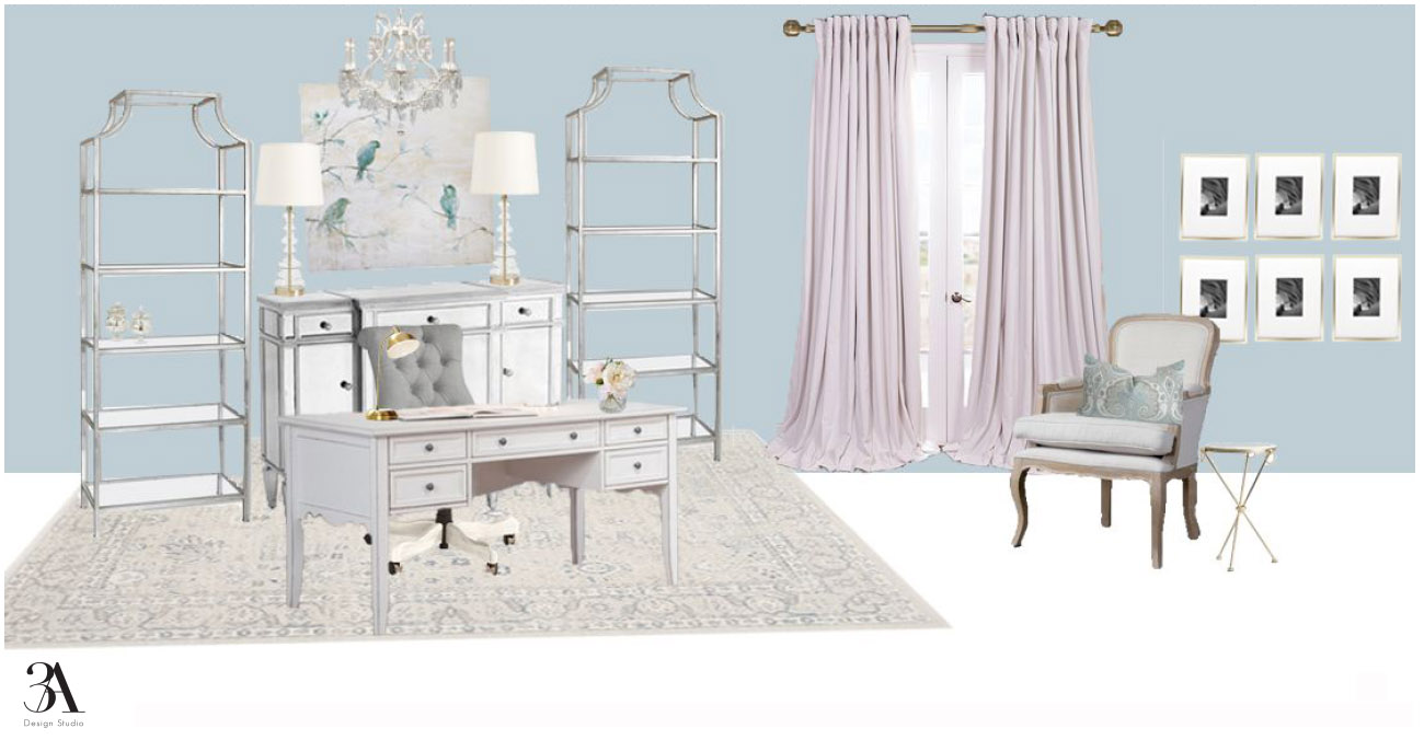
Client Glam-Pham was in the process of building a new home in Houston, Texas and reached out to us. She needed help with putting together a design for her master bedroom and office, as well as paint color suggestions for the entire house.  She wanted a soft glam aesthetic for both rooms. Our color palette consisted of soft blues, grays, and ivories. We mixed in a few metallics, along with luxurious textiles and a couple chandies of course! Here is what we came up with.

Master Bedroom

soft glam bedroom design

Master Bedroom and Bath Wall Color Suggestions


Office

Office Paint Color Suggestions

We can't wait to see progress pics and promise to share. In the mean time, we are really excited to be working on a design for her living room. It is going to be fabulous! A navy sofa may make its way into the room. Here is the color pallete we will be working with.

navy and blush color pallete

We will keep you posted. 

Have a great weekend!

jessicasignature.jpg

If you are building a home, let us help you. We can help pick out finishes, as well as put together a design that you can implement once you move in. Drop us a line here to start the conversation.

Client Design: A Modern Classic Kitchen

We recently had a client contact us about helping them update their kitchen.  The couple didn't want to do a huge renovation or overhaul, just some ideas they could easily implement to give their kitchen a facelift.  Lucky for them, our E-Design process was perfect for such a task!

Lucky for us, they already had great bones to work with--an island, shaker style cabinets, a built-in banquette. They had also recently purchased these modern barstools and they wanted to know how to incorporate them into a more traditional style like the rest of their home.

We loved the clean lines of the stools and were excited to get to work marrying traditional pieces with some modern touches.  Here is what we designed.

The lights over the island are a much cheaper version to Troy Lighting's Maidstone.  It was a great fit for a beautiful style on a budget and wasn't too ornate for some modern pairings.  We suggested updating painting their cherry cabinets in Silvermist (SW-7621) and adding this brass hardware for more clean, modern lines.  A good rule of thumb for hardware is pulls on the drawers and knobs on the doors.

schoolhouse electric brass hardware

For the countertop we suggested this beautiful Torquay Quartz by Cambria.  This was the biggest item in the budget, but it will last forever.  It has the look of marble but with much less maintenance.  They didn't have a backsplash before but were interested in adding one if they could find something in their budget--enter white subway tile.  It's a timeless classic (that's why you see it everywhere), but it's also very affordable. 

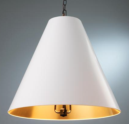
For the banquette area we wanted to add in some fun color and pattern with these pillows in a fabric by Kravet.  They add a playfulness to the space and soften the banquette which was previously just a wooden bench.  We topped off the banquette update with this high-gloss, oversized cone pendant light with gold lining inside to add the perfect glow for conversation.

oversized cone shade pendant

We love how this kitchen turned out, and even better, so did the client!  Kitchens are some of the easiest spaces to update with paint, hardware and lighting.  If we can help you spruce up your space, contact us here.