Project Gregory
/At 3A we love working with real estate investors. It is so gratifying taking an unsightly property and transforming it into a beautiful and desirable home. One of our latest flip projects was this 1930s cottage that had been neglected for sometime.
The house had high ceilings and great original features that we wanted to accentuate. It was important to us that the finishes we chose complimented the architecture and age of the house.
On the exterior we chose to keep a clean and crisp color palette to match the roof’s existing green shingles. The house was painted Benjamin Moore’s Simply White and the accents Behr Totally Black. New light fixtures and fresh landscaping finished off the new and improved look.
before
after
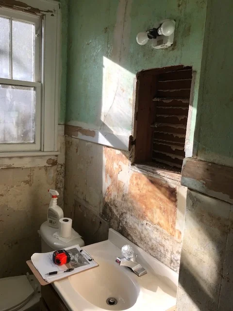
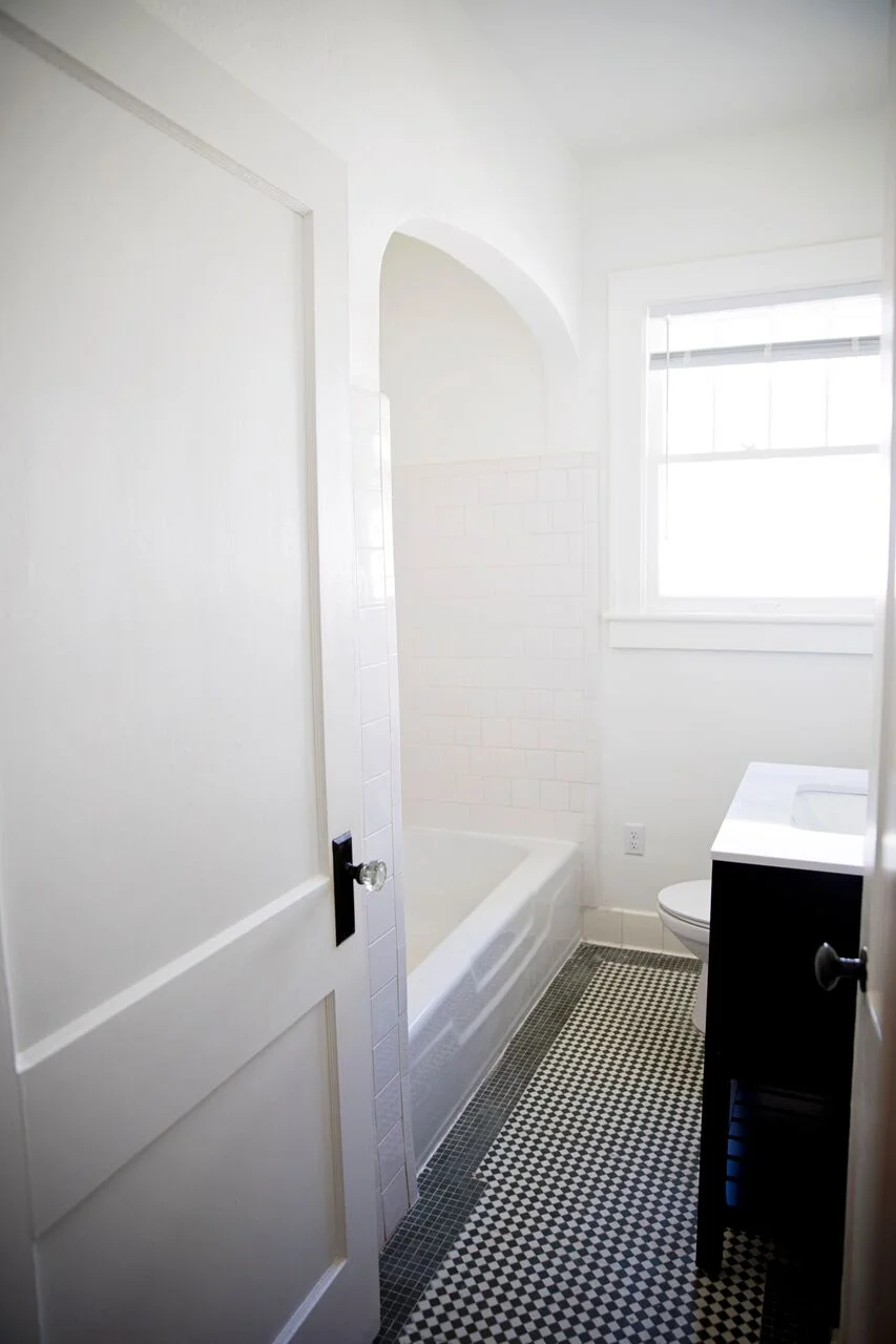
Heading inside, the only bathroom in the house had pretty emerald green tile that was in good condition. So we built our design around it using accents that tied in with the vintage style.
Pottery Barn’s Mercer double horizontal sconce and vintage recessed medicine cabinet were the perfect options. We purposely chose to mix the finishes for more character and dimension in this small room. The newly selected oil rubbed bronze shower fixtures pop against the refreshed white shower tile. And a previously covered up arch leading into the shower/tub was exposed again adding so much character to this little space.
BEFORE
AFTER
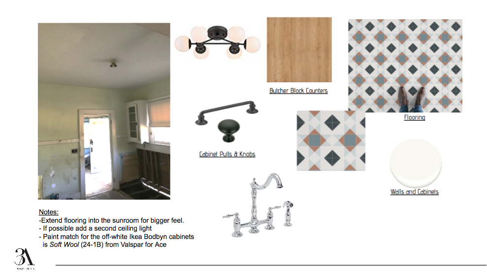
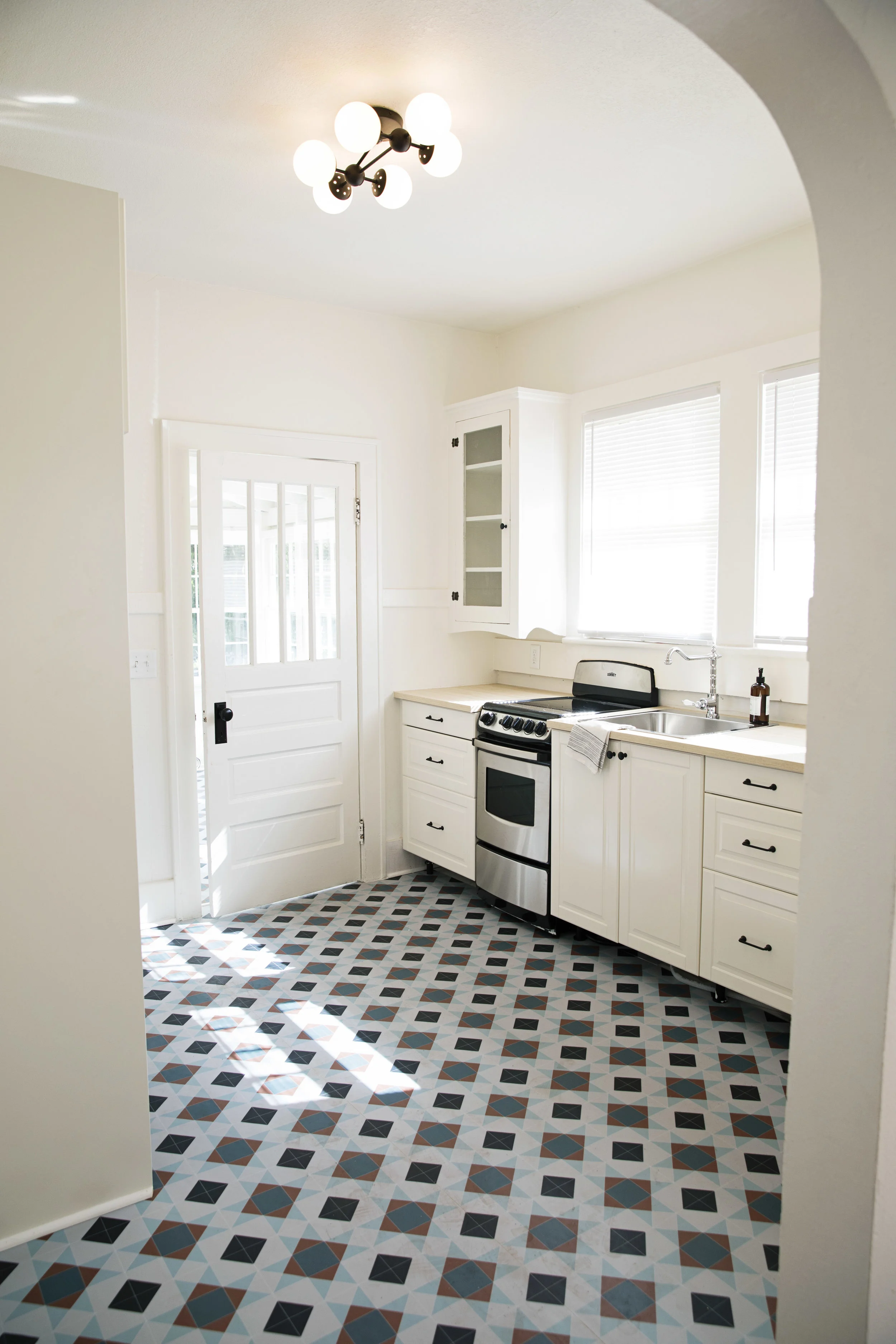
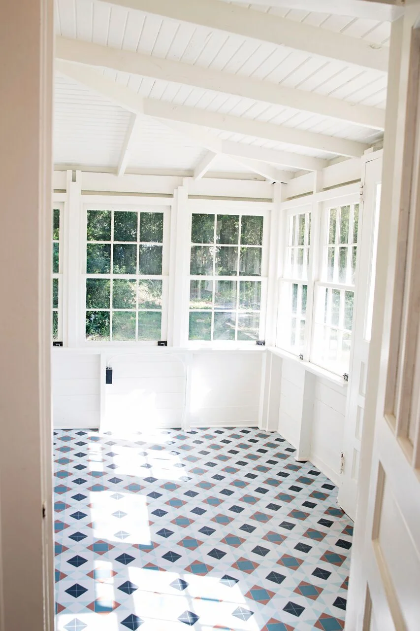
We continued to mix the house’s original pieces with new ones while working in the kitchen. Ikea Bodbyn cabinets were used for the lower cabinets while the original cabinets were kept for the uppers. Both the upper cabinets and walls were painted Valspar’s Soft Wool to blend in with the Bodbyn’s warmer white finish. Keeping the same theme throughout, we again mixed the finishes and found a cool light fixture to modernize this old space. To top off the space, we went with Atrafloor luxury vinyl from England in a fun, vintage print for both the kitchen and the connecting laundry room. Both the pattern and color brought a breathe of fresh air to the previously neglected spaces.
BEFORE
AFTER
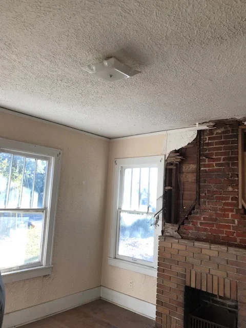
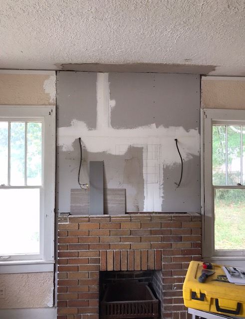
The living room was the last big room to need some major revival. The wall above the fireplace was ripped off and needing great repair. Matching the original plaster texture would have been difficult and not added any character to this charming home.
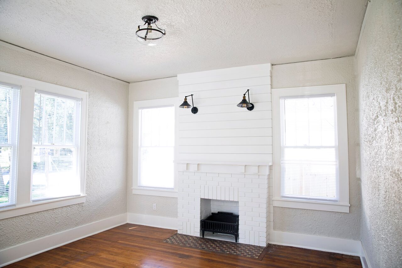
So instead, we outfitted it with ship-lap and swing arm lamps to bring it back to the true focal point it once was. A fresh white coat of paint on the brick and a new mantel detail finished off the fireplace. The original hearth tile and fireplace grate looked right at home now. Lastly, the walls were painted Silver Drop by Behr and the overhead fixture got a much needed swap.
BEFORE
AFTER
There’s truly nothing more satisfying in our job than bringing a space, or in this case an entire home, back to life. If you have a room or whole property that needs some new vision, please let us know how we can help. You can contact us here to get started.


