Baby R's Nursery Update- Decision Time
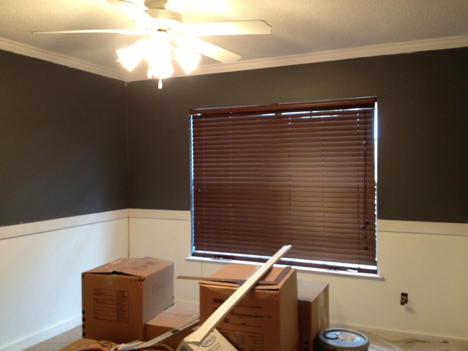
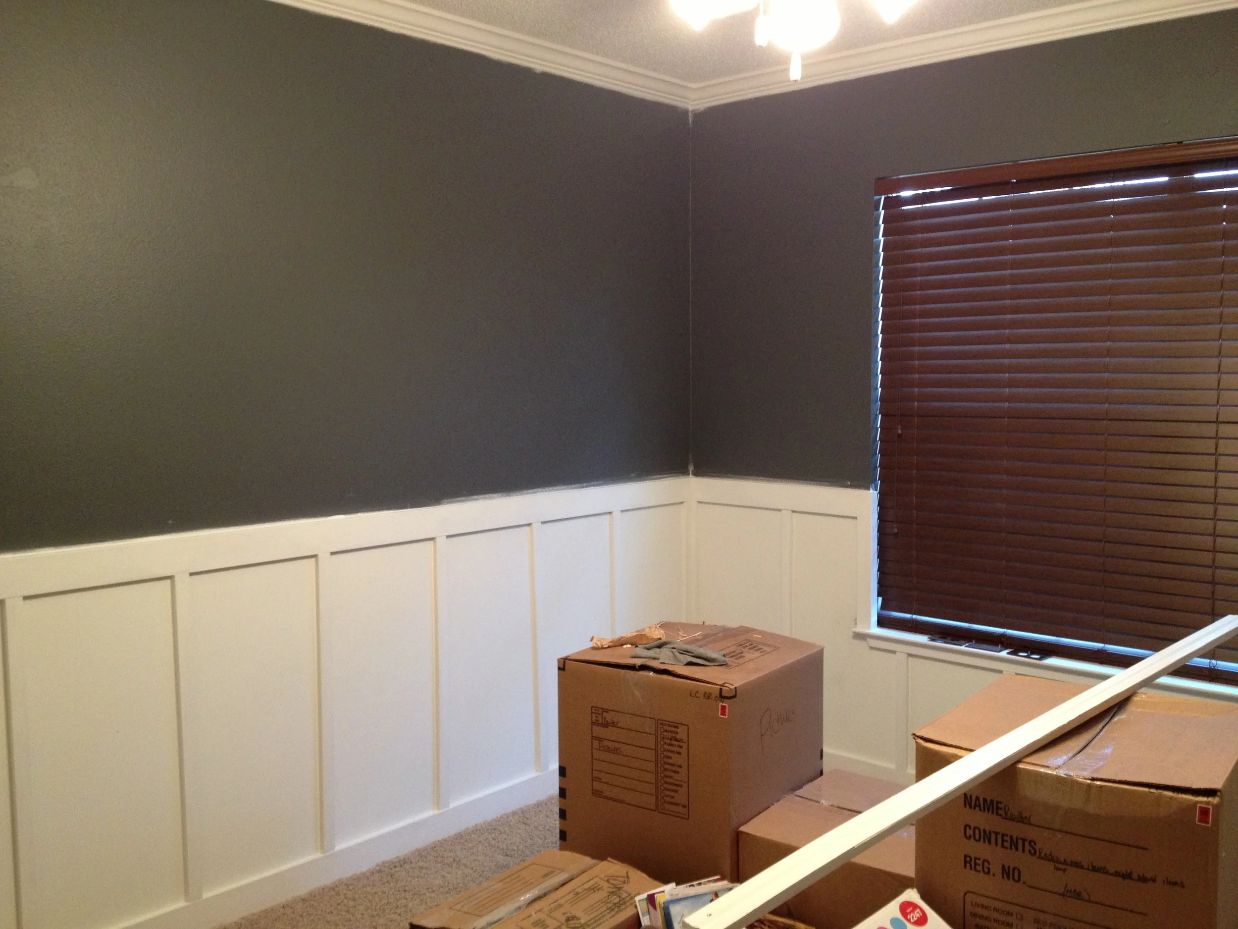
/This past week I've been in major nesting mode wanting to check everything off of my never-ending house to do list--specifically in the new nursery. Jon and I have a lot of cleaning out to do (it's currently his "man cave"/catch all room) before the real decor can even go up. I'm one who loves to clean out and organize as it is, but when you add in a baby, it's even worse.
In an attempt to get a move on, I've been finalizing some nursery decisions so that all pieces are here when it's time to get everything in its place. Specifically, the curtains have been ordered and sheets have been decided.
Here are the four curtain options I was considering:
After much consideration (and a little help from my fellow design friends), I chose option number one with a blackout lining. You may remember the top part of the room is painted a dark charcoal color so I really wanted something light to balance it out. And down the road, when the girls start sharing a room, these will easily transition to a non-nursery room.
I also picked out my crib sheets. I loved the blue trellis ones from Serena & Lily that I used in Auden's room, and I think the mocha option will work great in the new nursery. And because my love for block print can't be stopped, I really like this booti pink print from Rikshaw Designs. The bed skirt is a muted petal pink linen-cotton one from Restoration Hardware Baby & Child and the bumpers will be the white pique with gray trim we used for Auden. I plan on flipping it around so I can monogram the other side for this baby. Waste not, want not, right?
With those items being confirmed, here is the updated mood board. If you need a refresher, here is the starting point from over a month ago.
The other new items are these gold leaf frames from West Elm and these beaded ones from Design Aglow for her gallery wall. I purchased this art print from Jones Design Company months ago (before I was even pregnant) and think it will work great in the room. The other new contender is this lamp by Nate Berkus. I saw it in Target and immediately fell for the modern lines and acrylic base. Because I love a good mix of modern and vintage, I think this will be a great addition to keep that balance.
So that's the latest for Baby R. What do you think?
I'm off to get my nesting fix on and start cleaning out the man cave closet with the hubs! As you can imagine, he's thrilled to be doing this on his off day ;)
Until next time...


