Pregnancy Wrap-Up

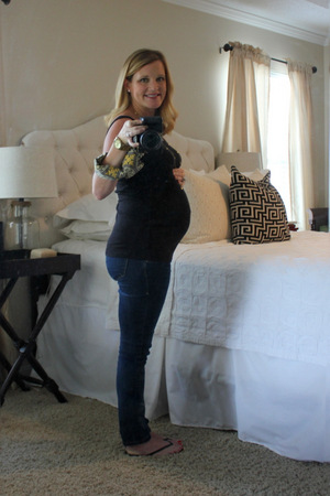
My weekly bump pic at 37 weeks.

My weekly bump pic at 37 weeks.

The end of my pregnancy has arrived, and it seems like it both took forever to get here (4 months of sickness will do it to you), yet snuck up so quickly.  It's hard to fathom that any day now we will have not one but TWO daughters.  It's so overwhelming and extremely exciting to think about.

The last couple of weeks I've been scrambling to get things in order, well as much order as can be achieved with a new baby on the way and a toddler at home.  My doctor told me at my 35-week appointment (2 weeks ago) that he expected her arrival between 37-38 weeks.  As you can imagine that sparked a lot of excitement, nerves and anticipation.  I've felt like a kid on Christmas Eve every day...not knowing if the next day will be when our long-awaited "gift" arrives.

The nursery is basically complete (aside from patching and painting a few holes), and I love how it turned out.  It is a far cry from what it was when we first bought the house (faux finish metallic walls and bamboo sticks chair rail). I'll be sure to share more pictures once my fabulous photographer and her wide-angle lens can get in there and truly capture the space.

Photo by Jordan Burch Photography

Photo by Jordan Burch Photography

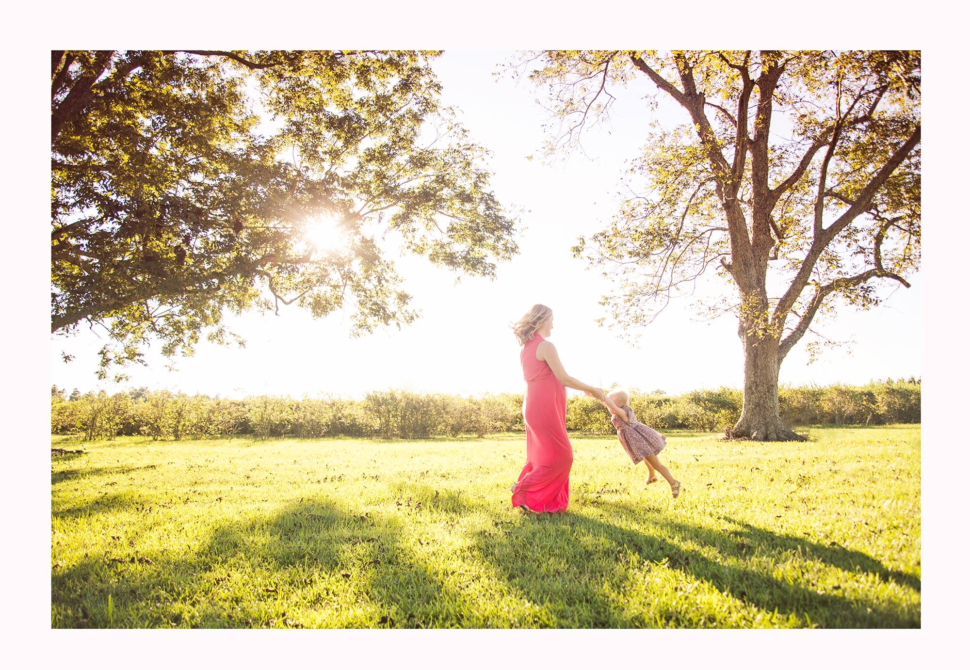
One of the ways this pregnancy has been different than Auden's is that I've felt better toward the end.  I attribute a lot to that to less weight gain (maybe from chasing a toddler around?) and acid reflux medication (miracle drug!), but I think it also is because I partially know what comes at the end.  The overwhelming swell of your heart when you hear that first cry and get to finally lay your eyes on the little being you've been carrying around for nine months.  The tears of joy that stream down your face when you get to hold them in your arms for the first time.  The knowing that your life will never ever be the same in the best possible way.  It is such a magical experience and makes every back ache, sleepless night and 348, 232nd trip to the bathroom worth it.  

I haven't forgotten that a newborn also brings worry, sleep deprivation or breastfeeding trials, but I know that those things will pale in comparison to the new love we'll feel as our family grows by one.  We can't wait to meet you, baby girl. 

A nursery's transition to a big girl's room

Hope everyone had a great Labor Day weekend.  I thought I would share with you today an e-design we recently completed. 

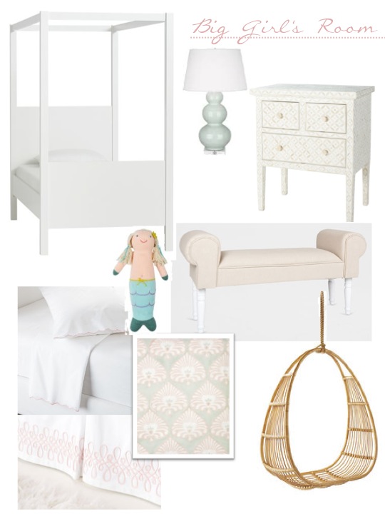
More times than not, we have clients who want to update the look of a room by purchasing a few new pieces rather than starting from scratch. Our client from South Carolina had a beautiful nursery but her daughter was outgrowing her toddler bed. She asked for our help to transition the nursery into a big girl’s room.   

Our objective was to create a youthful design that her daughter would not out-grow for many years to come. We selected a beautiful canopy bed with contemporary lines and a few supporting pieces to tie-in the look with the existing elements in the room. The nursery’s rocking chair was replaced with a fun hanging chair, in a similar tone to the woven shades that are in the room. At bedtime, the bench at the foot of the bed can be used to place stuffed animals and extra pillows.

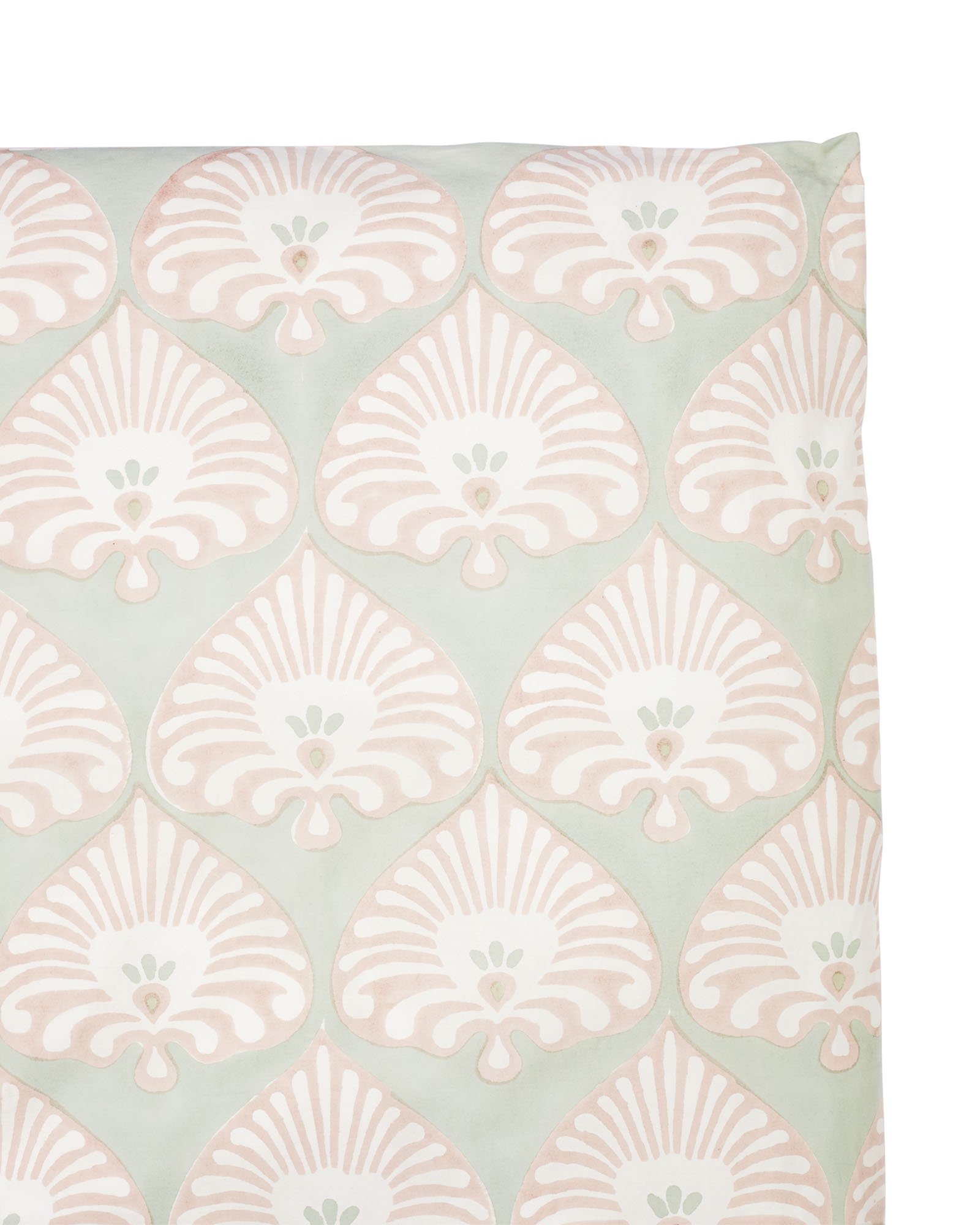
Here is a better image of the duvet cover.

As the years go by and the toys get replaced with clothes and accessories, the room's foundation pieces will remain relevant. We hope it becomes a room her daughter will look back on with many fond memories.

If you are interested in refreshing one of your room's, drop us a line. We would love to help.


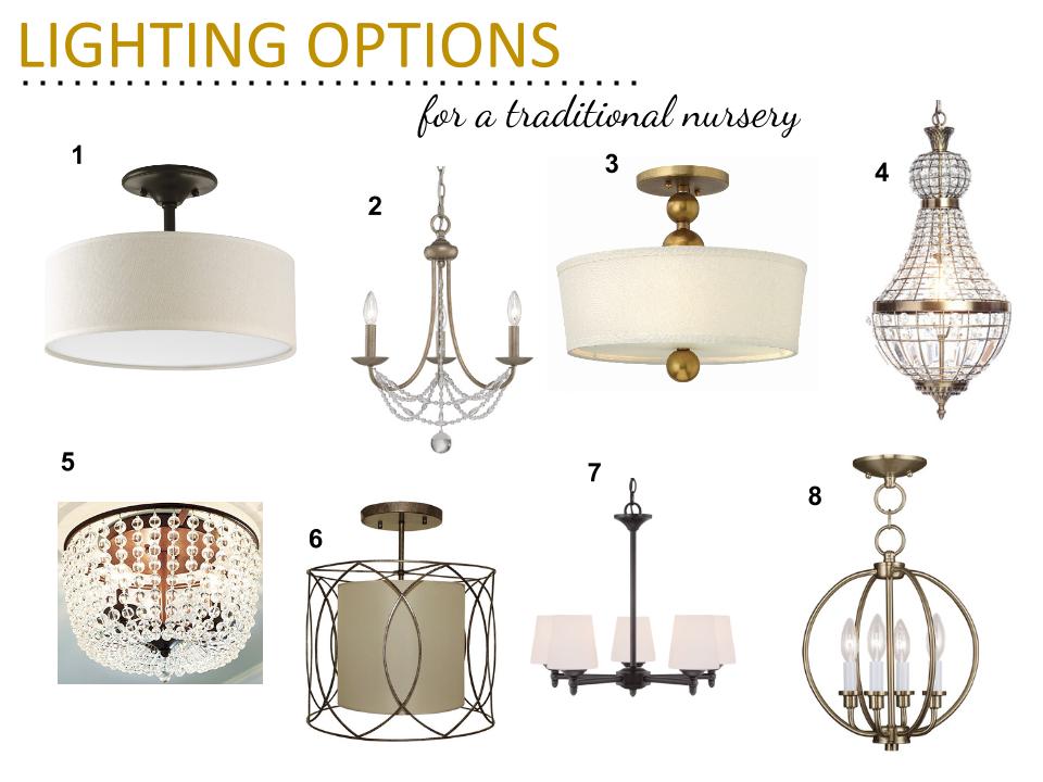
Traditional Nursery Lighting Options

As many of you know, my husband Jon and I are expecting our second little girl in the next few weeks.  My due date is actually October 6th, but according to my doctor, I will most likely have her within the next two-three weeks.  I am 35 weeks right now, so hearing that at my appointment yesterday was a bit of a shock! 

If my nesting wasn’t bad enough already, it’s kicked into high gear now!  I shared her last nursery update here, and we’ve accomplished most items on my checklist since then.  There are only a couple of big tasks left-- I’m still waiting on the hardware to arrive for the acrylic frame, and we still need to hang the light fixture.

We attempted (and by we, I mean Jon while I looked on for supervision) to hang the light fixture this past weekend, but we ran into a snag since it’s a vintage find.  Apparently me and my pregnant brain didn’t realize that it was missing the ceiling strap needed to anchor the light to the ceiling.  So now we’ve got to make another run back to the hardware store to fix that problem.  In the meantime, I decided to look into some more lighting options just in case this one doesn’t work once we get it hung up (which would be Jon’s worst nightmare). 

I have no time to waste, and I refuse to let an ugly white ceiling fan ruin the rest of the room so here are a few options I've found. 

traditional nursery lighting options

one // two // three // four // five // six // seven // eight

I'm praying that the one I already have will work because I love the natural patina and vintage crystals it has.  Fingers crossed!  In the meantime, here's an updated shot of the nursery since we hung the wall sconces (pardon the iPhone photo quality and crumpled curtains).  

We're getting so close to meeting our new girl! 

blue traditional vintage girl nursery

9 Best Plug-In Sconces

I recently added some brass sconces to my second baby’s nursery design, and I can’t wait to get them up on her wall.  They will go on the same wall as the crib, flanking the artwork to be hung over the bed, and I think they'll add so much to that side of the room. 

Because I didn’t want to add one more thing to our growing nursery to do list (you’re welcome, Jon:) ), I opted for some a plug-in option.  In this case, the cord is clear and won’t be very visible on the white board and batten that we have on the lower half of the room.  After a few wall anchors and screws, they will be up and running!

Image via Sissy+Marley

Image via Sissy+Marley

But if for some reason they don't work out in the nursery, they can easily be moved to another room in the house—the office, the guest room, etc.  That’s another great thing about a plug-in option as opposed to a hardwired, they are much more movable down the road if you want to change things up.

Image via Lonny

Image via Lonny

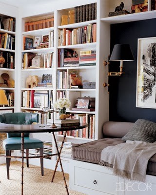
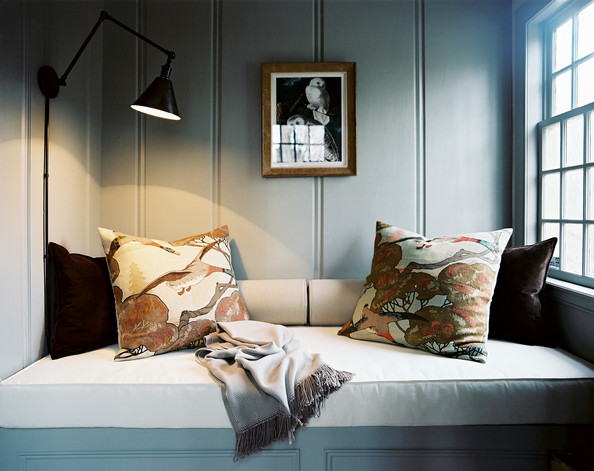
I’ve long been a fan of sconces and think they always look so charming in a nursery or bedroom.  They offer a variant level of lighting in the room, aside from ceiling and table lamps, and they adorn the wall like pretty little earrings finishing off a beautiful outfit.

The kind I wanted to purchase from Pottery Barn is unfortunately now sold out (I was lucky enough to find a pair on eBay).  But if you have the desire to add some "earrings" to one of your rooms, here is a round-up of some more great options.  They are all in various styles and finishes to help you find just the look you’d want.

best plug in sconces 3a design studio

one // two // three // four // five // six and seven // eight // nine

I kept things pretty reasonable in the price category, with ranges from $45-170.  Not too bad for adding such a statement to a room!  

Client Project - A Nautical Nursery

We recently completed an E-Design for a client looking to create a nursery for their first baby, a boy.  The clients live near the beach and wanted a nautical feel with pieces that would easily grow with the baby later.  It was music to our ears.

In case you haven’t gathered, we absolutely LOVE creating kid’s spaces, especially nurseries.  And because we’re all three moms ourselves, we understand meshing style with function.

In this space, we started with a soothing color on the walls, Wedgwood Gray by Benjamin Moore. Having this blue as the backdrop allowed us to bring in a lot of neutral pieces to balance out the space and possibly transition to another nursery (even for a girl) or room later down the road.

nautical nursery mood board 3a design studio-001.jpg

Paint // Ceiling Light // Curtains // Artwork // Crib // Lamp // Dresser // Crib Skirt // Crib Sheet // Rug // Pouf // Pillow // Glider

We kept the space playful by bringing in a mix of textures and patterns, including buffalo check, houndstooth and ticking stripes.  For the rug, we chose an indoor/outdoor option for easy cleaning (both for now—baby spit up anyone? and when their little boy gets older with more messes to make).  And it could also work great in a playroom one day!

We kept the nautical theme in tact through artwork, textures (the rope lamp), shapes (the bentwood light mimics the lines on a boat) and colors.  The key to creating a subtle themed room is using ALL facets of the design to tell the story, rather than branding everything with typical nautical decor.  In other words, having an anchor on everything was not the way to go :)

The end product speaks for itself, and the client was thrilled with how we married their love for the water with their fun, yet traditional style.  And we know their little boy will soon love it too! It was such a great project, and we can't wait to see some "after" pictures.

If we can help you finish off your space or do a complete room design, drop us a line or go here to learn more about our E-Design process.  We’d love to give you a new space to enjoy for years to come!


 ​

Baby R's Nursery Update- Decision Time

This past week I've been in major nesting mode wanting to check everything off of my never-ending house to do list--specifically in the new nursery.  Jon and I have a lot of cleaning out to do (it's currently his "man cave"/catch all room) before the real decor can even go up.  I'm one who loves to clean out and organize as it is, but when you add in a baby, it's even worse.

In an attempt to get a move on, I've been finalizing some nursery decisions so that all pieces are here when it's time to get everything in its place.  Specifically, the curtains have been ordered and sheets have been decided.  

Here are the four curtain options I was considering:

Desktop45-001.jpg

one // two // three // four

After much consideration (and a little help from my fellow design friends), I chose option number one with a blackout lining.  You may remember the top part of the room is painted a dark charcoal color so I really wanted something light to balance it out.  And down the road, when the girls start sharing a room, these will easily transition to a non-nursery room.  

I also picked out my crib sheets.  I loved the blue trellis ones from Serena & Lily that I used in Auden's room, and I think the mocha option will work great in the new nursery.  And because my love for block print can't be stopped, I really like this booti pink print from Rikshaw Designs.  The bed skirt is a muted petal pink linen-cotton one from Restoration Hardware Baby & Child and the bumpers will be the white pique with gray trim we used for Auden.  I plan on flipping it around so I can monogram the other side for this baby.  Waste not, want not, right?

With those items being confirmed, here is the updated mood board.  If you need a refresher, here is the starting point from over a month ago.   

The other new items are these gold leaf frames from West Elm and these beaded ones from Design Aglow for her gallery wall.  I purchased this art print from Jones Design Company months ago (before I was even pregnant) and think it will work great in the room.  The other new contender is this lamp by Nate Berkus.  I saw it in Target and immediately fell for the modern lines and acrylic base.  Because I love a good mix of modern and vintage, I think this will be a great addition to keep that balance.  

So that's the latest for Baby R.  What do you think?  

I'm off to get my nesting fix on and start cleaning out the man cave closet with the hubs!  As you can imagine, he's thrilled to be doing this on his off day ;)

Until next time...