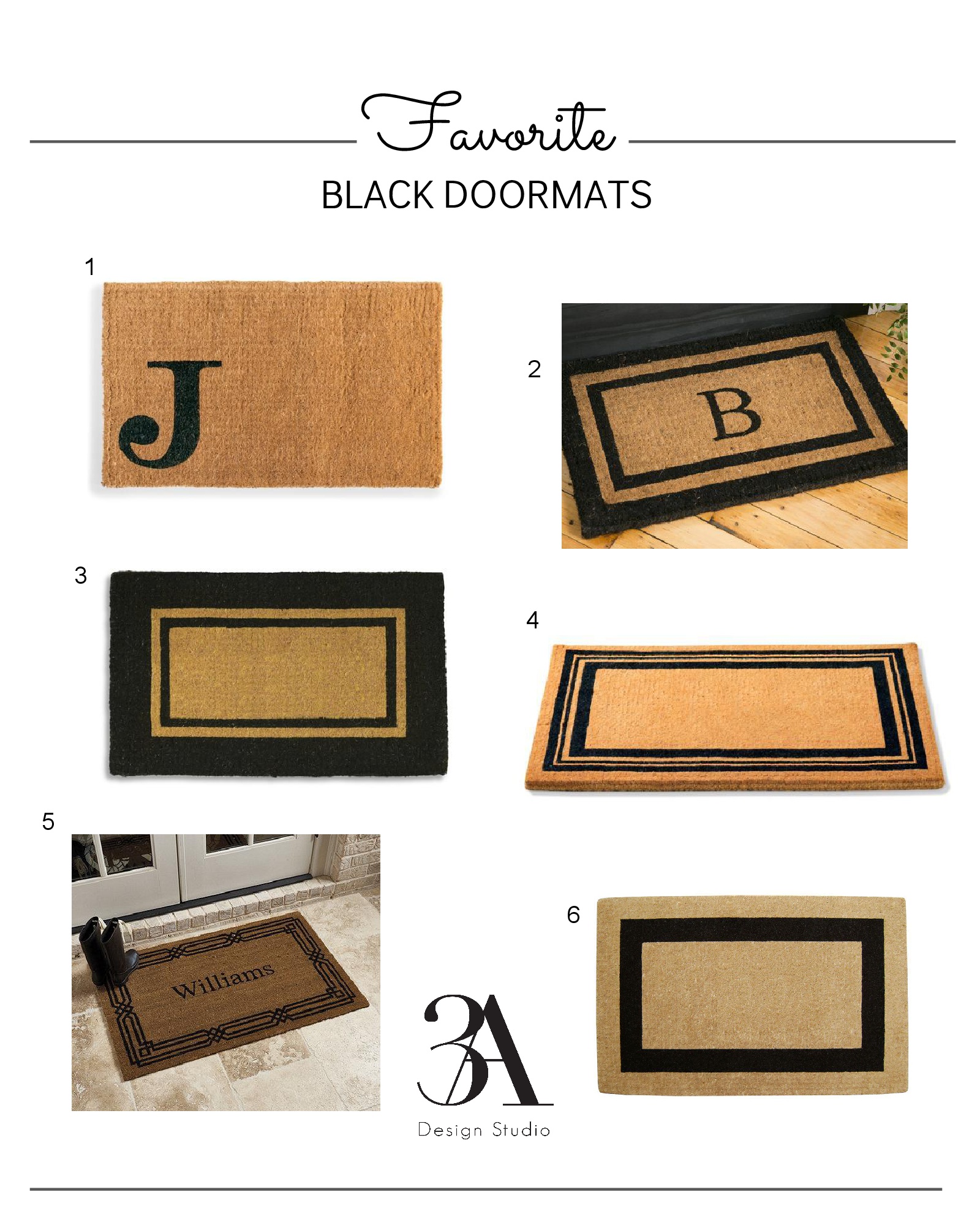
Favorite Black Doormats

I'm not sure if it's because it's summer or because we live minutes from the beach, but our guests always amp up around these months.  It's led to me taking a good look at my exterior decor and adding a few updates to our front and back porch.

One thing we desperately need to update is our front door mat.  It's taken a beating over the years and is screaming to be replaced with a more substantial, larger option.  So I started my quest for a classic design with a 48" width.  I found a few contenders and thought I'd share them with you guys in case you're needing an update too.  Now we can all welcome our guests in style!

one // two // three // four // five // six

Have a great weekend!

A Mid-Century facelift

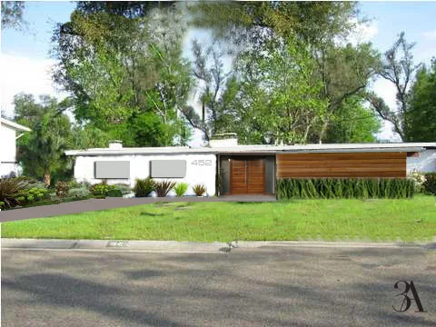
Sometimes it takes an outside eye to help visualize the potential your home has. Here is a curb appeal facelift we did for a client who was interested in purchasing this outdated, mid-century home. He knew it had good bones but needed help with envisioning how to improve the overall look of the exterior. We were able to give him a visual representation showing how a few improvements could transform this unadorned, outdated home into a stunner. 

3aexteriormakeover.jpg

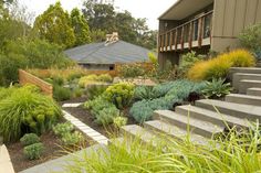
For this facelift, the mid-century modern homes commonly found on the west coast were the source of inspiration.

Image Via

Image Via

Image Via

Image Via

Image Via

Image Via

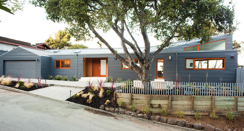
To achieve this look, we gave this girl a new set of contemporary doors and modern brushed nickel address numbers. Replaced the sliding doors with matching windows and added Ipe shiplap siding for a sleek look. People often underestimate the effects of good landscaping. We replaced the existing landscaping with plants that are more structured, having straight lines and geometric forms.

Here is the final look

3adesignstudiofacademakeover.jpg

and a side-by-side comparison

semur sidebyside.jpg

If you need help with ways to improve the look of your home's exterior,  contact us. We would love to help.

Got Curb Appeal?


Everyone loves a beautiful home on the inside, but too often we forget that the exterior is your home’s first impression. It is known that a house with good curb appeal sells more quickly and for a higher dollar value than a house in the same neighborhood that is not appealing from the exterior.  Plus, a home with good curb appeal not only adds value to the home but also to the neighborhood. I see the effects of this firsthand. As a realtor, too often my potential buyers pass up touring the inside of a good home just because it looks “ugly” on the outside. 

Ugly houses are seen as golden opportunities to investors. They sit on the market for far too long, and are eventually purchased at discount by someone who can visualize how small improvements can make a huge difference and increase the value of the home.  But not everyone can envision the potential. Sellers don't know how or where to make improvements, often fearful it will require too much money and effort. And realtors are often left wishing they could show buyers how great a home could look with minimal changes that would not only make the purchase worth their while, but also add value instantly.

To help realtors, sellers, and buyers envision the potential a home contains, we offer a curb appeal facelift that is done virtually. You send us a picture of your home and we provide recommendations and a visual representation of what your home could look like.

Take a look at a recent project of ours. The client was preparing to list her home on the market and was at a loss on how to make the home’s exterior more appealing.

3Adesignstudio_facelift.jpg

The first thing we noticed was the lack of color and interest. The existing door color blended into the brick. We recommended that she add a pop of vibrancy selecting a shade of blue for the door and shutters that compliments the brick. The next thing we suggested was to replace the outdated trellis columns and add shutters to the large window for symmetry. To add some architectural interest to an otherwise typical ranch design we suggested replacing the vertical siding with shaker siding, replacing the door with a more attractive one, and installing a carriage style garage door. As a final touch, we addressed the landscaping. The pine tree and palm were obstructing the view of the home. The landscaping we recommended adds symmetry, visual interest, a pop of color, and completes the look.

3Adesignstudio_curbappeal.jpg

For a relatively small budget, the client is able to make a huge impact on her home’s curb appeal. Her home is no longer lost amongst the landscaping and has a visual interest that makes it stand out among the other houses on the block. Her house is now sure to sell more quickly.

If you would like help improving the look of your home's exterior, contact us about our Curb Appeal Facelift service.