A Fall Table, Two Ways

The fall season is all about gathering, entertaining and eating great food over great conversation, right?  So what better place to do that than over your beautifully decorated dining table? 

We know that for many, the holidays bring an added stress of making everything "perfect," and we're here to help!  A beautiful tablescape doesn't have to be time or budget consuming.  We're big proponents of using what you have and making it count.  So we've both designed some easy table setups to share with you guys.  I'll feature mine today, and Jessica will follow with hers.  Let's get started!

IMG_3468.jpg

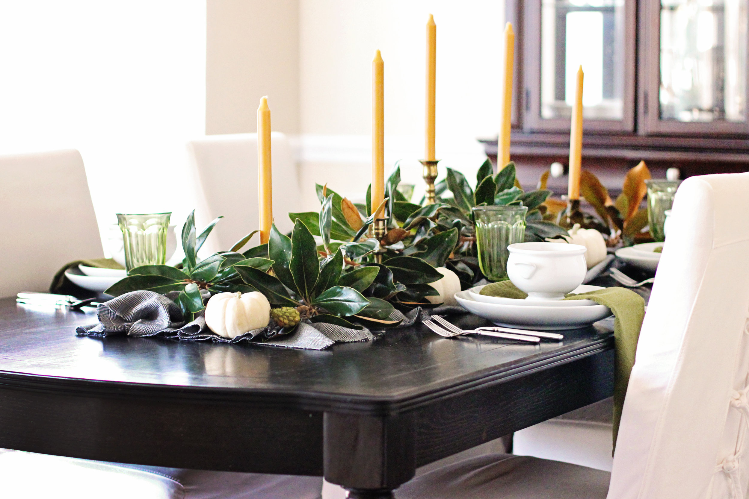
I started by laying down a piece of plaid houndstooth I found in the fabric bin at the thrift store for $3.  Fabric isn't a necessity for a tablescape, but if you do want to use some, don't feel like you have to splurge on a table runner or tablecloth--sometimes a piece of fabric is just as good, if not better!  I bunched mine to create some movement and texture in the middle of the table.

IMG_3553.jpg

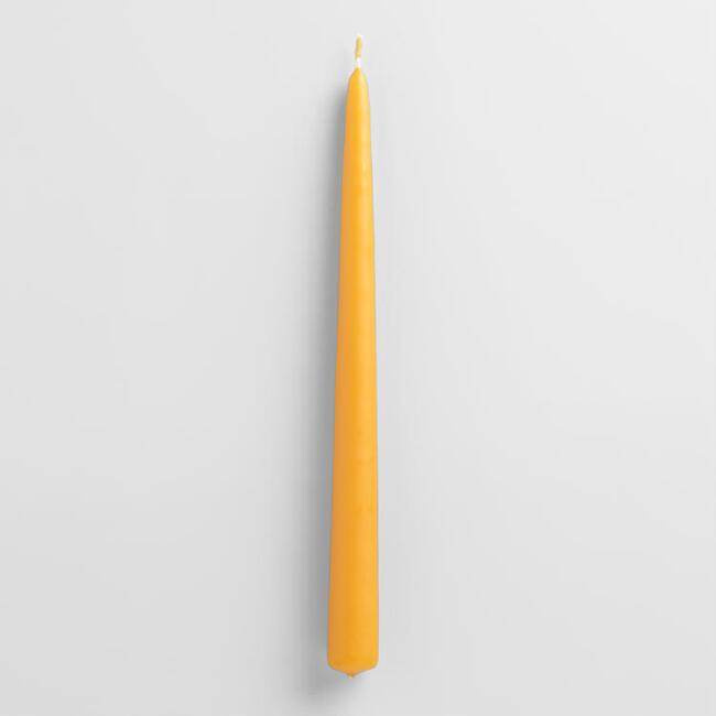
Next I added my vintage brass candlesticks that I've collected over the years (largely at thrift and antique stores).  Are you sensing a pattern?  I love the hunt and thrill of a good deal!  I swapped out my normal white tapers for some marigold ones for warmth and a nod to the traditional fall colors.

IMG_3472.jpg

Once I had my candlesticks spaced out how I wanted them, I started to add in the magnolia branches I clipped from the tree in my yard.  Greenery is one of the easiest and cheapest (free if you can use trimmings from your own yard or a sweet neighbors!) to build a table centerpiece.  I stuck to just magnolia on mine, but you could certainly use a variety of clippings for a more layered look. 

IMG_3520.jpg

Next I added some mini white pumpkins I picked up on a trip to the grocery store for $1.50 each. Nurseries and farmer's markets are another great place to look for more selection.  And remember, you don't have to stick to pumpkins.  My grocery store had some beautiful green squash that would have been a fun choice too--and they were 99 cents!

IMG_3488.jpg
IMG_3491.jpg

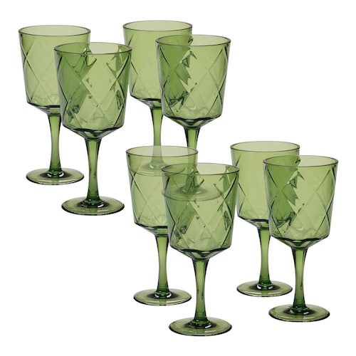
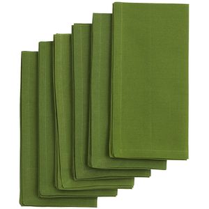
The next layer to the table was my dishes, which themselves got layered.  Layer, layer, layer friends!  I also added some green napkins and glassware that used to belong to my mom.  Who said you can't use green for fall decorating?

IMG_3524.jpg

The finished product cost me $13.50 ($3 in fabric and $10.50 for pumpkins!).  The best part is that it didn't take long at all to put together. 

IMG_3500.jpg

When you're shopping for entertaining decor remember to look for pieces that you will be able to use in a variety of different ways for different events.  That way the next time you have a function, you won't have to run to the store, just to your storage closet!

IMG_3529.jpg

GET THE LOOK

IMG_3499 copy.jpg

Happy fall, y'all!
signature+Mallory.png

Get the Look-Monochromatic Bedroom

Have you guys seen the new home of Natalie Morales from the Today show?  She reportedly just purchased a home in Brentwood, CA for her new West Coast gig, and the listing photos are gorgeous.  In case you missed it, I'll give you a mini tour of my favorite rooms.

But first, let's all take in this beautiful back exterior.  Would wouldn't want this to be the back of their house??  Look at all of those porches and windows!
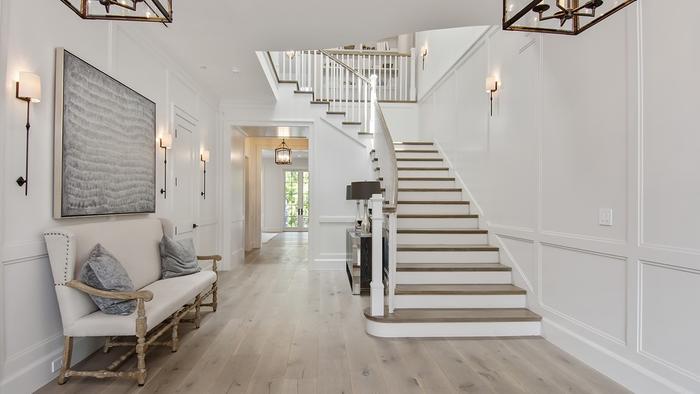
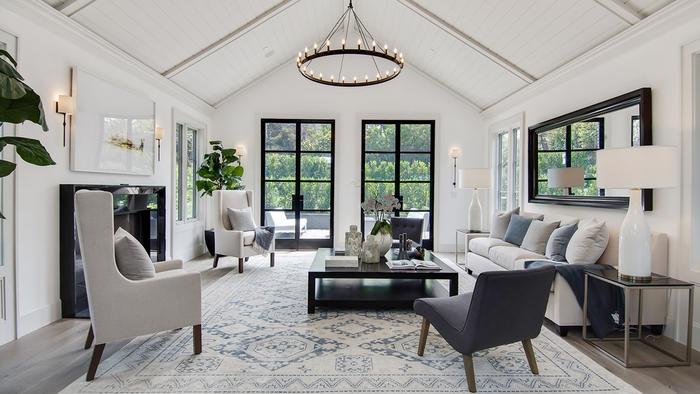
A simple and stunning entry greets guests when they walk in the home.  I love those oversized sconces and artwork.

This monochromatic transitional look has the best lighting in the house--natural lighting from those huge glass doors!  I will never tire of those iron and glass doors.

Again, there isn't a ton of color in the space, but that doesn't mean it lacks interest.  The leather mixed with the wood, mixed with the iron, mixed the stripes...it's good.

If you're going to go for some color, why not do it in the office/library?  It is typically a place that is used for igniting creativity and thought, and this blue will do just that.  The light fixture and Spanish style desk with those gorgeous turned legs aren't so bad either...

Now for the bedroom, a place of relaxation and rest.  What's more fitting than calming, tone-on-tone furnishings?

all images via realtor.com

all images via realtor.com

Me and my neutral-loving ways were instantly attracted to this monochromatic bedroom.  It's very easy for a completely light room to look very sterile and flat, but the stagers here did a great job adding warmth and layers through varying textures.  That's the key!  I decided to do a "Get the Look" to show you how it could easily translate into your own bedroom.

get the look monochromatic bedroom natalie morales

What's your favorite room?  Comment below to let us know!

Until next time...

Get the Look: Modern Classic Master Bedroom

Pinterest is full of beautiful rooms, right?  Put what's the point of just looking at them, if you can't recreate them yourself?  I pinned this room a long time ago but have come back to look at its understated beauty time and again. 

I love the simplicity of it, the layers and beautiful texture and the mix of modern and classic.  You can't go wrong there in my book!  I love it so much, I thought I should recreate a similar look for anyone else that may be fan too.

1. Sconces // 2. Curtains // 3. Chandelier // 4. Duvet // 5. Bed // 6. Quilt // 7. Lamp // 8. Pillows // 9. Throw // 10. Swivel // 11. Seagrass Rug // 12. Oriental Rug

If you have a room that inspires you, but need some help finding the pieces for your home, you're in luck! 

Our Ask My Designer service is about to launch. Ask My Designer bridges the gap between full room design and single item sourcing. Through AMD, we can give you tips on how to enhance your space and even help you track down the items to do so.  You can read more about it here.

Have a wonderful weekend!


Six Stylish Lantern Pendants that won't Break the Bank

Hope everyone has had a good start to their week and have been enjoying the cooler temperatures. Here on the Gulf Coast, we actually had a day over the weekend where we could bust out with our boots, but it was short lived. :) On to design topics....

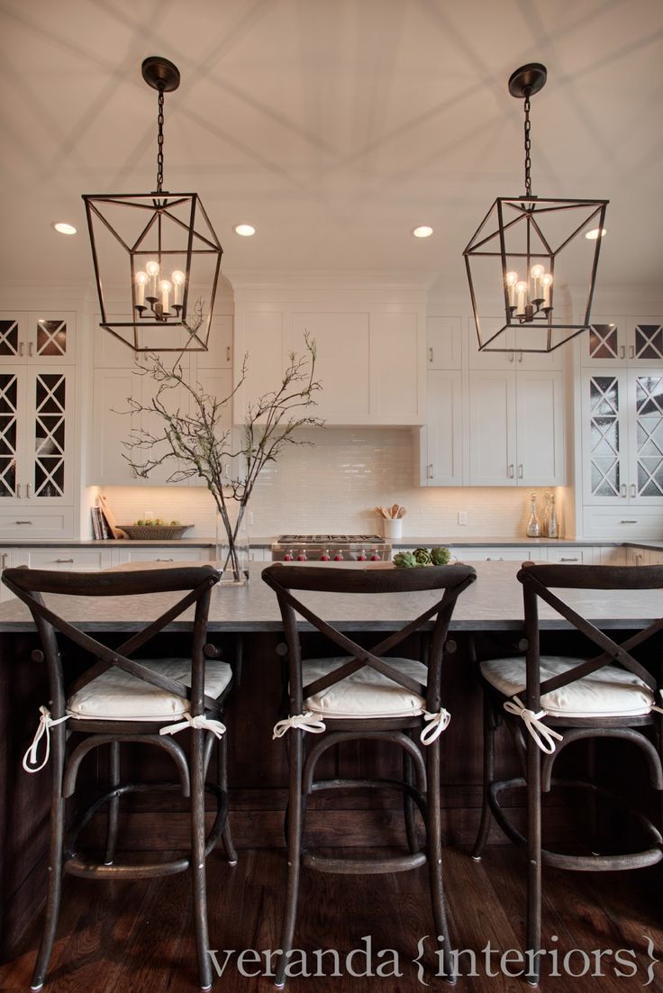
To give you a quick update on our Bristol Park project, last week we were searching for light fixture options for the foyer. The ceiling in the foyer is sloped, so we needed a hanging fixture that could also be shortened to accommodate the ceiling height. The perfect choice was a lantern pendant in a matte black finish with clean lines. The combination of glass and black metal has a look of strength and elegance about it.

Via Decorista

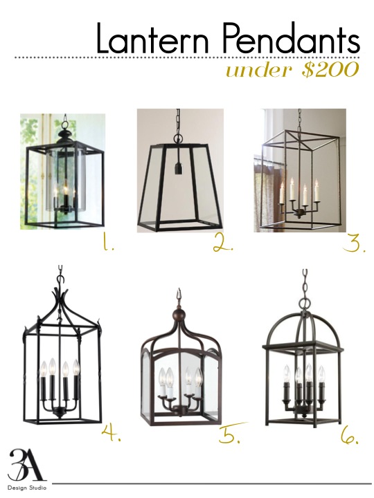
As you have just seen from the images above, there are a variety of lantern pendants styles available on the market. Some look traditional and others more modern. You can get the look with these six pendants priced under $200.

one // two // three // four // five // six //

one // two // three // four // five // six //

Until next time.

Hello Fashion World

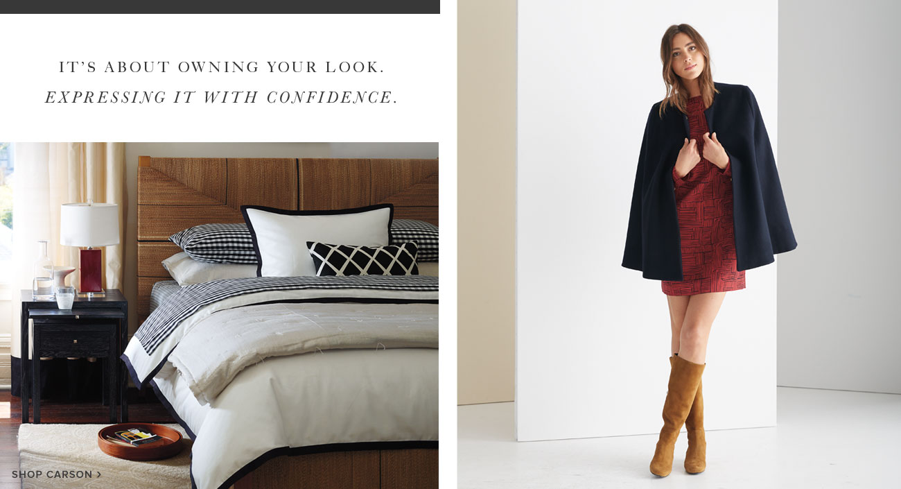
Home retailer Serena and Lily expanded in to the fashion world this year. Fashion has always been a source of inspiration for many designers, so it doesn't come as a big surprise, especially since they started out as a textile company. Just recently they released their fall collection, which did not disappoint.

Comprised of timeless and elegant silhouettes, the collection reads as simple sophistication. Much like a great sofa, their staple pieces appear comfortable and are neutral enough to be layered with accessories to create a statement. 

Many of the design principals found in fashion can be applied to interior design and decorating.sofa //  throw blanket  // pillows

Many of the design principals found in fashion can be applied to interior design and decorating.

sofa //  throw blanket  // pillows

Martine Cape ($595)

Martine Cape ($595)

Love all of the capes this season! Doesn't it make you excited for fall?

Belt4_crop.jpg

What are your favorites form the collection?

Creating a Custom Look Without the Custom Price

Let’s face it—custom work doesn’t come cheap.  Whether it’s custom drapes, custom upholstery or custom art, they will more than come with a high price tag.  But there are ways to save and still achieve a custom look in your home.  Below are a few ideas on achieving a designer look without the custom price.

1. Custom drapery

-Don't use the pocket. First and foremost, do not hang drapery with a rod pocket if at all possible.  Instead, use drapery rings or hooks for a more finished look.   

Curtain pocket vs. curtain rings

Some retailers sell panels with hooks included.  If that’s the case, use them and attach to the rod with an inexpensive set of rings, removing the clasp for a closer hanging.

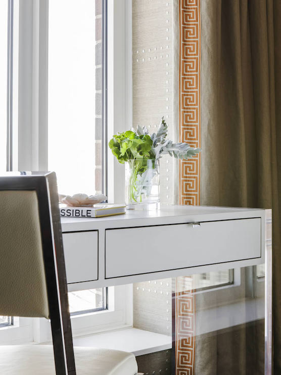
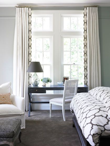
-Add trim.  Purchase inexpensive, plain panels from Ikea or a discount retailer and dress them up with custom tape trim.  If you’re not an avid sewer, you can use Stitch Witchery and iron it on.

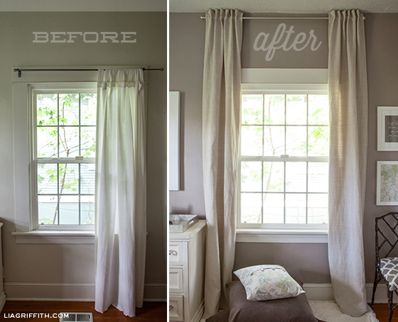
-Hang them high.  We’ve mentioned this several times on here, but it’s worth repeating.  Purchase curtains all long as you can to fit in your ceiling height and hang the curtain rod as high as possible while still allowing the panels to skim the floor like in the image above.  It will make your room and your panels look even grander. Here's a great before/after illustration showing the difference.

2. Custom furniture.

Custom furniture is a costly venture and can often take a lot of time to receive.  Instead, opt for a piece that you can pick up in store at a furniture retailer or discount décor store (HomeGoods!) and then get a local shop to reupholster the back in a different (perhaps more expensive) fabric for a unique look. You can even add embellishments like nailhead trim.  You're left with a custom-look for a fraction of the price!

custom fabric back chair


3.  Custom art.

Instead of the store-bought, mass produced art options, support small business and shop from Etsy or a local artist. To frame the piece, purchase an inexpensive frame from HomeGoods or a craft store and get a custom mat cut to fit the frame.  Opt for a wider mat or off-centered cut for a more custom look.

Try these three tips to update your home with a designer look!