Get the Look-Monochromatic Bedroom

Have you guys seen the new home of Natalie Morales from the Today show?  She reportedly just purchased a home in Brentwood, CA for her new West Coast gig, and the listing photos are gorgeous.  In case you missed it, I'll give you a mini tour of my favorite rooms.

But first, let's all take in this beautiful back exterior.  Would wouldn't want this to be the back of their house??  Look at all of those porches and windows!

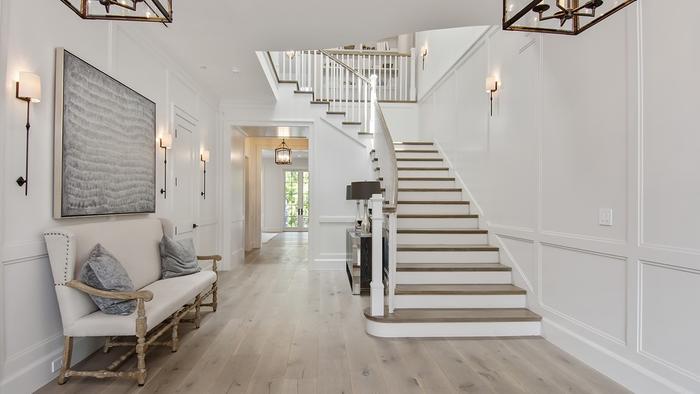
A simple and stunning entry greets guests when they walk in the home.  I love those oversized sconces and artwork.

This monochromatic transitional look has the best lighting in the house--natural lighting from those huge glass doors!  I will never tire of those iron and glass doors.

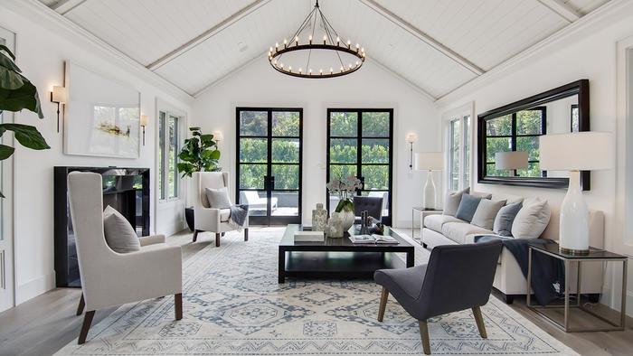
Again, there isn't a ton of color in the space, but that doesn't mean it lacks interest.  The leather mixed with the wood, mixed with the iron, mixed the stripes...it's good.

If you're going to go for some color, why not do it in the office/library?  It is typically a place that is used for igniting creativity and thought, and this blue will do just that.  The light fixture and Spanish style desk with those gorgeous turned legs aren't so bad either...

Now for the bedroom, a place of relaxation and rest.  What's more fitting than calming, tone-on-tone furnishings?

all images via realtor.com

all images via realtor.com

Me and my neutral-loving ways were instantly attracted to this monochromatic bedroom.  It's very easy for a completely light room to look very sterile and flat, but the stagers here did a great job adding warmth and layers through varying textures.  That's the key!  I decided to do a "Get the Look" to show you how it could easily translate into your own bedroom.

get the look monochromatic bedroom natalie morales

What's your favorite room?  Comment below to let us know!

Until next time...

A Tale of Two Baths

In the second installment of a "Tale of Two..." we're featuring two bath designs we recently completed for a client new build.  Unlike our last client in the "tale of two kitchens," this family was able to nail down a favorite.  But in the interest of showing you a bit more of our process and this gorgeous bath (if we do say so ourselves), we thought we'd share the two options with you.    

boothbay gray bathroom edesign mood board 3a design studio

Option A features cabinets painted in Benjamin Moore's Boothbay Gray (HC-165) with matte black hardware and porcelain floors that mimic marble without all of the upkeep.  Two different light fixture options with natural wood accents were given for hanging above the fabulous soaking tub.

lamp room gray farrow and ball bathroom edesign mood board 3a design studio

Option B had the same tile but a different vanity color (Lamp Room Gray by Farrow & Ball) with a lighter option of wood mirrors with satin nickel hardware.  As with Option A, two different ceiling lights were given to leave the client with the final decision. 

Many times, we supply our clients with a couple of perfectly great options and give them the freedom to "pull the trigger" so to speak on the option they gravitate toward the most.  We've found that while most clients come to us feeling lost or overwhelmed with a space, they still want to feel a part of the process in the end.  Narrowing down some choices but leaving the final decision with them, is a great way to not only give them confidence but to also help them feel invested in the space---after all, it is their home.  We love that part of our job!

With these baths, we didn't think the client could go wrong with either option (obviously we had a hard time picking a favorite ourselves), but which one would you choose for your home?  Comment below and tell us which one "speaks" to you. 

We'll have more designs from this beautiful home coming up soon.  Stayed tuned!

Client Project-Nautical Nursery

Is it just us, or is everyone you know having babies these days?  We have a few nurseries in the works right now, and couple we're waiting to get "after" pictures of.  So exciting.  We LOVE doing nurseries and kid rooms!

Here is a recent one for an October baby.  The family wanted a nautical look without plastering sailboats on everything in sight--challenge accepted.  The walls are being painted in thick gray and white stripes and all of the large furniture pieces in the room will have a neutral palette.  There will be little pops of blue here and there with a few vintage whale pieces making an appearance as well.  Also, in the room, the client's antique, cane seat rocker (we couldn't find a matching one online, so the one on the mood board is just for a reference), but who doesn't love antique kid-sized piece of furniture??   

nautical nursery moodboard edesign 3a design studio

Gray blackout curtains were a must because---babies and sleep.  Ikea's Hemnes gray-brown dresser from a few years back is still on point.  Serena & Lily bedding was chosen with trellis sheets and nursery basics bumper and skirt in blue.  And this sailboat toile pillow
 (on sale!) will be perfect in the rocker. 

Stacked white floating shelves will keep decor off of the dresser, which will also function as the changing table and a rope mirror will hang above to bring in some more natural light from the room's single window. 

We can't wait to see photos of this one!

If you need help with your little one's room, or any room for that matter, contact us here
 and we'll help you get started!

Condo Refresh

With summer vacation days coming to a close, condo owners are assessing their rentals and looking to refresh their properties to get more bang for their buck next year.  I don't know about you, but one of the main things I look at when renting a condo (next to location) is the style of the place.  If you're going away, you'd like it to be a place you want to relax, right?  A place you want to spend time.  A place to make you feel like you're on a vacation.  

A few design updates can go a long way when sprucing up a condo.  And thinking outside of the coastal cookie cutter box can make your condo stand out among the rest of the competition. 

Here a condo E-Design we recently completed.  They didn't need a full overhaul-just a little refresh, and we were more than happy to oblige.

With a great neutral backdrop to start, all we had to do was add in a few new pieces to bring this place back to life.  We suggested updating the kitchen with a new backsplash in these coastal blue arabesque tiles and replacing the existing can lights over the bar with these antique nickel pendants.  Finishing off the updated kitchen, we suggested using these modern, easy to clean acrylic bar stools in lieu of the dated wooden ones they had.

In the living area we added in a durable seagrass rug one size larger than their existing one (scale is huge), brought in some new pillows for their existing slipcovered sofa and added some blue lamps.  The blue color and acrylic base of the lamps tie into the tile and barstools in the adjoining kitchen, and the fabric on the pillows (great for camouflaging stains) has a coral inspired look with a slightly unexpected color palette. Update complete!

If you're looking to update your condo or rental, here are a few things to consider giving a "refresh"--

  • lighting
  • pillows
  • wall paint colors
  • hardware
  • backsplash
  • rugs

And if you have no idea where to start, contact us and read more about our E-Design process here.  We'd love to help!


Baby R's Nursery Update- Decision Time

This past week I've been in major nesting mode wanting to check everything off of my never-ending house to do list--specifically in the new nursery.  Jon and I have a lot of cleaning out to do (it's currently his "man cave"/catch all room) before the real decor can even go up.  I'm one who loves to clean out and organize as it is, but when you add in a baby, it's even worse.

In an attempt to get a move on, I've been finalizing some nursery decisions so that all pieces are here when it's time to get everything in its place.  Specifically, the curtains have been ordered and sheets have been decided.  

Here are the four curtain options I was considering:

Desktop45-001.jpg

one // two // three // four

After much consideration (and a little help from my fellow design friends), I chose option number one with a blackout lining.  You may remember the top part of the room is painted a dark charcoal color so I really wanted something light to balance it out.  And down the road, when the girls start sharing a room, these will easily transition to a non-nursery room.  

I also picked out my crib sheets.  I loved the blue trellis ones from Serena & Lily that I used in Auden's room, and I think the mocha option will work great in the new nursery.  And because my love for block print can't be stopped, I really like this booti pink print from Rikshaw Designs.  The bed skirt is a muted petal pink linen-cotton one from Restoration Hardware Baby & Child and the bumpers will be the white pique with gray trim we used for Auden.  I plan on flipping it around so I can monogram the other side for this baby.  Waste not, want not, right?

With those items being confirmed, here is the updated mood board.  If you need a refresher, here is the starting point from over a month ago.   

The other new items are these gold leaf frames from West Elm and these beaded ones from Design Aglow for her gallery wall.  I purchased this art print from Jones Design Company months ago (before I was even pregnant) and think it will work great in the room.  The other new contender is this lamp by Nate Berkus.  I saw it in Target and immediately fell for the modern lines and acrylic base.  Because I love a good mix of modern and vintage, I think this will be a great addition to keep that balance.  

So that's the latest for Baby R.  What do you think?  

I'm off to get my nesting fix on and start cleaning out the man cave closet with the hubs!  As you can imagine, he's thrilled to be doing this on his off day ;)

Until next time...


Turks Review and Backyard Inspiration

My husband and I got back home from beautiful Turks and Caicos late last night.  We had a wonderful trip and had a lot of sun and relaxation.  I also used this trip to make a little announcement...

beach pregnancy announcement

That's right.  Baby number 2 is on the way!  We'll be adding another little human to our brood in early October/late September, and we're so excited!

Knowing that our lives are about to get more hectic (and more wonderful), it was great having this time to simply enjoy each other without any interruptions or early wakeup calls.

The Gansevoort Turks + Caicos was the perfect spot to do just that.  The beach was something you can only dream of and the pool was a little slice of heaven.

gansevoort turks beach
gansevoort turks pool
gansevoort turks pool 2

It's easy to see why we didn't want to leave, isn't it?  

The pool area was a favorite of mine.  The mix of white, aqua and wood was done so well and the palm tree and flower backdrops just made it perfect.  But if you can't get to paradise yourself, you can create your own backyard oasis with these items.

gansevoort backyard oasis mood board .jpg

Until next time...