Chalkboard Walls: A Job Well-Done
/We recently painted a wall in our house with chalkboard paint. It's a small little wall that includes a doorway, leading from our would-be dining room to our kitchen. Lucky for us (kind of), we have a very spacious breakfast nook which we use for all our meals, and now we've decided to make the dining room a permanent "learning/play space" for children (and the contents of the space tend to overspill into other rooms of the house, but I think that comes with the territory of children--not necessarily the location of the space).
Anyway, that room is slowly working itself into something visually pleasing (which I'll save for a much later reveal), but for now, let's take a look at some of my favorite inspiration photos and why they work:
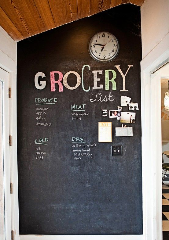
From top to bottom this whole wall has been covered. And to add some visual interest and bring your eye to the unique geometry of the space, they've added a wall clock and some personalized hangings. Love it!
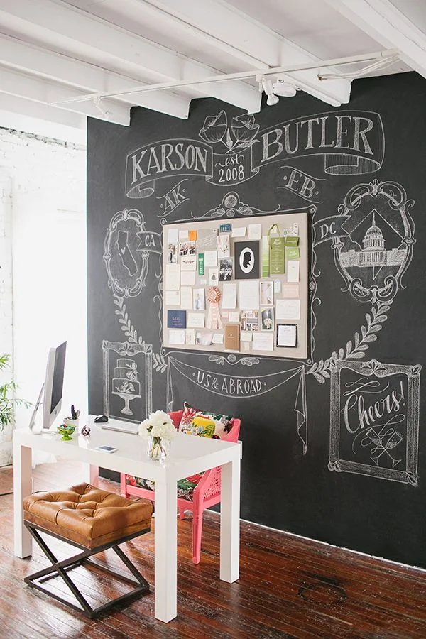
Karson Butler Events' clever workspace via Inspired by This
Another floor to ceiling chalkboard wall, this black background not only adds some weight to the light and airy workspace, but it doubles as an inspiration board.
Love this! This was one of my main inspirations for our wall. Not only is it an art wall, but it also has an organization function. Everything is neatly placed and ready to become...well...I'm sure not-so-neat ;)
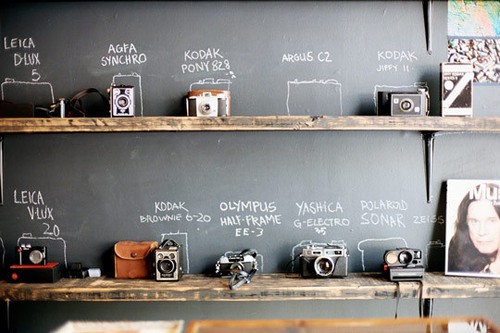
vintage camera wall photographed by Shawn Hoke, image via Mint Design Blog
Very clever! This shelving and display wall was given a masculine dark backdrop that helps to catalogue this collector's findings.
image via Dear Lillie blog
A great use of a framed chalkboard space here. I've seen a lot of framed chalkboards, but they tend to all just be floating in the middle of the wall. Terrible. But here, our friend Dear Lillie made it a nice accessory to her well-styled console table, grounding it nicely and tying it in with the rest of the wall space. Very well done!
Preschool learning corner via The Sweatman Family Blog
Another great framed chalkboard. This one, although not as detailed as the image above, still works well. It's height is directly relative to the shelves on the adjacent wall, and the nice accessories below help it not to have that "floating in space" look. This is also similar to what we're going for in our house.
Image from Isabella and Max Rooms via Lauren Liess
I love that this wall is the both the backdrop and the accessory for a gallery wall. The black frames stand out just enough from the deep charcoal walls, and having small frames for your chalk doodles or latest inspirations suggests it's importance to you-- just like the other items in the collage. So smart!
image via Valspar
Another cool thing about chalkboard paint that might not be evident at first is that it comes in a lot of colors. Several manufacturers carry it, but we got ours in a tinted can of Valspar at Lowes. They had a ton of colors! We are able to come very close to matching our other accent wall which is a dark, warm gray (and the walls are not adjacent so you really can't even tell they're not the same color).
So, based on the above collection of great examples of chalkboard wall execution, I've put together the following guidelines for painting a chalkboard wall in your home:
1. Choose your wall and color carefully. Are you going to go black? If not, the color should relate to the walls in the rest of your home. Just because it's a chalkboard wall doesn't mean it is exempt from relating to the design scheme. And if you are going black (especially a whole wall), make sure the space can handle it. If you're not going for "moody," make sure you've got a lot of good light.
2. Give it borders. Either paint the wall edge to edge, or consider the balance of your selected area. If you're not going edge-to-edge, give it a frame or border. And make sure it's not floating by it's lonesome by itself. Add surrounding furniture or wall decor.
3. Give it a purpose. Do you want a chalkboard wall just to doodle on? Consider what you might doodle there. A welcoming logo for visitors, daily motivations, reminders, etc. Are your children using it? Add to it's purpose accordingly. Give it some character just like you would any other wall in your home.
4. Accessorize. This goes with 2 and 3 above. Is it solely a doodle wall? Then perhaps put some artsy prints on the area you won't be doodling on. Or whatever inspires your creativity. Is it for organization? Invest in some good shelving or wall hooks. Add a magnetic board or cork board. Tape off a calendar with washi tape. Get creative!
5. Don't neglect it. Ours has week-old doodles and half-erased scribbles on it right now, and it desperately needs a clean sweep to make room for new ones. Granted, it is a kid space, so a little messiness is understandable, but if your area is frequently seen by guests, fix any smudges, keep it updated, and rotate out your design for something new on a regular basis.
If you've been loving some chalkboard inspirations lately, I would definitely nudge you in the direction of "go for it!" After all, it's just one wall. Even though we painted ours for our daughter, we've all found ourselves using it from time to time. I have a lovely garland drawn around our doorway. And having some attention brought to the wall has inspired us to do other things in the space. I love it.
(Although, word of advice, especially if you use a brand like Valspar--the no VOC rule does not apply to chalkboard paint! I assumed because it was Valspar it was safe to sit my tired pregnant booty on the sofa while my husband painted. A dizzy spell and headache later, I decided to read the paint can and noticed the strong advisory to paint in a well-ventilated area. Oops! Sorry, baby! I left the room and we opened the windows after that...)
Happy creating, friends!
Until next time...


