A Bright New Sunroom
/While it can be fun to work in existing pieces into a client's space, we don't typically get clean slates to work with. So when a client of ours moved into a new house and came to us to outfit her gorgeous, light-filled sunroom, we were excited. But let's get serious--we are always excited about design ;)
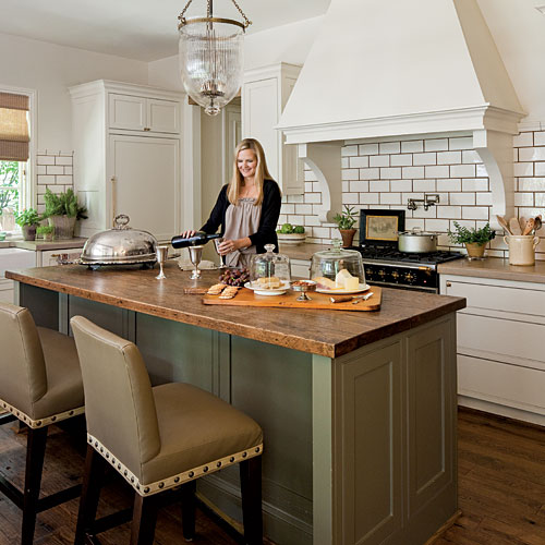
To top it off, she sent us this really great inspiration photo of her style.
image via Southern Living, kitchen designed by Melanie Pounds
That image was enough to instantly transform the space in our minds. With each project, we all see something slightly different for the end result. So when we have the conversation "what is everyone thinking for this room?" it's always fun to see what we have in mind--how different, and how similar our thoughts are. But this time we pretty much came together in unison:
Natural woods, warm neutrals, whites, muted kelly and lime greens, and natural greenery. It's a sunroom after all!
So let's see a few more inspiration photos of this sort of color scheme:
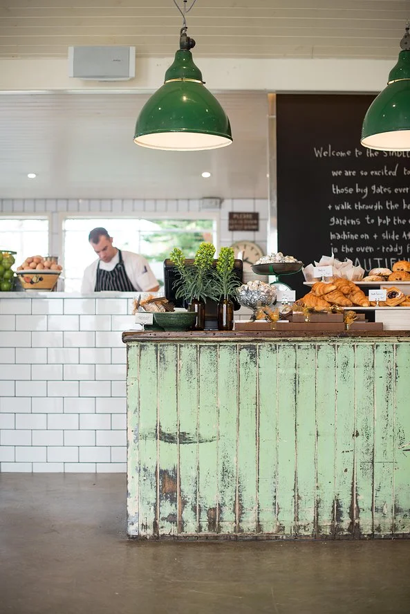
Image of the Stables of Como via Desire to Inspire
Those pendants! I need those pendants! Also a blueberry scone would be nice.
Image via Dear Lillie Blog
Great use of texture layering in this cozy sunroom. Notice how dark the walls are, yet the space still feels very light and airy. Also, if you fear you have a black thumb, fresh cut greenery always does the trick. I find the $6 bundles at Publix to be perfect for this--and they last two weeks sometimes! Talk about getting your money's worth!
image via; original source unknown
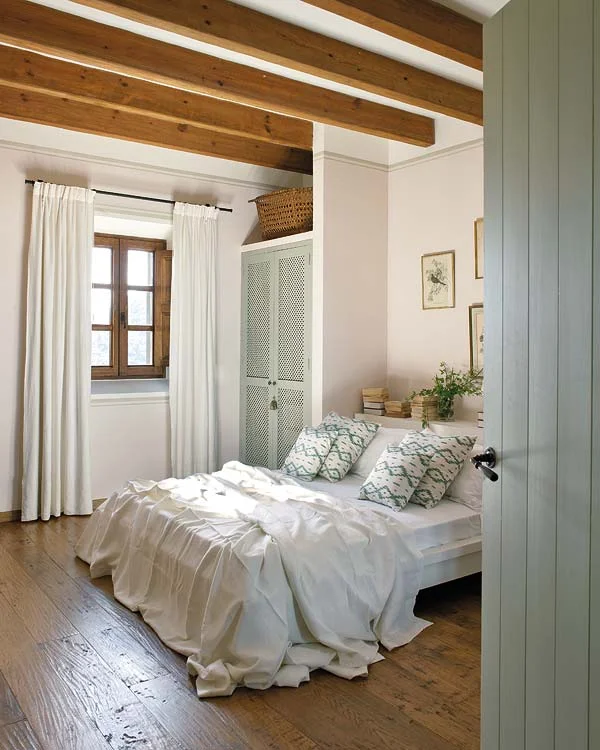
I wish I knew who designed this bedroom. Because there are few things that I've loved more than this bedroom. The screened closet doors...the bed alcove...the perfect weight of those draperies...I think I'm spotting natural linen bed coverings. And does anyone else have a strong urge to run over to the window and open it up?
Image from designer Charles de Lisle via Remodelista
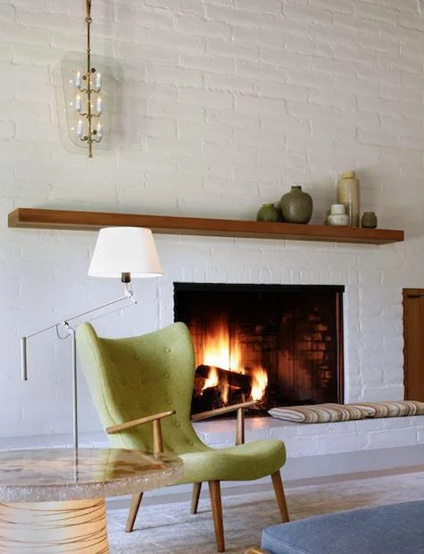
Loving the clean lines of this modern danish home--set off perfectly by the pop of green and the curves in that wonderful chair!
So now let's have a look at how we made the space work. The room is long, narrow and full of windows and white painted brick. The floors are a warm brown tile. A dream of a sunroom and blank slate.
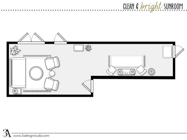
Here's the floorplan:
Every wall in the room is filled with windows edge-to-edge--either to the outside or to the inside of the home. So we couldn't get carried away with large furniture pieces that would block the view or the light from entering the home from outside. The top and right part of the room lead to the outside, and the door at the bottom on that little side wall leads into the kitchen and breakfast nook. So we had to keep those paths open. Another important feature that the client wanted was a that everything remain comfortable as a gathering space for friends and family. So we created two spaces within the one: a small bar height area, and a comfy lounge and conversation area. The large piece to the far left is actually a daybed with a twin mattress--perfect for cuddling and naps!
We suggested a few spaces to place natural greenery--but we recommended getting as many as the clients were comfortable with. I've personally found gardening--even in home--to be quite enjoyable. It's peaceful, adds great texture to any space, and there's a small sense of pride watching a plant grow and thrive (and most importantly, not die). They're also inexpensive decor, and improve indoor air quality. Get over to your local nursery today and find out how you can incorporate some natural greenery into your home. Please do not use fake plants in your home! And please PLEASE do not use silk plants on top of your furniture or cabinets. Wanna impress a designer? That's step one.
Moving on...
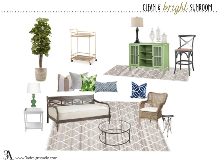
Here's the moodboard for the room:
As you can see, we stumbled up on some navy throw pillows and decided to use that as a secondary accent color to the greens. We love it! We decided to go with wicker chairs for two reasons: the first was cost, and the second was overall durability. A lot of wicker chairs can be very comfortable with good cushions, and those cushions can be easily replaced to update the look of the chair (or if they just get worn out from use). We also didn't want many fully upholstered pieces because of the amount of sunlight coming in. That should always be considered when picking upholstery fabric for your space. If your piece has a lot of color and is in direct sunlight, expect fading to occur, and have a plan in action to prevent it--either light window coverings or a UV resistance (Sunbrella is very popular for this). However, either of these options can get pricey, so we went the most economical route ;)
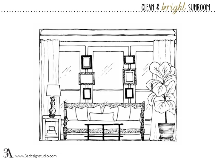
And lastly, here's an elevation sketch of the conversation area wall:
These clients are natural light lovers (as we all should be!). So they didn't want heavy window treatments blocking out their light. Well, we thought of just about every way to add some sort of sheers or something to the windows, just to dress them, but with the way the windows are spaced and sized in the room, it would be either very difficult, or very expensive...but probably both. However, we did get away with adding them to frame out this comfy conversation and lounge area. Nothing to cover the windows, but just enough to add some softness and texture.
We even suggested a collection of artwork hung in the small space between the windows. We've seen this done a lot lately--even with installing mirrors over windows in bathrooms--and we love it. It's another very clever way to decorate your walls when your walls happen to be all windows. And this wall goes out to the side yard of the house, so it's not blocking any major views.
Do you love it? We do! I want that space in my own house!
Another one in the 3A books.
Do you need help with a blank slate in your home? Or even a not-so-blank slate that just needs some finishing? Read more about E-Design here, or contact us here. We would love to help create a space that's perfect for your style and needs.
Until next time!
