Christmas Decor... for a Boy's Room

If you're like us, you want the holidays to last a lot longer than the calendar says they should.  One of us (*cough* Jessica) may have even put up our tree before mid November. :)

There's just so much joy, sparkle (literally) and comfort in Christmas decor.  In fact, we love it so much we thought, "Why not extend the holly and jolly to the kids' bedrooms?"  I mean if there were ever such a place for wonder and delight it's there, right?

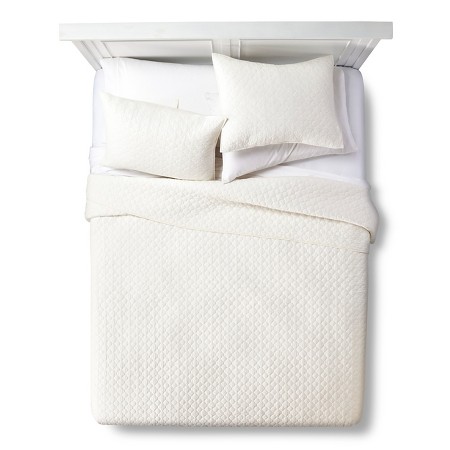
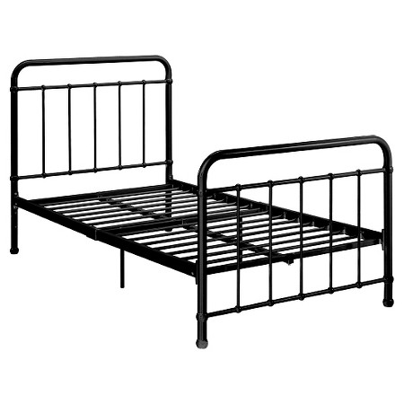
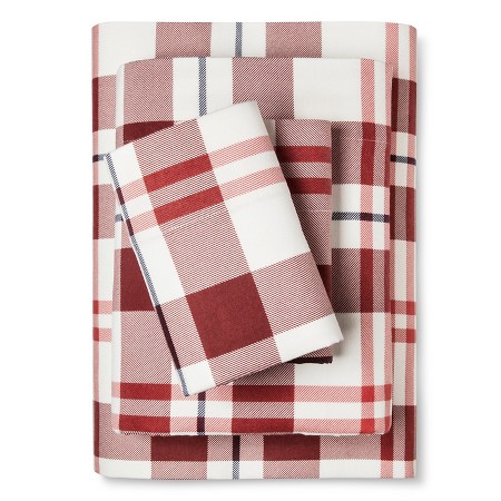
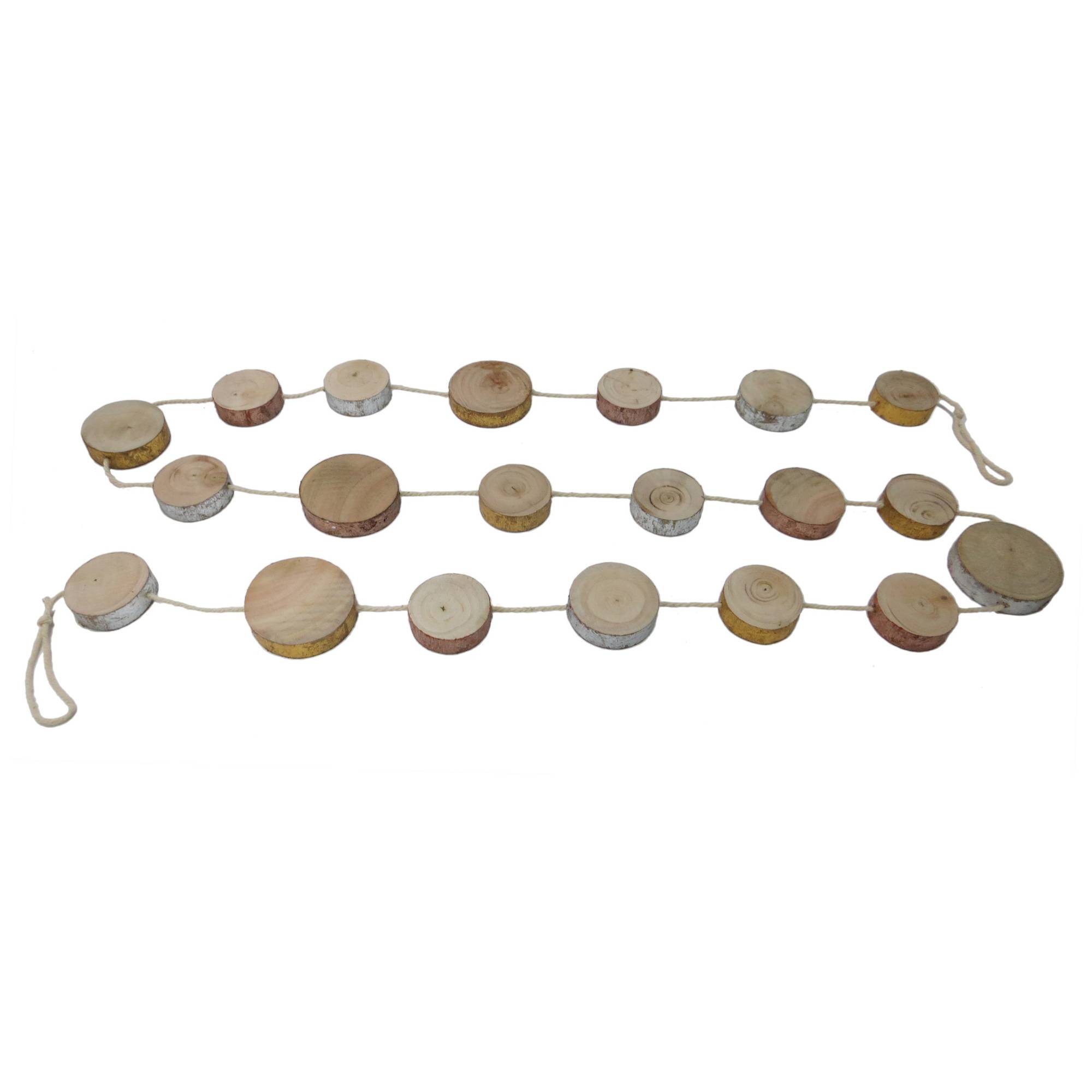
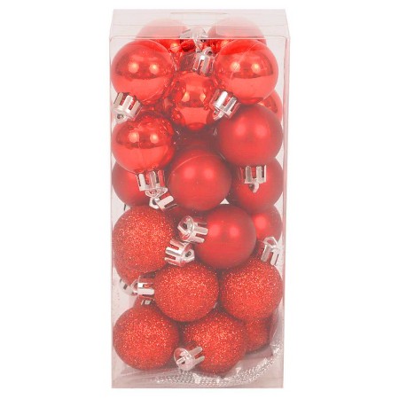
Starting with the gentlemen...Here's how to dress up your boy's room with a few touches of holiday cheer...all from Target!  There are some great deals...$20 tree, $14 flannel twin sheets, etc.  And they are all pieces you could use for years to come.  My favorite piece might be that wood garland.  So cute! 

We hope you enjoy decking the halls!  We'll be back with decor for a girl's room later.

Boys room christmas decor 3a design studio.jpg

{Click images for sources}

Get the Look-Monochromatic Bedroom

Have you guys seen the new home of Natalie Morales from the Today show?  She reportedly just purchased a home in Brentwood, CA for her new West Coast gig, and the listing photos are gorgeous.  In case you missed it, I'll give you a mini tour of my favorite rooms.

But first, let's all take in this beautiful back exterior.  Would wouldn't want this to be the back of their house??  Look at all of those porches and windows!

A simple and stunning entry greets guests when they walk in the home.  I love those oversized sconces and artwork.

This monochromatic transitional look has the best lighting in the house--natural lighting from those huge glass doors!  I will never tire of those iron and glass doors.

Again, there isn't a ton of color in the space, but that doesn't mean it lacks interest.  The leather mixed with the wood, mixed with the iron, mixed the stripes...it's good.

If you're going to go for some color, why not do it in the office/library?  It is typically a place that is used for igniting creativity and thought, and this blue will do just that.  The light fixture and Spanish style desk with those gorgeous turned legs aren't so bad either...

Now for the bedroom, a place of relaxation and rest.  What's more fitting than calming, tone-on-tone furnishings?

all images via realtor.com

all images via realtor.com

Me and my neutral-loving ways were instantly attracted to this monochromatic bedroom.  It's very easy for a completely light room to look very sterile and flat, but the stagers here did a great job adding warmth and layers through varying textures.  That's the key!  I decided to do a "Get the Look" to show you how it could easily translate into your own bedroom.

get the look monochromatic bedroom natalie morales

What's your favorite room?  Comment below to let us know!

Until next time...

Ten Small Pools that are Big on Style

Like most of the U.S. it has been soo HOT here. This heat has me wishing we had a pool. Not a big one that takes up a lot of yard, but a plunge pool big enough for the family to cool off in. I have started compiling inspiration images of what our perfect small pool would look like.

Here are a few pools that are big on style but do not take up a lot of space.

1.

Not too big, not too small. Just right.

2.

The glass gate around this pool offers safety for the little ones while still looking very stylish.

3.

Lap pools are great in tight areas due to their long and narrow shape.

4.

Is this not the prettiest lap pool?!

5.

A raised pool is a great look and also helps prevent accidental falls in to the pool. Can you tell I have a toddler with all my safety concerns? :)

Via Pinterest

Via Pinterest

6.

This raised pool is located at the chic Casa Fayette in Mexico. Experience would be complete with a margarita in hand.

Via Pinterest

Via Pinterest

7.

8.

Ideally I would like a pool without a lot of cement surrounding it. Below is a neat take on the pool surround by visually breaking up the cement with grass cutting through it.

9.

This beauty is located on the Gulf Coast in Alys Beach. Probably too small for us but the design is gorgeous.

10.

Last but not least, this pool offers a nice change from the typical rectangular shape.

While soaking in our new pool, how cute would it be drinking from these straws created by OhJoy?! Click here to download the free template.

Do you have any tips on what to look for in a new pool? If so, i would love to hear from you.

A Tale of Two Baths

In the second installment of a "Tale of Two..." we're featuring two bath designs we recently completed for a client new build.  Unlike our last client in the "tale of two kitchens," this family was able to nail down a favorite.  But in the interest of showing you a bit more of our process and this gorgeous bath (if we do say so ourselves), we thought we'd share the two options with you.    

boothbay gray bathroom edesign mood board 3a design studio

Option A features cabinets painted in Benjamin Moore's Boothbay Gray (HC-165) with matte black hardware and porcelain floors that mimic marble without all of the upkeep.  Two different light fixture options with natural wood accents were given for hanging above the fabulous soaking tub.

lamp room gray farrow and ball bathroom edesign mood board 3a design studio

Option B had the same tile but a different vanity color (Lamp Room Gray by Farrow & Ball) with a lighter option of wood mirrors with satin nickel hardware.  As with Option A, two different ceiling lights were given to leave the client with the final decision. 

Many times, we supply our clients with a couple of perfectly great options and give them the freedom to "pull the trigger" so to speak on the option they gravitate toward the most.  We've found that while most clients come to us feeling lost or overwhelmed with a space, they still want to feel a part of the process in the end.  Narrowing down some choices but leaving the final decision with them, is a great way to not only give them confidence but to also help them feel invested in the space---after all, it is their home.  We love that part of our job!

With these baths, we didn't think the client could go wrong with either option (obviously we had a hard time picking a favorite ourselves), but which one would you choose for your home?  Comment below and tell us which one "speaks" to you. 

We'll have more designs from this beautiful home coming up soon.  Stayed tuned!

Client Project-Nautical Nursery

Is it just us, or is everyone you know having babies these days?  We have a few nurseries in the works right now, and couple we're waiting to get "after" pictures of.  So exciting.  We LOVE doing nurseries and kid rooms!

Here is a recent one for an October baby.  The family wanted a nautical look without plastering sailboats on everything in sight--challenge accepted.  The walls are being painted in thick gray and white stripes and all of the large furniture pieces in the room will have a neutral palette.  There will be little pops of blue here and there with a few vintage whale pieces making an appearance as well.  Also, in the room, the client's antique, cane seat rocker (we couldn't find a matching one online, so the one on the mood board is just for a reference), but who doesn't love antique kid-sized piece of furniture??   

nautical nursery moodboard edesign 3a design studio

Gray blackout curtains were a must because---babies and sleep.  Ikea's Hemnes gray-brown dresser from a few years back is still on point.  Serena & Lily bedding was chosen with trellis sheets and nursery basics bumper and skirt in blue.  And this sailboat toile pillow
 (on sale!) will be perfect in the rocker. 

Stacked white floating shelves will keep decor off of the dresser, which will also function as the changing table and a rope mirror will hang above to bring in some more natural light from the room's single window. 

We can't wait to see photos of this one!

If you need help with your little one's room, or any room for that matter, contact us here
 and we'll help you get started!

Client Project-Farmhouse Entry and Dining Room

Hello, hello!  Summer is officially here (as in school is out for our kiddos), and we have been working hard on a few projects before the chaos ensues (hopefully not).  So we wanted to drop in and share a few new designs with you!

Today's design is for an entry/dining/sitting area that opens up to the clients' large kitchen.  It's a big space with pine wood clad walls and a stone-covered hearth. 

Because this space will function as multiple things on multiple occasions, we kept the pieces classic and timeless but with a touch of "farm."  The kitchen cabinets will be painted in White Dove by Benjamin Moore, one of our favorite white cabinet colors, and the rest of the color scheme is neutral with touches of blue and green.  Of course, we also brought in lots of texture!

As you can see, we offered two options for the dining room seating and suggested slipcovers since the clients have kiddos themselves.  Aside from the wood bead Regina Andrew chandelier, the lamps on the entry table and rope hanging mirror are two of my personal favorites in the space.  I think I could put those Visual Comfort Thomas O'Brien lamps in every design I do and be happy.

Lighting is one of the largest ways to transform a space, and since the chandelier we suggested was a big buy, we also supplied some real life images of it so the clients could get a better idea of its look before pulling the trigger.  Even though this is an E-Design, we still want clients to feel as if they are out shopping with us!

So there's a little peek into our latest work and our process!  We'll be back soon with some more client designs to share with you guys!