The Beginnings of a Nursery

My husband and I recently found out Baby #2 is a....GIRL!

gender reveal beach balloons

I'm so excited that Auden will have a little sister as close in age as me and my sister were.  I can't wait to watch them grow up and form the sweetest bond.  Jon and Remi (our boy dog) will be outnumbered in the best possible way.

Now that we know the baby's gender, it's time to begin the nursery design!  Unfortunately, Jon's man cave was a short-lived affair and will now become the new nursery. Because we recently painted and added board and batten in the room, we are going to keep that as the backdrop.  The room is currently painted in Benjamin Moore's Charcoal Slate so to combat the dark hue, I'm going to add soft colors and textures to the space.

Several of the items from Auden's room will be moved over including the crib, crib bumper, floor lamp and rocker.  And the dresser I'm going to use is a family piece that currently resides in our guest room.  So the only items left to buy are a new crib skirt, curtains, rug, accessories and art.   

Here's what I'm imagining at the present...

elegant vintage antique girl nursery by 3adesignstudio

I want the overall feel to be warm, sophisticated and cozy with lots of character. 

SOURCES:
Crib-Tate Crib by Restoration Hardware Baby & Child (sold out)
Empire Rocker by NurseryWorks
Gray and White Pique Bumper
Rug-vintage from Etsy
Dresser-family piece
Crib Skirt-RHB&C
Flax Stripe Pillow (on final sale at RHB&C)
Vintage Brass Chandelier-Thrift store find from years ago
Floral Block Pillow-Williams-Sonoma Home (sold out)
Paint-Charcoal Slate by Benjamin Moore

So that's the plan for right now.  What do you guys think?  


Favorite Online Bedding Resources

If there's one way to finish off a bedroom or nursery with a designer's touch, it's with great bedding.  Just as we are against a matching set of furniture, so too are we against the good ol' "bed in a bag."  I know that these are made in an attempt to have you believe that by using the pieces provided, you'll achieve custom-looking bedding but I assure you, the opposite is true.  

Mixing and matching bedding pieces is the way to go--and it's so fun!  Mixing and matching colors, textures and patterns will instantly give your bedding a beautiful layered look that was thoughtfully put together.  

Below I've outlined a few of my favorite online bedding resources for adults and children/babies for easy shopping.  Don't be afraid to mix and match items from different retailers to finish your look!

Best bedding sources by 3A Design Studio

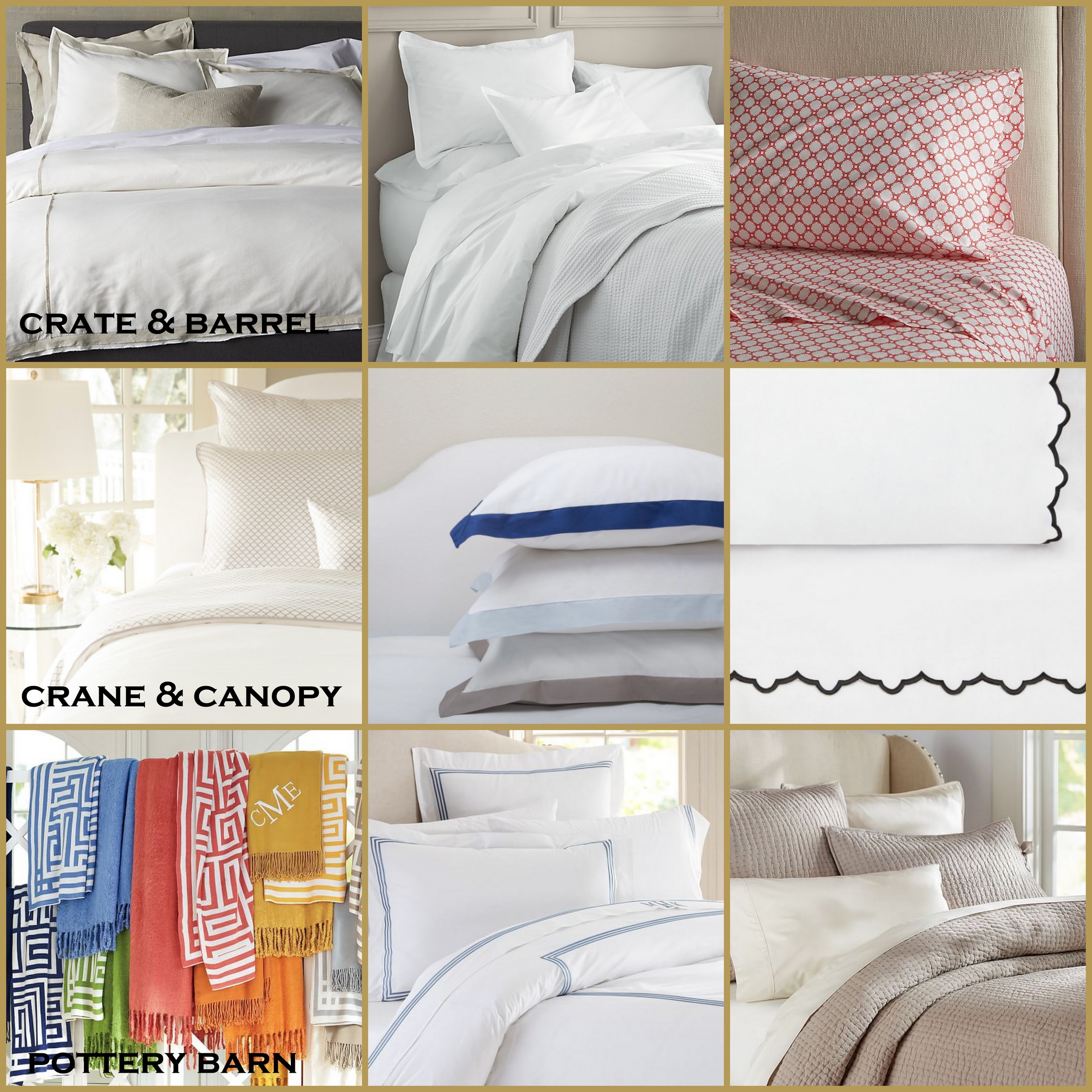
CRATE & BARREL
They have a lot of great foundation pieces (linen duvet covers, solid quilts) on which to build the rest of your bedding.  I also love their patterned sheets to add a little fun to any room.  And furthermore, they have great sales!

CRANE & CANOPY
Bedding is what they do so naturally they are going to have a lot of great options.  Beautiful, subtle patterned sheets and shams, soft duvets outlined in every color of the rainbow and gorgeous scalloped sheets that I mentioned here.  They also usually run a lot great sales.

POTTERY BARN
This retailer is not new to anyone.  My favorite pieces from them are the embroidered duvets and pick-stitch quilts.  They also have a new line of greek key throws that are amazing.

For kids and babies in your life, here are my favorites sources:

SERENA & LILY
They have well-designed crib sheet patterns (that are also super soft), a bedding basics collection with bumpers/crib skirts in every color and an assortment of unique pieces like this macramé crib skirt.  

LAND OF NOD
Home to whimsical and playful bedding options from crib sizes up to a queen (something that's usually hard to find in kid-friendly prints).  They also have an assortment of duvets and unique crib bedding.  And when they run a sale, it's usually a great one!

RESTORATION HARDWARE BABY & CHILD
If you're looking for soft tones, comfortable fabrics and subtle patterns, RHBC is your guy.  I'm particularly fond of their washed linen and matelasse crib bedding collections.  They also have a ton of great sheet options and will send you swatch samples for free!

So the next time you're looking to update your bedding, give these sources a look first and say "good bye!" to the bed in the bag!


Big Girl Bedding

My little girl will be 17 months old this month, and I've started thinking about what her room will look like once she's out of her crib and in a "big girl" bed.  I'm fortunate enough to have some gorgeous antique twin beds passed down from my great grandmother that I'm going to get to use in her room.  They have beautifully carved headboards with matching footboards, and I want them to be the show stoppers in the room.

Even if I had different beds, I think I'd still want to keep the bedding pretty simple though.  There's something so sweet about predomimently white bedding with a pop of color for a little girl.  I know I want to use a white coverlet with a folded fluffy duvet at the foot of the bed.  I'll keep the sheets a simple white with a colored scallop detail like these.   

For the pillows, I'm thinking of a sham with a matching color border like these, also from Crane and Canopy.

To finish the look, I envision a decorative pillow in the front.  Here are a few of my favorites at the moment.

decorative pillows for a girls room

As you can tell, I'm really loving floral block prints right now.  There's just something so sweet and feminine about them.  Here are all of the sources:

1- On sale for $29.99 and the back side is beautiful too.
2- This watercolor print is also currently on sale for $31 at Layla and Grace
3- A favorite from Serena and Lily for $68
4- I love the muted colored in this kilim option from Etsy -$69.95
5- The priciest of the bunch at $100, this handmade option is gorgeous

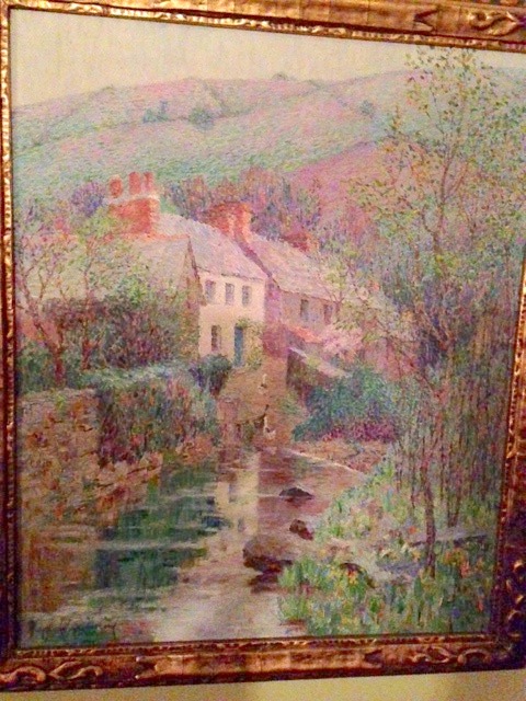
To finish off the room, I'd hang this beautiful painting.  I've admired it since I was a little girl and saw it hanging at my grandmother's house.  Impressionism is by far my favorite art movement and the colors in this piece are just so stunning.

I can't wait to see Auden's room to come together this year.  I hope she'll love it as much as me!


One Artist, Six Nurseries: Mallory's Design

If you've been following us this week, you've seen that we're doing a nursery challenge, where we each design a boy and girl nursery around artwork by the talented, Gingiber.  If you haven't checked out all of the adorable pieces she has to offer, you should!  

Dana detailed her nurseries designs on Monday and Jessica showed her's in the last post.  None of us knew what the other was going to do or use in the room so we've really enjoyed seeing how our different design aesthetics how shown themselves in the spaces.  Now it's my turn for the big reveal.

I love a good, classic design and the same is true in my boy's nursery.  I kept the palette soothing and fun with a play on texture and pattern, and I love the end result.  With darker walls in Benjamin Moore's Winter Solstice and solid ivory (with blackout lining!) curtains, the rest of the fabrics and finishes can take center stage.  And let's not forget to mention the Persidio Glider by Serena and Lily.  It has a removable slipcover--a treasure in the land of baby messes.

Crib // Crib Sheet // Bookcase // Light // Rug // Glider // Pillow Cover // Pouf // Curtains // Dresser // Paint

For my girl nursery, I kept another neutral palette with pops coral and tones of blue and cream for a feminine feel.  I used the Land of Nod Hampshire Dresser in both spaces because it is such a versatile piece that can grow with the child.  The ottoman pouf and curtains (although in a different shade) are also carried over from the boy nursery design.  Again, these are pieces that can work in many spaces (even if you choose to move them to another area in your home later).  I chose another slipcovered glider from Serena and Lily for this space and outfitted it in a coral jaipur print.  It is a bit of a splurge, but the quality and slipcover option will allow for many years of use.

  Crib // Crib Sheet // Bed Skirt // Bookcase // Light // Rug // Glider // Pillow Cover // Pouf // Curtains // Dresser // Paint

The bookcase and beautiful iron crib with upholstered sides are from Pottery Barn Kids.  Here's another shot of the crib (in an alternate finish) to give you a better view of the sides.  I love the mix of the soft upholstery with the iron details.

The light fixture is the finishing jewel in this space.  I've said time and again that light fixtures can truly transform a space and this one is the perfect choice.  The shape is eye-catching and when the bulbs are lit, they will cast a playful shadows around the room.  I have a similar cutout style in my daughter's nursery, and I still love it.

Alright, so that's it!  That's a wrap for our Nursery Challenge week.  We hope you've enjoyed seeing our varying designs as much as we have enjoyed making them.  If you need help with a nursery (or any other room) in your home, please let us know.  

Thanks for coming along for the ride this week!  We'd love to hear which designs and pieces really caught your eye.  Comment on each post or let us know on Facebook.

Get the Look: Estee Stanley Girl's Bedroom

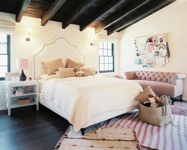
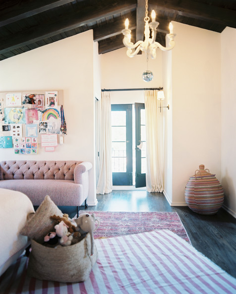
I've long been a fan of celebrity interior designer Estee Stanley's work and this darling little girl's room is no exception.  When I saw it in Lonny several years ago, I instantly fell in love.  The subtle pinks mixed with warm ivories and dark woods make for a sweet and sophisticated space while all of the layers of texture and pattern give it a childish bohemian vibe any little girl would be lucky to call her own. 

The dark wood ceiling and beams might be hard to replicate in your home, but I've put together a few other items to give you the overall look of this beautiful space... just in case you love it as much as I do.

estee stanley girl room via lonny
sophisticated bohemian girls room 3a design studio

Amelia's Nursery Reveal

opt1.jpg

I'm baaaack. Took some time off to enjoy my new little nugget, Amelia Skye. This little being has brought us so much joy. After almost thirteen years, I love being a new mom again.

The day we brought Amelia home, it was so neat to show her her room that I had put together while she was in my womb. I still have a few finishing touches but figured I would go ahead and show you.

If you recall this was the inspiration for the room. I wanted the room to be fun and yet classic at the same time. The room was designed around this sweet flamingo print by Bella and Bunny. Originally, I had planned on wallpapering the wall behind the crib. However, after considering the way the walls stagger and the small size of the room I decided against it since it would make the room feel more choppy. To serve as a soft backdrop, I chose Benjamin Moore's Classic Gray for the walls.

Slide1.jpg

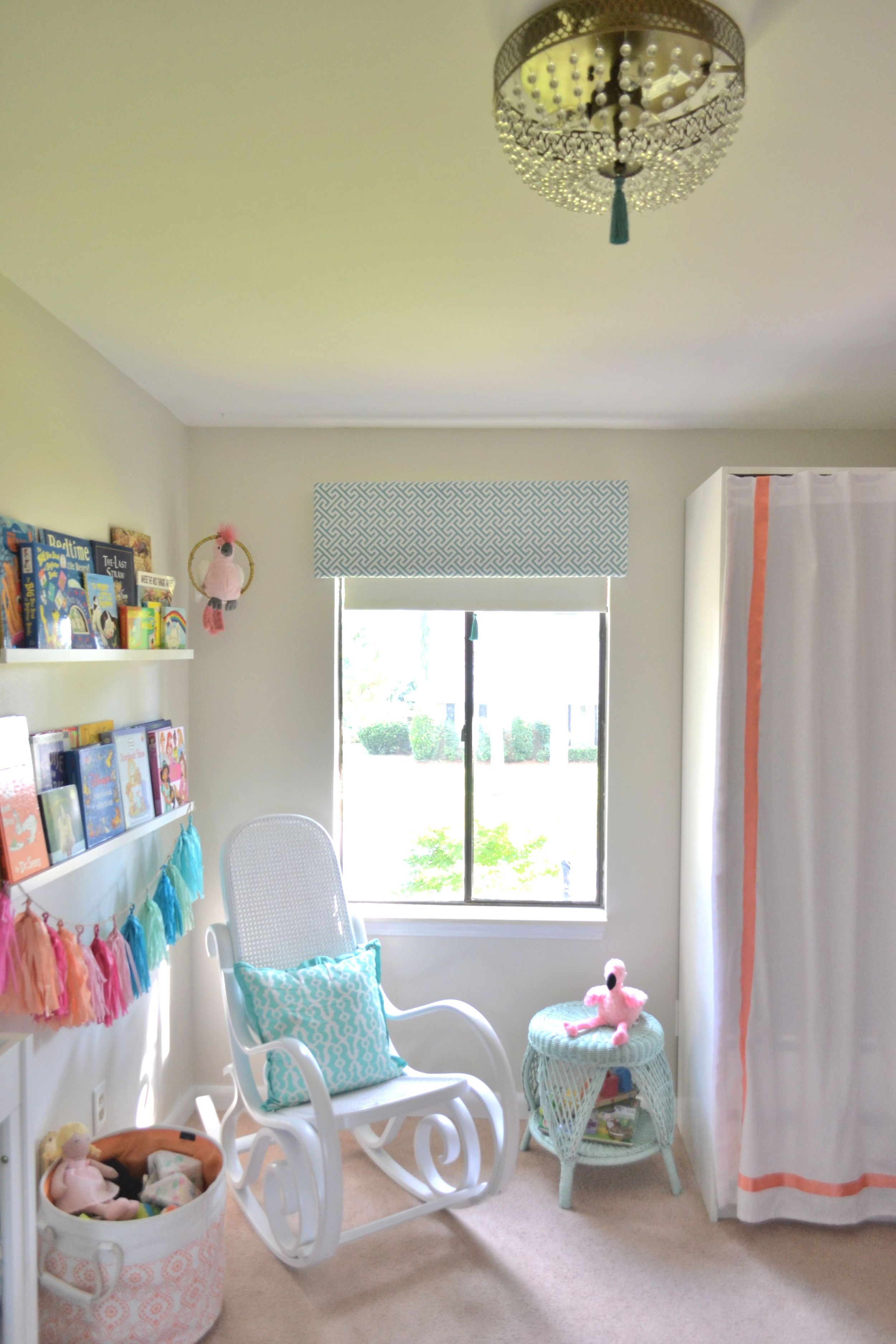
The inspirational glider was beautiful and came with a hefty price tag of over $1000. I was not sure how much I would use it. So, instead I found a vintage bentwood rocker with nice lines and painted it white. Well, Ty painted it :) Not bad for $45 and a couple cans of spray paint. It is pretty comfortable too.

With a lack of storage in mind (Amelia and I share the closet space), I chose this great crib with underneath storage from Target.com. The sheet is from Target.com as well.  Pillows are a Tuesday Morning find. The blanket is a handmade gift from a friend along with the tassel garland. And the book ledges are from Ikea.

DSC_0186.JPG

 I created a cute little dressing valet for Amelia with these sweet little shelves from Land of Nod.

DSC_0522.JPG

The original design included a starburst light fixture but I wanted something a little more girly. Came across this light fixture on a trip to Home Depot. Attached a tassel and got instant glam for about $100. At night it makes the most beautiful patterns on the ceiling and walls. The side table was another vintage find.

This little guy used to belonged to big sister. I sprayed painted an embroidery hoop and wrapped gold twine around it. Now he has a place to perch.

DSC_0584.JPG

The painting is of Ty and I looking over Amelia. Ha! Just kidding. I know it is not the typical art you would find in a nursery but I love it! It has the Palm Springs vibe that I was going for. The pineapple print is by yours truly and the dresser was another vintage score. You can check a DIY I did on it here. The changing pad cover was a custom order from an Etsy store.

DSC_0549.JPG
DSC_0581.JPG

Though there are a couple items I would still like to get, overall I am happy with how the room turned out. Looking forward to creating many memories in here.

jessicasignature.jpg